Reply With Quote
No.Originally Posted by Engi

Eddie


Is the 20->1> riveted oyster bracelet sample arrived ?
Thanks.

No.
Eddie
Whole chunks of my life come under the heading "it seemed like a good idea at the time".

Agreed.
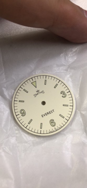
So have you definitely done away with the 'Everest Expedition' text that was on the 'minor tweeks' image you posted?
Have you decided on the style of hands you are going to use?
I'll be doing them all.
Eddie
Whole chunks of my life come under the heading "it seemed like a good idea at the time".
Bloody good news!

That dial looks great.
Will the hand proportions be changed Eddie?
Sent from my iPhone using Tapatalk

Apologies if I missed this somewhere in the thread but are drilled lugs going to be on these?
They should be in the new release of the PRS-25, at least for the hour hand. I do not know if the minute hand will be shortened a bit, maybe Eddie can better explain.
Yep, I think both need adjusting, brilliant watch otherwise.
Sent from my iPhone using Tapatalk
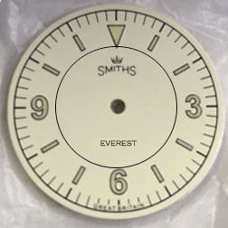
Have a bit of fun with this. Don't know whether to have
Different colour outside the circle or inside
or
Gloss inside/matte outside or vice-versa
Eddie
Whole chunks of my life come under the heading "it seemed like a good idea at the time".
Here's some inspiration for you:

I know this is not an answer to your question, but I must say I really don't like the way the circle touches the triangle and 6 markers.
It bothers me so much that I struggle to address the issues of colour and finish!
I do like the smaller font for 'Everest' though ..
Smaller font looks good, but not a fan of the circle. I think it works really well on the type C render, but don't really like this one. I also like that without it, the B and C feel more distinctly different watches (and would make me feel more compelled to buy both)
A redesign along these lines would also mean that the idea of this model as an homage to the rare blonde Explorer would have gone.
That doesn't bother me as such personally, but some potential buyers might lose interest for that reason alone.
As I understand it, the circle is just a quick addition meant to indicate the areas that are potentially going to be differentiated. It is not actually going to be in that placement.
I think a matte outside / gloss inside, or light color outside / darker color inside would work better.
I like that the "Everest" text has been reduced in size to be better in proportion to the Smiths logo.
I would retain the original Everest font size and make the Smiths logo bigger - exactly like you had it on your very first post in this thread (22nd December 2018 15:35)
And I would also stick to the original idea for the dial of one colour and one finish.
Last edited by 459GMB; 28th April 2019 at 09:03.
This is all a white dialled Everest needs to be, no more, no less.
F.T.F.A.
I agree with Bob
Would you not welcome rebalancing of the size of 'Everest' with 'Smiths', either by reducing the size of the former as per this latest illustration or - as 459GMB suggests - reverting to the original, larger size of the Smiths logo?
I do feel that the large EVEREST above 6 combined with the small Smiths logo below 12 leaves the dial unbalanced, and quite a few people have commented along those lines at various points in this thread.
It looks fine as it is to my eye. Larger logo at the bottom, smaller at the top, is a more a natural balance. IMHO.
That's not the traditional balance of course - and indeed it's not unusual to have no logo or legend in the bottom half of the dial at all - but if that's what you prefer then there it is, no-one can gainsay that.
Hillary's actual watch doesn't have a stepped dial and looks better for it in my opinion.
The stepped dial was only ever proposed for the Everest Expedition variant, not for the Everest itself (which is inspired by the Rolex Explorer design, admittedly having zero connection with the 53 ascent!).
I am still quiet happy with the original... but a few ideas on Eddie's theme.

Thanks, that's the kind of feedback I was hoping to get.
Eddie
Whole chunks of my life come under the heading "it seemed like a good idea at the time".
I like the simplicity of the sample dial, but if I were to go for the two stage dial, I would make the outside darker to empasise the contrast of the numbers against the background. Thinking something like the JLC Master Control Date in that regard, although with the added benefit of luminous numbers.
Whatever you do will be great.
A couple more ideas...

The alternatives being put forward are merely highlighting why you should stick to your original plan Eddie - nice photoshop skills from OliverCD though ! :-)
I agree, just for clarification, are all models a through c going to produced? The black and white Everest and the expedition? Id like to see all of them.
Im wearing my Everest 36 at the moment and would love to see the expedition model (which is model c I think).
Sent from my iPhone using Tapatalk
Hear hear.
#520
I just read this article it has some good photos and info, the photos highlights the dial nicely.
https://www.watchgecko.com/vintage-s...-deluxe-watch/
Sent from my iPhone using Tapatalk
Good work as ever Oliver, but I wouldn't buy any of those versions - the C has it, the C has it!
Great combination - wonder where the strap was bought from?
Nice, very keen to see this one.
Agreed.
I'm in.
Can't wait to see the hands
...
BUBI 0_0
What about the other one - version C - no news on that one?
Last edited by Mads Gorm; 4th May 2019 at 13:04.
Sent from my iPhone using Tapatalk
The 10 atmosphere line works really well at filling an empty space discreetly. My favourite option so far, with the bigger logo doing the same in the upper part of the dial.
'Against stupidity, the gods themselves struggle in vain' - Schiller.

"Once is happenstance. Twice is coincidence. The third time it's enemy action."
'Populism, the last refuge of a Tory scoundrel'.
Yes, that looks superb.
At only 36mm the dial should be left as uncluttered as possible so as not to shrink it, particularly with a mix of fonts/sizes.
Hear hear.
#520
I think you might be right, this was my inspiration. I think it looks good on the sarb035 but im unsure about it here.
Sent from my iPhone using Tapatalk
If anything I would lower a touch the 2 lines.
The size of the dial is marginally irrelevant as its a matter of proportions.
I wouldnt call this one cluttered:
And it didnt exactly ruin its sales and popularity.
'Against stupidity, the gods themselves struggle in vain' - Schiller.
I would be interested to see what a smaller Logo with everest at the top would look like, with Automatic and 10 atm in the lower part. Maybe too close to the 1018?
'Against stupidity, the gods themselves struggle in vain' - Schiller.
Yep, proportions and balance, and homogeneity of font/size. None of which the '10 atmospheres' has.....in my opinion. That is what makes it look cluttered, to my eye.
 Posting Permissions