Reply With Quote
First one I have seen like that. Being at the top of the dial, my eye is immediately drawn to it. Whilst I like to have a date on a watch, it is better to be more discreet, so this doesnt get my vote


Fancying a Longines in the new year I stumbled across this model whilst looking through their collection, is it just me or does it make the thing look upside down at a glance?
Sent from my SM-A320FL using Tapatalk
First one I have seen like that. Being at the top of the dial, my eye is immediately drawn to it. Whilst I like to have a date on a watch, it is better to be more discreet, so this doesnt get my vote

Looks wrong to my eye.
Also I think the amount of "top half" dial text is out of balance.
Both make it look upside down to me!

Don't like that at all. Better if it could be higher (possibly impractical), maybe window shaped more like markers and gold on black?
To my eyes.... horid! Beautiful watch but that date window would completely kill any interest I'd have. Mind you I would 100% rather have no date at all on that watch.
Longines are very dogmatic about date windows, ie include them when anyone with any sense of proportion would say they should be left off. This one looks to me like the dial was printed upside down but they went with it anyway. Clueless.
Presumably they sell so people must like them!
Jewellers windows are full of models that no-one here would love. Hardly ever see forum favourites like the Legend diver. Same with Seiko, Citizen and other brands.
Good thought, I would definitely blend in more.Originally Posted by Kingstepper

Sent from my SM-A320FL using Tapatalk
Favourite place for date for me is 6 oclock followed by 3 oclock. This doesnt work for me.
+1, date at 6 works far better, date at 12 doesnt look right to me.
Aesthetically, it leaves something to be desired. One can see the reasonable idea behind it, however. Say you want a date window. Say you also want to quickly orientate the dial, which some do with a differently shaped marker at the 12 position. Two birds with one stone. As mtagrant says, the eye is drawn to it. And a date window elsewhere is a carbunckle, anyway. If you are going to show a date, either have a date dial, or do an Oris (most aesthetically pleasing solution to my eye).
Best wishes,
Bob
Does this mean that
was better than

^^^^^^
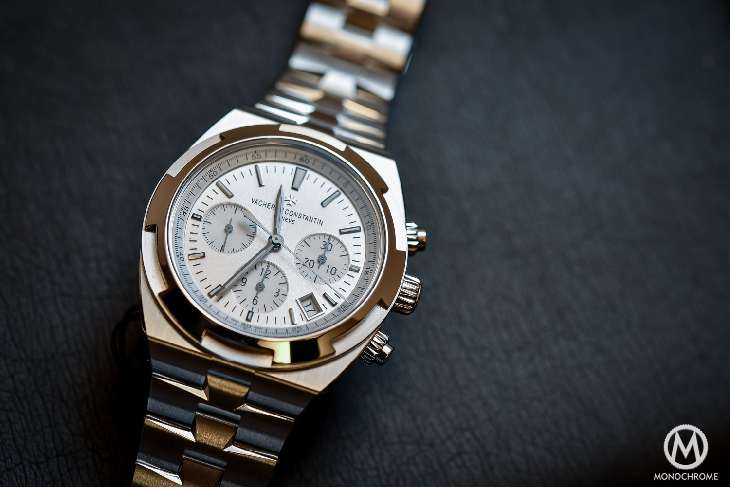
Thats the watch I was going to post, the 12 double window date works really well on the VCOC
Agreed; the Lange Saxonia Moonphase's large date also works well at 12 o'clock. Small date windows seem odd there, but maybe that's just what one is used to! Personally, no date is my preferred option, though I'm comfortable with large dates and date sub-dials (and pointer dates) in general.
Mmmm
It was more aimed at the Longines Watch in the OP, should have explained myself better, the chronograph Watches look more balanced with the sub dials for some reason.
One of my favourite Watches, the Breitling Blackbird big date has the data at the top and imo looks great, and that is some date in terms of size.
Sent from my SM-A320FL using Tapatalk
Yes, I'm sorry, I've been slightly facetious, the other details on the dial and the size of the date are making a big difference.
Going back to that Longines, I think that this particular eccentricity is at least rooted in tradition. iirc that placement was first used when date windows were still relatively new. I'm trying to remember who it was in the mid 60s that put them at 1.30. Possibly Citizen? I'll try to find an example. Looks so weird.
Edit: here we are....

Last edited by Der Amf; 27th October 2018 at 12:08.
Not a fan of that 1:30 date Der Amf, never seen a date at that position before, when you think you've seen it all something different always pops up :)
Sent from my SM-A320FL using Tapatalk
Orient too:

With the day underneath, that might look ok with the date in the top middle
Don't mind that Citizen. Prefer horizontal date rather than at an angle like the Orient.
Orient would have been better at exactly 1:30 too.
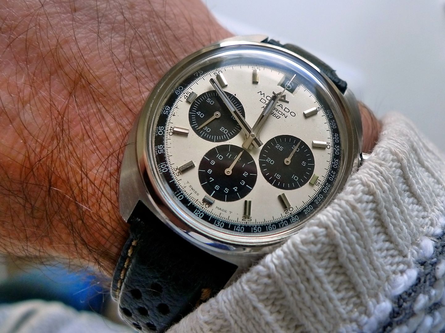
As proven with the VC I don't think all dates at 12 look wrong, just the Longines isn't a good example. Here's my early 70's Movado Datron which looks pretty good to my eyes.
Cheers,
Gary
Looks pretty good to me too Gary, but I think it's because black date wheel doesn't stand out to the eye against white as much as a white date wheel on black, plus this puppy is a panda, the black subdials and chapter ring help to keep things calm.
Good luck everybody. Have a good one.
I agree the date at 12 looks wrong but that's presumably, at least in part, because we are not used to seeing it there.
I think having the date at 4 o'clock looks really wrong!
I will go against the general consensus and say I quite like the date there, that said it would look nicer on a white dial I think, but I love this one. The dates at 12oclock! Shock Horror
Sent from my iPhone using Tapatalk
So this is really wrong?
IMG_4974.JPG
Sent from my iPhone using TZ-UK mobile app
Save your money Matt, modern Longines are no use and that particular one does indeed look completely wrong.
It just looks wrong, don't know why it just does.
I'm not a fan of that.
Sent from my SM-G930F using Tapatalk
Roamer notably put the date at 12 a couple of times on their chronographs and I think it works design-wise, the problem is that you need to get the chrono hand out of the way first:

A date at 12 can look great as Lange demonstrate, the Longines just looks out of proportion as it is too small. For the date to look right at 12 it needs a certain presence and the Longines just looks lost.
Odd how such important aesthetic decisions as placing the date at 12 can be got so wrong, a majority on this thread don't like it but somehow Longines convinced themselves it was a good design. Admittedly TZ are a pretty critical bunch
Disagree that looks great, date looks like two separate numbers
The Vacheron looks great! When the Lange has single digits showing it looks off to me, probably the only thing I don't like about them.
This Squale Master also has the date at 12. Would look a lot better at 3 in my opinion.

 Posting Permissions