
 Reply With Quote
Will they have the new SMP models?Originally Posted by MartynJC (UK)


Im popping into my local AD tomorrow to view these - hopefully have a report back to you all later. Anyone got some questions meantime for Omega on these new models?


Will they have the new SMP models?
Yep. Thats what Im checking out. They dont have the blue, but have the black and grey. May take the flexible friend along!!
The grey dial with the blue hands looks the pick of the range for me. I was in a AD a few weeks ago and the colour scheme really works on the Aqua Terra so hoping it works as well on the SMP
Sent from my CLT-L09 using Tapatalk
Sounds good, I will try to get over tomorrow and see what's new.

What's the verdict?
I saw these up close a while back. They do look good, especially the new colour scheme shown below but bear in mind they have grown slightly and are now 42mm with I think 21mm lugs. The He valve looks uglier than ever too. I prefer them to the no wave version but prefer the 2254/5 generation even more:

I like the idea of the 8900 movement, but I don't like the wave design, so that would rule it out for me. The old wave design was better imho.
My question to Omega would be: Why change a classic design just for the sake of it? The original wave dial is a thing of beauty!
I think the original has not been surpassed by either of the two iterations which succeeded it, mind you I am very conservative and I guess this may bring in new punters. Cynical, moi?
Well I quite like them. Especially the bracelet changes- subtle and now with adjustable clasp (about time). Here is the new with the old.
This one is particularly striking
They do have a back face with Siena gold accents on rubber strap. Looks not unlike a Yaghtmaster but take off £10K !!
Prices actually seem reasonable in today’s market considering the silly PO pricing.
Anyway - not on general release until October. Plenty of time for switching around the collection.
Martyn.
Last edited by MartynJC (UK); 16th August 2018 at 13:38.
Each to their own - personally I think they look a little bit bling - have they taken on some ex Breitling staff?
Other than a welcome improvement to the bracelet, the other improvements will probably have many saying they prefer somewhat older versions.

I think this looks fantastic!
I have the opposite opinion, but then I like Corum Bubbles and orange planet oceans so what do I know :)
Looks like some sort of toy watch. That's not a wave dial, it's a disaster.

I agree wholeheartedly
Dave
Sent from my iPhone using Tapatalk
Haha. It's maybe a bit much but I like the boldness.

As always with shiny dealerships with very bright lights I'll wait to see what these look like in the real world! It's my main issue with wanting a blue Pelagos - I've never seen one outside a dealer so have no idea what the dial looks like in the evening, on a rainy day, even in sunshine.
I'm not a huge fan of anything over 20mm lugs on a 42mm watch, 21mm or 22mm bracelet and lugs don't make the watch look smaller or more secure on the wrist, is the odd number just so Omega can corner the market in unusual size NATOs?
I do like the look of the dials, Omega have done something different. Four or five years ago I picked up an Omega brochure and realised there was virtually nothing of interest going on, now they do watches with orange details (which I like), some nice Speedies, retro models and now these Seamasters. I think they're heading in the right direction with the sports and space stuff.
"A man of little significance"
Not for me. The increase in size is enough to rule it out. I'm a fan of the pre-ceramic models and I quite like the original SMPc provided it's black, but this just looks a mess to me. Losing the original wave dial was a mistake IMO, but resurrecting it in this form makes little sense. I'm a great believer in getting a design right and sticking with it, this seems the exact opposite.
Maybe it looks better in the metal......it needs to!
Paul
Not a great fan of that silver/blue wave dial one. Also the valve looks awful on these?!
Come on Omega, stick an 8900 movement in a 2254.50.
Job done.
Sent from my F8331 using Tapatalk
Me neither. All they had to do was give it an adjustable clasp.
Another decent watch ruined.
Looks like Ulysse Nardin designers have had a go. Certainly its going in a different direction
Nope, not a fan either. Reminds me of a mid nineties tag for some reason, there's definitely a retro vibe going on there... In a bad way
Sent from my SM-G960F using TZ-UK mobile app
Likewise Tony - just awful.
Last edited by Chris_in_the_UK; 16th August 2018 at 20:01. Reason: Double post thingy
When you look long into an abyss, the abyss looks long into you.........
Love these. A move away from the blandness that pervades from Geneva
Nail, head.
I actually like the new model, not an improvement but I like it, yet that HE crown is a shocker, the first thing that jumped out at me and now I cant see passed it.
That "wave dial" looks absolutely awful to my eyes.
Not my cup of tea, much prefer the 1st gen watches
To me they look to 'Toy' watch, almost trying to hard. The previous ceramic bezel and gloss dial was lovely, apart from the black date window (on the blue dial) and lack of applied indices at 3.
Like the bigger case size and movement mind you, but may god that HE valve. (come on even Bond does't use this anymore)
I popped into the AD in Tunbridge Wells hoping to see some of these today but they haven't had any in yet. I've been looking to replace one of my Omegas and this might give me something different as I currently have 3 Planet Oceans (steel, ceramic GMT and a titanium).
Not for me either, I can't believe a load of Omega designers thought that was good.
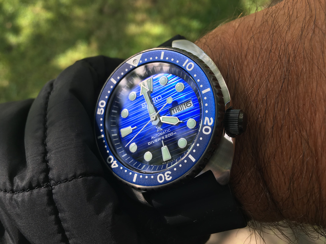
Popped in yesterday to my local boutique but they don't have them in stock just yet, so I needed some with a wave dial and came away with this.
Glad its not just me! Horrible looking watch, at least in photos. Perhaps its better in the flesh.
Nah... don't think so...............
How did they make the helium release valve look even worse?
It is 2am here, but if you told me these were from a Chinese website, I would have thought, well yeah obviously!
Agreed, what once was a real divers watch is now an unreadable mess.
Got a new watch, divers watch it is, had to drown the bastard to get it!
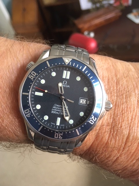
Sticking with this...
Tool not toy.
I've owned all variants and still have the 2531 and the ceramic. I'll definitely look into these, but can't see myself adding to the collection.

I don't like those at all, the hands are practically invisible!
If Omega really had to make changes the best thing they could have done would have been to do away with the He crown. Completely useless feature in this day and age.
The new wave dials do not appeal to me at all, change for changes sake.
Not for me as they look like a dog's dinner.
I do think the current SMPc is one of the best value watches on the market however.
I'd like to see one in the steel as it were. The pics tend to make it (Dial, hands) look rather, plastic.
But you know what they say, "If it aint broke, keep tinkering with it until it looses all merit".
Id be interested to see the black one in the flesh but pretty sure I wont be swapping my SMPc for one.
Deep discounts ahead!
Likewise
It's just a matter of time...
They can make a flush HEV ala the PloProf, so no excuse for not updating the 300m if they were making changes to the valve anyway.
It has been about the best value in the range, and even better at a decent discount. The SMPc is just very very good value imho.
I definitely wouldnt sell one of my SMPcs for the new model for its looks alone. The bracelet does look very nice though.
Most likely, I cant see this being the sales success it should have been - although Im looking forward to see what they can do with Limited Editions ;)
It's just a matter of time...
I personally think this new Seamaster looks hideous, the waves are far to bold, as said, all the Previous Seamaster needed was an adjustable Clasp, I quite like the new date position but I've nothing against it being at 3 either.
Sent from my SM-A320FL using TZ-UK mobile app
 Posting Permissions


