closing tag is in template navbar
timefactors watches


TZ-UK Fundraiser
Results 1 to 46 of 46

Thread: Patek 5146, change for...?

  1. #1
    Master daveyw's Avatar
    Join Date
    Sep 2013
    Location
    London
    Posts
    2,021

    Patek 5146, change for...?

    Hi all,
    I’m looking for suggestions and input re possibly changing my Patek 5146g. This was a huge purchase for me and was bought New from WoS last year. The watch itself is awesome but unfortunately I just have not bonded with it. No matter how much I love what it does and how it feels both on the wrist and to own, I still struggle to read the dial under certain light conditions due to what appears to be a marked decline in eyesight! The question is what to do next?
    I’ll take a hit financially and don’t want too much pain but am prepared that I may have to pay a bit for my mistake.
    Options are-
    1) wait another year and replace dial with slate grey(cost approx £2k from Patek)
    2) px and change for a used 5167r with a bit more cash
    3) px and more cash for a 5960p or r
    4) something different?
    The thinking behind the options are that I already own a 5711 that is for special occasions and a rose gold Reverso for dress wear, so this watch needs to fulfill an ‘everyday’ all occasion purpose.

    First world problems I know but I would really like people’s and owners thoughts on the 5167r and 5960p
    Any other suggestions are also welcome. Thanks

  2. #2
    Craftsman
    Join Date
    Feb 2014
    Location
    UK
    Posts
    967
    i would have thought the slate grey dial would be harder to read than the cream. If you like the complication then maybe the 5396 could be one to try. It's a special occasion watch, but can also be worn daily and the simpler dial should be easier to read.
    Last edited by Cinch; 2nd May 2018 at 19:57.

  3. #3
    Master
    Join Date
    Mar 2013
    Location
    Here and there
    Posts
    1,408
    Option 1 for me. Slate dial is actually my preference from all the options (just like the colour) for that model and given the cost is not much (relatively) I think you give that a try. If it does not work out then you can try the other options.
    The 5146r is a different watch altogether because of the gold colour. Also not sure the bezel in gold makes it an everyday watch given the amount of scratches it will get.
    The 5960 I initially liked when it came out but I have gone off it tbh. I think the is dial is too white, mixed fonts and the bracelet being too bling. Secondary resale Is also not good.
    Other options could be in the Lange territory but given the choices you have put out I think you really want a PP.
    Last edited by JP28; 2nd May 2018 at 19:54.

  4. #4
    Grand Master Der Amf's Avatar
    Join Date
    Oct 2015
    Location
    UK
    Posts
    11,984
    Quote Originally Posted by JP28 View Post
    Other options could be in the Lange territory
    Annual Calendars with blued hands:


    But perhaps both too dressy for your taste, day in day out?

  5. #5
    Craftsman
    Join Date
    Feb 2014
    Location
    UK
    Posts
    967
    The Lange annual calendar is 1mm bigger than the 5146 and wears very well, well it did when I tried it on

  6. #6
    Master daveyw's Avatar
    Join Date
    Sep 2013
    Location
    London
    Posts
    2,021
    My change in jobs means I’m not in an office much and the cream dial works better in indoor lighting.
    Lange ac’s are exceptional quality but perhaps too dressy

  7. #7
    Master
    Join Date
    Feb 2012
    Posts
    1,864
    Blog Entries
    6
    Quote Originally Posted by JP28 View Post
    Option 1 for me. Slate dial is actually my preference from all the options (just like the colour) for that model and given the cost is not much (relatively) I think you give that a try. If it does not work out then you can try the other options.
    The 5146r is a different watch altogether because of the gold colour. Also not sure the bezel in gold makes it an everyday watch given the amount of scratches it will get.
    The 5960 I initially liked when it came out but I have gone off it tbh. I think the is dial is too white, mixed fonts and the bracelet being too bling. Secondary resale Is also not good.
    Other options could be in the Lange territory but given the choices you have put out I think you really want a PP.
    5960p is platinum and not on bracelet. You are thinking steel. This model comes in grey, black and blue. Blue and black are expensive, grey can be bought cheaper as older. Discontinued model so will be buying used.

    5960a is steel and on bracelet. In white and black dial. Again discontinued. White used is cheap for what it is and most likely increase over the years, this will be the lowest point. Black is rarer and more, no bargains on this one. Of all the 5960s I’d say white is easiest to read, white dial and black markers.

    Either of these will mean a lot more cash so I’d change the dial and see how it is. Maybe go view a slate and see if that does the job?
    Last edited by Kash; 2nd May 2018 at 20:12.

  8. #8
    Master daveyw's Avatar
    Join Date
    Sep 2013
    Location
    London
    Posts
    2,021
    I’m going to talk to some AD’s and try a few options. The 5167r option took me by surprise but it does tick a lot of boxes. Does anyone have any experience?

  9. #9
    Master
    Join Date
    Feb 2012
    Posts
    1,864
    Blog Entries
    6
    Not of the 67 but I do of the 64r. Tbh they are lovely watches, so much more special than just gold. The dial goes very well with the rose gold and legibility is great. However, for me it wouldn’t be an everyday contender. That bezel is too delicate and once marked would ruin the watch for me. This is one reason I sold it in the end.

    Also with this deal you would likely put money in and lose a complication. Not sure I’d go that route.

    Good idea to get to some dealers and try a few options on. How about that 5227G black dial you once thought about. I think I saw one at the London salon.
    Last edited by Kash; 2nd May 2018 at 21:10.

  10. #10
    Grand Master MartynJC (UK)'s Avatar
    Join Date
    Dec 2008
    Location
    Somewhere else
    Posts
    12,371
    Blog Entries
    22
    I find the 5146J works for me under most conditions.


  11. #11
    Master daveyw's Avatar
    Join Date
    Sep 2013
    Location
    London
    Posts
    2,021
    That has also been a thought. The black dial carries a ‘sportier’ feel and legibility should be great also.

  12. #12
    Master daveyw's Avatar
    Join Date
    Sep 2013
    Location
    London
    Posts
    2,021
    I shall try to get to Patek next week. I presume these don’t get much, if any, sort of a discount?

  13. #13
    Master
    Join Date
    Feb 2012
    Posts
    1,864
    Blog Entries
    6
    Quote Originally Posted by daveyw View Post
    I shall try to get to Patek next week. I presume these don’t get much, if any, sort of a discount?
    Find an ad with stock (not salon), then check chrono for the general market (be aware US is always cheaper but for reason, tax etc, but will give an idea) and then go tell them what you want to pay, they should move.

    - - - Updated - - -

    Quote Originally Posted by daveyw View Post
    I shall try to get to Patek next week. I presume these don’t get much, if any, sort of a discount?
    Find an ad with stock (not salon), then check chrono for the general market (be aware US is always cheaper but for reason, tax etc, but will give an idea) and then go tell them what you want to pay, they should move.

  14. #14
    Craftsman
    Join Date
    Feb 2014
    Location
    UK
    Posts
    967
    Quote Originally Posted by daveyw View Post
    I shall try to get to Patek next week. I presume these don’t get much, if any, sort of a discount?
    I would think you could get a discount on the 5227.

  15. #15
    Master daveyw's Avatar
    Join Date
    Sep 2013
    Location
    London
    Posts
    2,021
    Thanks Kash
    Just a quick iPhone pic that shows how the lume insert on the hands closely matches the dial in certain light conditions.

    Or it
    Might just be me?

  16. #16
    Master
    Join Date
    Feb 2012
    Posts
    1,864
    Blog Entries
    6
    Yep it’s a close colour match. But I I’ve found Patek are not the best at legibility generally, a lot of models and dials suffer.

  17. #17
    Master
    Join Date
    Apr 2008
    Location
    Corona Borealis
    Posts
    6,965
    The correct answer is, of course, 5960p.

  18. #18
    Master
    Join Date
    May 2013
    Location
    UK
    Posts
    5,672
    https://www.chrono24.co.uk/laurentferrier/fbn22901-galet-square-blue-dial-limited--id7927525.
    https://www.chrono24.co.uk/urbanjuergensen/the-alfred-urban-jurgensen--id8096175.
    https://www.chrono24.co.uk/urbanjuer...-id7603614.htm — given current Ref 8s are PM, you could enquire as to the cost of swapping case to WG or RG

    While you’re looking at those, also take a gander at Chopard L.U.C.s — plenty of different models/styles to choose from, with arguably better finishing than Pateks at similar retail prices.
    Equally, Moser could offer an everyday casual alternative.

  19. #19
    Master
    Join Date
    Dec 2010
    Location
    End of the world
    Posts
    3,460
    Blog Entries
    9
    How about one of the Patek Pilots?

    PS - I love my Aquanaut as a daily. So slim ive never bashed the bezel. Keep it on for most things unless doing DIY or lifting weights

  20. #20
    Master
    Join Date
    Feb 2012
    Posts
    1,864
    Blog Entries
    6
    Quote Originally Posted by kultschar View Post
    How about one of the Patek Pilots?

    PS - I love my Aquanaut as a daily. So slim ive never bashed the bezel. Keep it on for most things unless doing DIY or lifting weights
    yep but thats steel, he is talking about the rose, soft metal, highly finished means any mark will hurt, and on gold it looks a lot worse.

  21. #21
    Master daveyw's Avatar
    Join Date
    Sep 2013
    Location
    London
    Posts
    2,021
    Have you had one Kash? Are they really that bad?

  22. #22
    Master daveyw's Avatar
    Join Date
    Sep 2013
    Location
    London
    Posts
    2,021
    Quote Originally Posted by Kash View Post
    yep but thats steel, he is talking about the rose, soft metal, highly finished means any mark will hurt, and on gold it looks a lot worse.
    Have you had one Kash? Are they really that bad to live with?

  23. #23
    Master
    Join Date
    Feb 2012
    Posts
    1,864
    Blog Entries
    6
    Quote Originally Posted by daveyw View Post
    Have you had one Kash? Are they really that bad to live with?
    I had the 5164R, travel time in rose. lovely lovey watch, when pristine. that bezel might get a knock, it will look bad and it will hurt. Patek also polish and don't laser weld so there isn't much you can do but buy a new bezel if its bad, and that will be expensive. i don't think these are dailys, but thats just my opinion.

  24. #24
    Quote Originally Posted by Cinch View Post
    The Lange annual calendar is 1mm bigger than the 5146 and wears very well, well it did when I tried it on
    Indeed. Personally, I'd far rather have a Lange AC than any of Patek's.

    Quote Originally Posted by daveyw View Post
    My change in jobs means I’m not in an office much and the cream dial works better in indoor lighting.
    Lange ac’s are exceptional quality but perhaps too dressy
    I think something like a matte croc strap in a colour that isn't black would give the Lange a much more versatile and casual look.

  25. #25
    I have quite a few of the watches mentioned in this thread.
    In terms of the 5146 - I chose the grey faced one as I think it is the pick of the bunch other than the 5146P.
    Here is mine and I find it easy to read, easy to wear and it does not seem to mark as easily as i thought it first would.
    I have changed the strap to a grey Patek strap which matches the dial.
    By contrast my 5167 has picked up much more noticeable scuffs and scratches on the bezel and I would echo Kash's comments about the 5164R. I was offered one recently and the main reason I passed was my experience with 5167 etc.
    The Lange Saxonia Annual Calendar is almost as easy to wear as the 5146 - it does however sit higher on the wrist and feels heavier - mine is the Platinum model so this may account for some of this weight. The strap is thinner and it uses a tang buckle rather than deployant.
    Again the Lange has picked up less scuffs and scratches than the 5167.
    Readibility and look of the watch surpasses the 5146 IMHO.

    Of the other watches mentioned a 5960P has some attractions, particularly the blue faced one but they are discontinued so it will be a pre-owned purchase. The drawback of the 5960 (all models) it that the font for the calendar is poorly designed and compressed which spoils the look.
    The same problem exists on the replacement model - the 5905P.
    As Belligero points out - Patek do seem to have lost the plot with fonts and layout on some of their watches.

    In terms of other watches - PJS suggests some alternatives. Moser do the Pionneer in steel with Blue face in automatic which is a great everyday watch.

  26. #26
    Master daveyw's Avatar
    Join Date
    Sep 2013
    Location
    London
    Posts
    2,021
    Thanks all.
    PJS - as usual, wise shout outs for less mainstream but high quality pieces.
    Kash- must have owned about everything at one point!
    Chris-lovely pics of the ALS and your 5146

    I still have a great, great watch but I'll take my time musing over a legible daily wearer

  27. #27
    Journeyman
    Join Date
    Aug 2017
    Location
    London
    Posts
    77
    Why not consider a Patek 5140?

    A lovely watch and not a million miles from the 5146? Available in a variety of finishes too... I have a soft spot for the 5140p-17 (anthracite/slate grey face).

    Here's a white gold alongside a 5960.

    imgonline-com-ua-CompressToSize-AxsB7QTt4d.jpg

    Small article here: https://www.hodinkee.com/articles/patek-philippe-5140

  28. #28
    Quote Originally Posted by CJQC View Post
    Why not consider a Patek 5140?
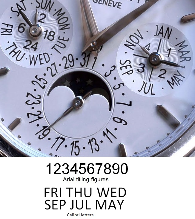
    Because its Windows-default dial looks cheap and nasty:


  29. #29
    Craftsman
    Join Date
    Feb 2014
    Location
    UK
    Posts
    967
    Quote Originally Posted by Belligero View Post
    Because its Windows-default dial looks cheap and nasty:
    Very poor design. I remember thinking that it wouldn't be noticeable on the wrist but it really is. Squashed numbers and oversized fonts was all I could focus on. The 3940 is the PP pc to get.


    What about the SS 5167 for daily wear?

  30. #30
    Quote Originally Posted by Belligero View Post
    Because its Windows-default dial looks cheap and nasty:

    I'd never noticed that before! It's the sort of detail that would make me assume it as a fake; very clumsy indeed.

  31. #31
    Master
    Join Date
    May 2013
    Location
    UK
    Posts
    5,672
    Quote Originally Posted by daveyw View Post
    Thanks all.
    PJS - as usual, wise shout outs for less mainstream but high quality pieces.
    Kash- must have owned about everything at one point!
    Chris-lovely pics of the ALS and your 5146

    I still have a great, great watch but I'll take my time musing over a legible daily wearer
    Thank you – best of luck with your deliberations.

  32. #32
    Master
    Join Date
    May 2011
    Location
    Aberdeen. Scotland
    Posts
    1,591
    Blog Entries
    1
    I would go for 5960/1A-001 or Lange phogograhed on this thread

  33. #33
    Buying some spectacles would be my very first suggestion.

  34. #34
    Quote Originally Posted by Belligero View Post
    Because its Windows-default dial looks cheap and nasty:

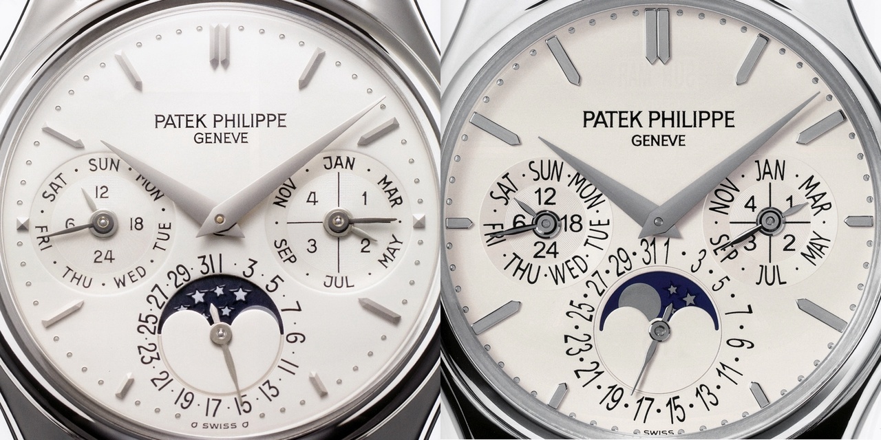
    I'm sorry, I can't find any similarity in these fonts apart from fact that they are sans serif.

  35. #35
    Craftsman Exiztence's Avatar
    Join Date
    Apr 2015
    Location
    Prague
    Posts
    384
    Quote Originally Posted by Belligero View Post
    Because its Windows-default dial looks cheap and nasty:

    Once you see it can’t unsee it.

  36. #36
    Quote Originally Posted by Normunds View Post
    I'm sorry, I can't find any similarity in these fonts apart from fact that they are sans serif.
    That's because they've been distorted by inept vertical stretching.

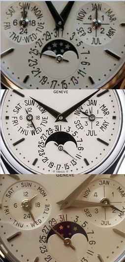
    Also, there's been a bar slapped onto the "J", presumably to imitate the the earlier versions' beautiful hand-lettered dials:


    There's no mistaking that they're from a cheapskate commodity box, which is amusing given that the Stern family originally made their fortune as high-end dialmakers; it's obvious that this design didn't involve anyone with even the most minimal level of competence in lettering and typography.

    That they used dumpy Arial is even funnier, as it's a low-grade knockoff of a respectable (though common) Swiss typeface that only exists solely for Microsoft to dodge licensing fees.

  37. #37
    Quote Originally Posted by Belligero View Post
    That's because they've been distorted by inept vertical stretching.

    That they used dumpy Arial

    I am not arguing whether it is better or worse than old dial font.

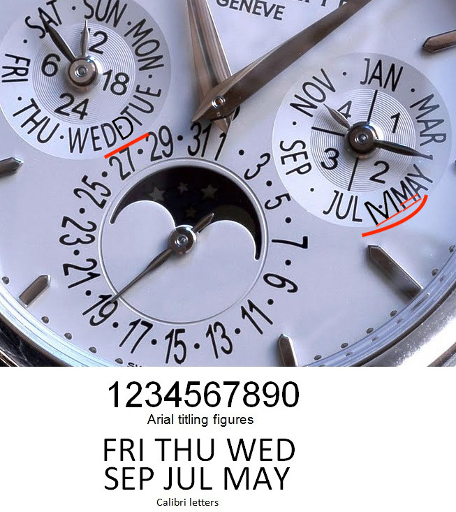
    It is not Arial font. and no, it is not stretched Arial too. This is different font, take a look at letters M and D.


  38. #38
    Master alfat33's Avatar
    Join Date
    Aug 2015
    Location
    London
    Posts
    6,199
    Quote Originally Posted by Normunds View Post
    This is different font, take a look at letters M and D.
    I was about to post the same thing. The R is also a little different.

  39. #39
    Obviously. Just as labelled, the letters are in that other dowdy Microsoft mainstay Calibri, which is tolerable as a spreadsheet default, but totally lazy and unappealing for a high-end watch dial.

  40. #40
    Master alfat33's Avatar
    Join Date
    Aug 2015
    Location
    London
    Posts
    6,199

    Patek 5146, change for...?

    If you look at the M in May, and look at the Calibri M, they are different.

    Look at the top of the J in Jan, and
    compare it with the Calibri example. No doubt side by side there are many other differences.
    Last edited by alfat33; 6th May 2018 at 19:24.

  41. #41
    Quote Originally Posted by alfat33 View Post
    If you look at the M in May, and look at the Calibri M, they are different.

    Look at the top of the J in Jan, and
    compare it with the Calibri example. No doubt side by side there are many other differences.
    Indeed, which is why I mentioned the extra bar on the "J". But it's unmistakably Calibri, or some equally-lame-looking near-identical derivative. Either way, it doesn't belong on a Patek dial — and neither does the sloppy alignment.

    The dial design is quite poorly-done for a watch of any price, let alone one that costs more than most new luxury cars.

  42. #42
    Master alfat33's Avatar
    Join Date
    Aug 2015
    Location
    London
    Posts
    6,199

    Patek 5146, change for...?

    Quote Originally Posted by Belligero View Post
    The dial design is quite poorly-done for a watch of any price, let alone one that costs more than most new luxury cars.
    I don’t disagree, although the font choice is OK with me.

    Edit: Removed some entirely subjective comments about PP dials that were unnecessary on this thread.
    Last edited by alfat33; 7th May 2018 at 09:38.

  43. #43
    Master daveyw's Avatar
    Join Date
    Sep 2013
    Location
    London
    Posts
    2,021
    Quote Originally Posted by Dent99 View Post
    Buying some spectacles would be my very first suggestion.
    Ha ha. I will do as it happens. :)

    As for the little details part of the discussion, these little things do matter when buying high end. The dial/ hands were more legible in the advanced research versions or solid hands would offer a great contrast on all dial variants. Ho him, I’ll try new specs first

  44. #44
    Quote Originally Posted by Belligero View Post
    Indeed, which is why I mentioned the extra bar on the "J". But it's unmistakably Calibri, or some equally-lame-looking near-identical derivative. Either way, it doesn't belong on a Patek dial — and neither does the sloppy alignment.
    Last time, it is not Calibri font. It is not even similar to Calibri.


  45. #45
    Indeed, it's some similar derivative with a few minor differences.

    Regardless, the way it's arranged and distorted is laughably poor, and the use of Arial for the numbering is inexcusable. It's the standard of design skill you'd expect on a cheap toaster, not a fancy watch.

  46. #46
    Master daveyw's Avatar
    Join Date
    Sep 2013
    Location
    London
    Posts
    2,021

    Patek 5146, change for...?

    Update...
    Finally I said goodbye to my 5146. A great watch for someone else but sadly not me.
    My thanks to all who who helped with ideas and to source a new piece and get the best deal possible for me. The dealers who I spoke to, even if they told me at times what I didn’t want to hear, were full friendly and helpful but especially Simon at Regal Time and James at David Duggan.
    Finally a special thanks for Kash, of this parish, for his patient support and various advices.

    Eventually I’ve ended up with this...


    Needless to say, I’m very happy with my choice.
    No complications but a dial and material that just pulls my eyes in every time.
    I’ll give a fuller review later if people are interested
    Last edited by daveyw; 19th June 2018 at 20:49.

Posting Permissions

  • You may not post new threads
  • You may not post replies
  • You may not post attachments
  • You may not edit your posts
  •  

Do Not Sell My Personal Information