Reply With Quote
Very nice, not sure about the big 9 though.


http://www.ablogtowatch.com/hamilton...-chrono-watch/
I really like these, what do you guys think?
42mm, 20mm lugs, twin register, logical design, see through back, robust movement.

Very nice, not sure about the big 9 though.
Good luck everybody. Have a good one.

Looks nice. Crystal/glass back always works for me aswel.
Good point didnt realize the 9 but now it does bug me abit.Originally Posted by seikopath

That looks good. Think I would probably prefer it without the day/date, but otherwise, very nice!
Isnt that H movement what they brand 'powermatic' when stuck in tissot watches?
I love it. I like the big 9 very much in the same way I like the squashed 7 on an Fpj chronometre bleu... Give the watch a playful character but not overdone
Sent from my D5833 using Tapatalk
I like those very much. I'd prefer and nice solid casebackas I don't find that movement particularly amazing to look at but it's doesn't matter too much.
I'd never buy one at list price as Hamiltons always seem to be in a sale somewhere, the 2 I have were less than half price each from Fraser hart.
Really pretty ordinary looking IMHO....
Oh hell no, it was going great until I saw the 9, what were they thinking!
I will stick with my Pan Europ...
Everything was going well till the 9, ruins the dial.
I'm in two minds about the larger 9. In some ways it balances the dial.
I would miss a running second hand though.

nice watch
Quite nice.
Like Dave I'm not a fan of the big 9 and the faux aged lume looks a bit naff, but yeah quite nice.
It's a shame, I think Hamilton is largely underrated as a brand and they have great history.
But the case is too big for the movement (or vice versa) so the date and sub-registers are stranded too far from the edge of the dial.
And that 9! Just too much design and too little function. For me it kind of indicates that it's a watch with its heart in the wrong place.
I've got the older, silver-dialed version of this (it's almost identical apart from the colour) and I have to say, it's one of the best VFM watches I've had. I really like it. I like these too because they are more toolish and military-looking. The silver dial is a bit of an odd mixture, but it's a good everyday casual watch. It's not quite shiny enough to be a dress watch and not quite dull enough to be a proper military watch. It's very legible though and has nice IWC-esque applied numerals.
The only thing that bugs me about it - and I can't decide whether it bugs me enough to sell it on - is the lack of a constant seconds hand. When you're wearing watches in rotation it helps to be able to quickly tell if it's still running, since it might not have been wound for a while. Since the movement is based on a 7750, which does have a constant seconds subdial at 9, this does irk me somewhat.
The other nice thing about Hamilton is that they don't use stock ETA movements. They are all modified to have a longer power reserve than the stock version, plus a few other tweaks here and there. The finish on the movement is nicely done too. Not overly showy with blued screws and perlage everywhere, but they do put an interesting engraved pattern on the bridge plate, where you can see it. It's subtle but I would imagine this is slightly more tricky to produce than the more common Geneva stripes, so it's a nice touch.
Funny, I didn't look too closely so didn't notice the nine until I went back and had another look. I thought, surely I'd have noticed that on mine? Sure enough, mine doesn't have a nine at all, so this is a major difference.
I guess this is because on the other, non-chrono Khakis the 12, 3, 6 and 9 are all larger and they've used the same proportions here. I do prefer mine now that you mention it.
I don't have pictures of mine handy, but there are some here - the page is in Japanese but there are lots of good pictures. While I was looking for this I found one reference to a 38mm version. I'm not sure if that really exists or if it was just an error, but Hamilton do tend to make their 3-hand Khakis in a range of sizes, so maybe they do the same with the chonos.
Very nice screams vintage chronograph and I like it best with the aged lume.
I rather like the big 9 - a little quirk that is presumably there because 12, 3 and 6 would normally also be larger....but they're missing due to the sub dials and date.
ATB
Jon
Looks like an honest watch for a fair price.
Just noticed: the chrono hours are divided up into segments of 12 minutes, rather than into the half-hours that the chrono minutes requires.
Does the dial designer understand how the watch works?
I'm a huge fan of Hamilton and I know it'll be well made but for me the negatives outweigh the positives; too big, too high, don't like the enlarged '9' and the day/date is too close to the middle of the dial.
Well spotted. Can confirm this is also different on my silver-dialed one. Seems they put a bit more thought into the older ones.
Very nice and real beast for the money.
why did they do that!??
Sent from my iPhone using Tapatalk
No, as it will be the same person that came up with the large 9. Perhaps they were told it was for a fashion watch brand...SaveSave
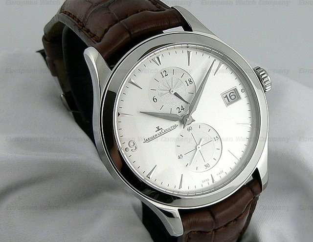
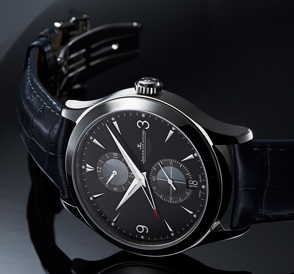
Presumably that large 9 is there for the same reason that the JLC Hometime looks like this:
The Aston Martin LE solved that problem by moving the date
Last edited by Der Amf; 10th August 2016 at 19:15.
This is the reason for the big 9:

That's a real shame. Stuff like that is very off-putting.
It's also shocking that Ariel Adams failed to notice this, or chose not to call attention to it.
I am not sure why people are put off by the Chrono hours set up. Can understand the big 9 grouse but doesn't bother me. Overall, I like it.
Generally speaking, I find decoration that isn't rooted in functionality annoying. Here, the designer has decided to fill up the space with markings that have nothing to do with the purpose of the subdial - nothing is especially gained, it's just thoughtless. Can't speak for anyone else, but when I'm trying to enjoy gazing at my watch, evidence of thoughtlessness isn't what I want to see.
I agree and its fussy
"I find decoration that isn't rooted in functionality annoying"
What a great expression,that is ecactly how I feel,this extends to motorcycles and other things as well for me.
Thought it looked nice until I saw the 9, now I can't stop looking at it
 Posting Permissions