


 Reply With Quote
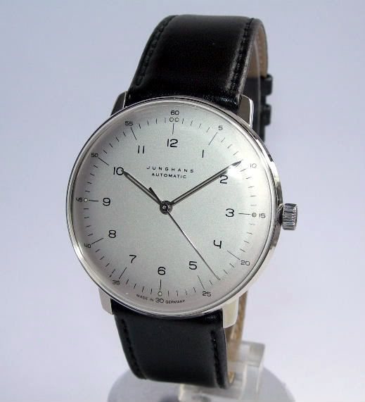
Junghans Max Bill. Not up on typefaces but probably one of his own?
There's something atomic-space-age-international-modernism about it I like.


Well designed typography has always had a spot in my heart and stumbling on a nice typeface makes me feel all warm inside. Recently I "rediscovered" this absolute gem from Hermès:
What makes this watch so strikingly beautiful to me is the form of its numerals, which were designed by Philippe Apeloig
I would go so far as to say this is the best use of a typeface I have seen in a watch to date.
The most iconic imo would be Paul Renner's Futura adopted by Omega in the late 1940's. It immediately makes me think of Omega despite their rebranding.
Anybody else a sucker for fonts? What are you favourite applications of typography on watch faces?

Junghans Max Bill. Not up on typefaces but probably one of his own?
There's something atomic-space-age-international-modernism about it I like.
I read somewhere that the guy behind Schofield watches spent months designing his own font for the Signalman.
Was going to say this but you beat me to it.Originally Posted by gentlemenpreferhats

One would assume that it's his own, yes.
Personally I wouldn't go so far as to call the Junghans beautiful but your description fits it perfectly. The typeface is indeed very nice and one I hadn't noticed. I wonder how it would fare in a more "prominent" scenario (such as on the Hermès).
Cheers
For me, FP Journe nails this aspect.
Very nice indeed. If the above models have a "modernist" touch, this is surely "classic" in essence. Do you know if their typography follows any philosophy? I was only vaguely familiar with the brand up until now.
They clearly have the worst website ever. Not indicative of their watches quality I assume.
Nomos probably deserve a shout... And come to think of it I've always liked the Patek Philippe font! Sinn however never worked for me, while GS's gothic has grown on me, strangely.

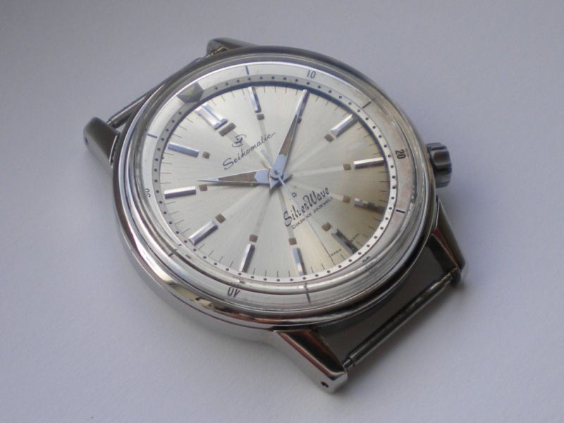
I love the fonts Seiko used on their Silverwaves in the early sixties, I don't know what fonts they are but they work for me
The Nomos, Hermès and Junghans all have a certain Bauhaus flair to them, using geometrical and undecorated (non-serif) letters and numerals.
The elongated "M" on these is quite spectacular. The font is certainly inspired by the "humanist" typefaces, something along the lines of "gill sans" and "frutiger".
In regards to PP. Some are divine, some questionable at best:

Last edited by drury; 29th June 2016 at 14:54.
I agree completely. In the early 60s Seiko employed lovely and elaborate typefaces. The Silverwave has an amazing mid-20th century vibe. It is quite the opposite of the minimalistic typefaces mentioned above (except the FP J).
 Posting Permissions


