Reply With Quote
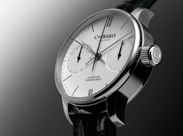
Whether you like the rebrand, reading the rationale behind it is enlightening.
http://www.01134.co.uk/christopher-ward/
Note that the following image is "bucking the predictable convention of watch advertising."Christopher Ward didnt come to us with a brief they came with an appetite for change. We are pretty straight talking as are they and they liked that. We had to get to the core of what these guys were all about they were disruptive, real, no-nonsense people, and their new brand needed to reflect this.
And that the logo is
crafted for reproduction at minute sizes.The key to this rebrand was that it started within the business, it wasnt imposed to impose a brand, no matter how clever, wouldnt be sustainable. The overriding response has been extremely positive within the business, and the now branding better reflects the feeling that most people have that they are part of more than just another watch company.