
 Reply With Quote
Wonderful.


I don't have a clue.
Wonderful.

Very nice
Oh dear, sorry to see this - is it the lurgi?

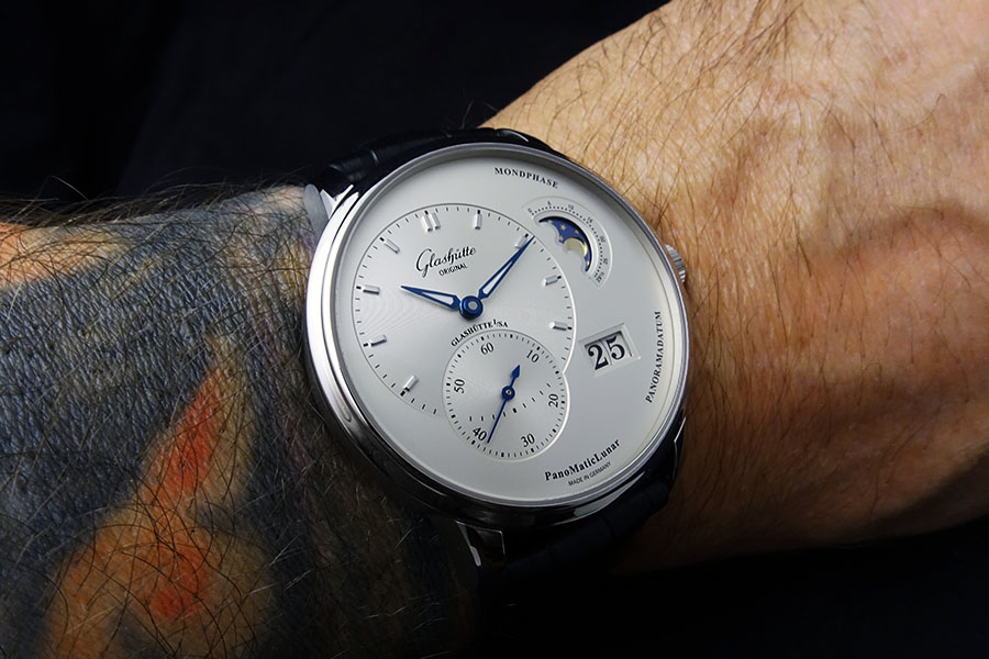
Woaw beautiful, how large is that? Looks like a 43mm or something
Thanks guys.
What is the lurgi?Originally Posted by WatchIng

Nope, 40mm on a skinny wrist.
That's a lovely looking watch indeed. Looks huge in the pic.
Very nice jocke!
lurgi is English slang for an illness, not sure why the poster mentioned this?.
mike
+1 Indeed, GO has the best dials. I think the angle makes it look a bit bigger, although it wears kind of large too.
One of my favourite "dreaming about" watches. Just lovely.
Beautiful watch, Jocke! Not sure about the ink though 😉
Maybe some kind of english humor?
The silver dial and the thin bezel fool the eye. Here side by side with the old one that is 39,5mm.
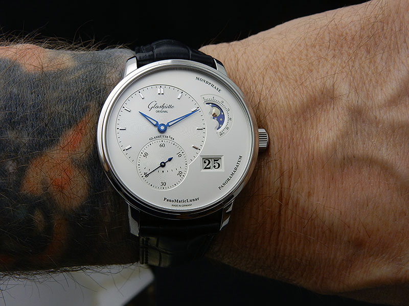
And another wristshot straight on.
Very nice indeed. To answer the question in the title, you missed the letter U out.
Oh, it might very well be the dial and the thin bezel that makes it look bigger.
Yeah that's right. Kind of prefer the older bezel design though, but the new dial is just miles ahead. On of the prettiest.
"Maybe some kind of english humor? "
Yes - sorry, my inner small child : you asked about colours, so it was a joke about your tattoo colouring. Obvious to my eyes, but evidently not to anyone else's!

Have to say the new dial design and bezel are nicer than the old one - but the dial looks a bit unbalanced, both the placement of the date window as well as how the time- and seconds-subdials cross each other looks a bit srange. Reminds me of the old-style Grand Lange 1, which has similar issues.
Lange have finally resolved this by designing a whole new movement which allows for perfect balance on the larger dial as well.
Love the new dial but the thing I prefer about the old dial is the way the hour dial passes through the second dial with the second hand in the middle !
Lack of the letter u ?
Love it. Never seen this one before.
Microsoft to blame....

Stunning! Very nice
 Posting Permissions
