
 Reply With Quote
Great photo as always but the subject still does nothing for me. Damn sight better than the beige offering from the other day though.


Great photo as always but the subject still does nothing for me. Damn sight better than the beige offering from the other day though.

Indeed it is.
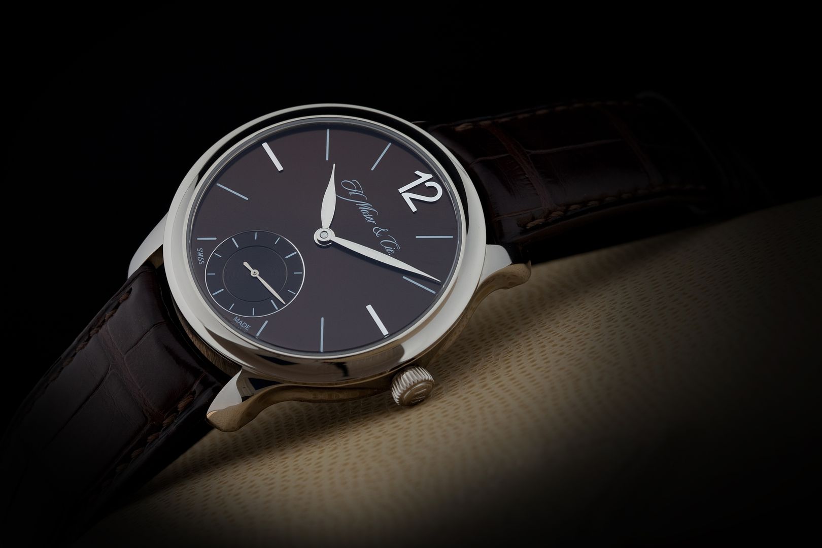
Other than that great big wacking "12" in that font, I'd agree.
PS, do you know what else is beautifully simple? light bulbs!
Tony, you're a great photographer for sure, but it'd be great to see some lighting that's all, rather than the moody "out of the shadows" photos you always do. Would just like to see the watches better, s'all. Keep 'em coming though!
Do you have a case back pic of this one?
Damned right. You want a bright picture or something different, take it yourself.Originally Posted by learningtofly

I'd very much like a picture of my VC like that!
I might take you up on that Tony... an imminent career change is probably going to see me back in the kind of places one doesn't wear a VC, or indeed anything that someone would cut off your arm for. So it won't be being worn for a quite a while!
Now that's something that never goes out of style, nothing much going on at that dial, but you still are drawn to it. Could that be the big 12 :)
Classy piece Tony.
Daddel.
Got a new watch, divers watch it is, had to drown the bastard to get it!
Not that keen on the watch TBH, but fantastic photos as ever.
As a mature, well, get older, I feel myself moving more towards the simpler designs on fine leather, nice looker, but prefer the perpetual calendar version.
Very beautiful indeed!
Perfection
Title says everything! Beautiful…
Tony, I never understand why people moan about your lighting… the photos always look dramatic, artistic and show all the detail. What more would you want!
Last edited by OliverCD; 11th March 2015 at 11:56.
Completely agree. This is your style, hone it and own it.

The movement is magnificent could stare at that all day. The dial just isn't doing it for me though the large 12 just not my thing. Great piece and photo though nonetheless!
I bit disagree. Probably its because I already have/had some watches. But longer run I demand much more for watch, especially dials, something extra.
Those minimalistic watches starts to bore within a month...
Very understated and as you you say simple !! I'd love to be able to take photo's like those .Well done Tony .
Was the big 12 something to do with the Japanese market..? Can't remember the history!
I think Tony's pictures are superb as they are. I don't like most of his watches (and a small voice in the back of my head thinks he buys them with one eye on how they'll photograph!) but they look damn good. What I think's most important (for me at least) is that they don't look overly processed, in the way that with some pictures the image is too flat (from toning down the reflections) or too sharp.

I know how much you love this Moser Tony. For me, the simplicity is outstanding, the big 12 balances the small seconds and the photo itself is superb. However, I don't actually like the watch that much. I appreciate its many facets but as a whole it's not for me.
'Not keen on the dial at all, it does nothing for me. A missed attempt at elegance.
But the movement is gorgeous. I'd wear it back to front.
I am also in the love em hate em camp with Tony's watches but please do not change your style of photography, simply mesmerising, makes photographic muppets like me jealous as hell!
Like!
Stark simplicity has its place, and I think sometimes people feel "simple" equals "sterile" but don't feel that's the case here. It's one of the first dress watches I've seen that have really appealed to me.
Pricey though!
Stunning picture Tony...but then i'm a fan of 'gloomy shadows' :o)
However, perhaps it's me, but simple just doesn't appeal to me, not at the moment anyway...i'm moving into my 'complications' phase I think! Maybe simplicity will come once i've tried everything else?!
Exactly my words
I happen to think this is by far the best watch you (currently) have and others such as the B-1 wouldn't get a look in. Then again I'm not a fan of Breitlings so there is a bias there straight away.
I like your photos too - you have a real artistry in my novice opinion.
A classical watch superbly photographed.
The pride of place on my living room wall goes to an A3 sized photograph of my 2001 Rolex Submariner 14060M taken for me by Tony last year.
It continues to receive fresh admiring comments.
scooter
Lovely watch.
I heard there is an expert on weight loss roaming around here.😄😄
As some said, a nice watch that is not exactly my style but the photo is outstanding as usual.
But with that unbalanced 12-Index I would not want it on a calender... which is not the photografers fault...
I quite like the design overall, but definitely nothing groundbreaking. Personally I cannot stand subdials for seconds.
As good as your photos are Tony (and they are, extremely), I imagine the true beauty of that particular dial is impossible to capture in a photograph?
Whether that photo does real justice to the dial or not I don't know, however from memory that's your best photo yet LTF. Great blending in of the strap either side of the head really draws your eye in to the subject and the cream leather(?) lends a wonderfully subtle contrast.
If I had just a quarter of the talent....
Nicest watch I have owned. Lovely pic too. As I recall the dial was an absolute pig to capture on camera
such a delightful piece. the finish on the case is just superb
I'm looking at buying a Moser to wear at my graduation which should be in about 15 or so months. I'll start looking around Christmas I think.
Is the case WG, Tony??
I like both the watch and the photo. I have yet to see a Moser in real life so I am curious as to whether it works well as a casual watch or mainly a formal looking dress watch (whatever that means)? It is hard to see from photos.
Cheers
Mabuse
Aesthetically I find the huge "12" and the fancy script of the logo, ruin the simplicity of the dial, and the hands look, in a the photograph, a little wider than is necessary.
It is nice - but it isn't perfect to my eyes, far from it.
I'm surprised that nobody mentioned that huge "12" ............................. oh wait a minute.......................
 Posting Permissions


