
 Reply With Quote
No Sapphire on a modern sport watch is a no go for me, same goes for anything without a hacking function, cheap bracelets, quartz that don't hit the markers.


One of the things I like about tz-uk is that people don't say how much they DISLIKE this or that watch, especially if a poster shows his grail or new acquisition. People might say e.g. "Not my type of thing but wear it in good health" or whatever but generally we're a positive bunch.
However, there MUST be things you hate, right?
Date? (Or no date?) Cyclops? Gold?
Here's mine:
Roman Numerals. (Cue old joke: who hates Roman numerals? I for one.)
Straps that taper from lug to buckle (eg. 18mm to 16mm or 20mm to 18mm)
Right, time to get those hates off your chest.
And don't just put "Rolex" -- it has to be features or attributes NOT whole brands.

No Sapphire on a modern sport watch is a no go for me, same goes for anything without a hacking function, cheap bracelets, quartz that don't hit the markers.
I always like a tapered strap, especially if it's leather and the watch is any way dressy.
Blingy - unnecessary polished surfaces - central polished links - eugh !! I personally think the vast majority of Brietling's look chavey.
Anything overly large
Non-universal lugs, whereby buyers are forced to buy brand specific straps/bracelets, or have bespoke ones made.
That must be frustrating, all things considered =POriginally Posted by Rev-O

My pet peeves are:
-Cathedral hands on watches which don't suit - e.g. Sub/etc
-Single fold deployants - they always sit too far to the side for me
-Day date with the day at 12
I can not see the point of Cyclops or the 21mm strap required for my Bambino, I would have so many more options od strap at 20 or 22mm
Cyclops
But most particularly contrasting date wheels.
+1....I'd forgotten about this! I owned a 116200 Datejust with red and blue alternate numbers on the date wheel and I really disliked it.
My pet hate has to be monobloc cases without a removable back. Awkward to take apart and tricky to regulate
Paul

Polished centre links. I'm not disgusted by them but just think they would look better brushed. Cyclops is a no no, especially a 3 o'clock or quater past the hour.
I don't like a subdial for the main hands as often found on A Lange Sohne and Glasshute Original watches amongst others.
And why is this subdial usually on the left where it's more likely to be under a cuff?
Multiple date window
Two tone watches that look like they were designed for pimps. The things are totally tasteless.
Also I don't like polished centre links - the epitomy of bad taste.
Last edited by Mick P; 4th October 2014 at 09:25.
- wrong style hands for the type of watch
- partially indexed bezel on a dive watch
- dial elements that overlap and step on each other
- Chrono's with a register at 12
- Bi-metal
- Over 44mm
- Absolutely never more than 4 lines of script on the dial - its not a bl**dy book !!!
- Jewels other than in the movement. Bling look nasty !!
- Modern watches that have the word "Vintage" in their title
I'm sure theres more - i'll add them in an edit
Rose gold
Yellow gold
Bi metal
Cyclops
Anything over 44mm
Panda or other contrasting dials
GMT hour hand thingies
Roman numerals
Too much polished metal/jewels/bling
Gold and/or bi-metal
Cyclops
Skeleton hands
44+ size
Loose or cheap feeling bezel fit/action
Date / day
Larger than 40mm
Roman numerals
Last edited by Velorum; 29th December 2014 at 11:57. Reason: Changed my mind

Cyclops, Roman numerals, yellow gold, size over 42mm, no sapphire
- Over 42mm
- More than 3 lines of script on the dial
- Cyclops
- Engraved rehaut (I know what the watch is already)
- Bezel rider tabs (I would own a Breitling if it wasn't for those)
- Pin and collar bracelets (ok I don't hate them, but those collars cant half jump)
- Roman numerals
- Power reserve indicators
- Dials too busy to read quickly
-
-
-
TBC
The only thing that I can think of is oversized cases where the movement is obviously tiny i.e. when the chrono registers are clustered around the centre.
Otherwise there will be lots of things I don't like on individual watches, but nothing specific covering the whole spectrum.
Concealed lugs.....
There's nothing I hate but there are a couple of things that I prefer on a watch such as a date and markers rather than numerals. Square cases are a big no no for me.
Bracelets, two tone, date windows at 4 o'clock, less than 22mm lugs, tapered straps, weird ass case shape, chrono dials that are too small for the watch and watches that try too hard to be different...
Orange faces, they're just wrong
Last edited by Schofie; 4th October 2014 at 10:17.
Too many complication's and poorly executed.
Cathedral hands.
Skeleton hands.
Poorly aligned bezel inserts.
Blingy watches.
Curved rubber straps.
Cyclops.
Sloppy quartz.
Expensive watch with very cheap quartz movement!
Pretentious watches.
Day and date windows.
18mm lugs, more so if they taper to 16mm.
Power reserve indicators!
To be continued......
Last edited by barryw; 4th October 2014 at 10:28.
Date windows that show more than one date (terrible)
Leather Straps and Bracelets that don't taper (tapers are more elegant and comfortable)
Compass bezels (completely pointless)
Screwdown pushers (entirely useless now that sealing methods are better, all tehy do is stop you using the chrono)
Dinner plate watches
That'll do for the mo
D
Date mechanisms with no way of adjusting them quickly.
Bi-metal case / strap, to me it says " wish I could by a gold watch, but can't afford it so got a halfway house" I know that's not necessarily true, but that's what it says to me
Arabics, especially cut off ones to fit in chrono dials, too fussy, and always reminds me of a watch you'd have as a child learning to tell the time.
Rubber straps, in general, but especially on expensive models, I think it looks cheap
PP prices
NATOs on anything that doesn't have fixed bars, in particular Submariner Bond wannabes
Anything over 42mm, not necessarily the size as such, but the art of watchmaking IMHO is to fit a highly intricate miniaturised 'engine' in to a case, rather than 'cheating' with a clock case
Polished centre links.
Non standard lugs/straps a la IWC Aquatimer.
Non sapphire crystals
I used to hate cyclops but it suited my Explorer II but imo does not work on the SubC.
Roman numerals.
Display backs that show how small the movement is in comparison to the case; and the related issues of the date window and/or chrono dials being too close to the centre of the dial.
Square cases, California dials, and most of all horrid screw heads on bezels.
F.T.F.A.
Non-standard lug widths.
Forgot....Roman Numerals :(
The thing I hate most about watches in general are the ones that are too large, the massive Royal Oak/Hublot Big Bang style watches that, for example, I saw David Coulthard wearing on the telly this morning.
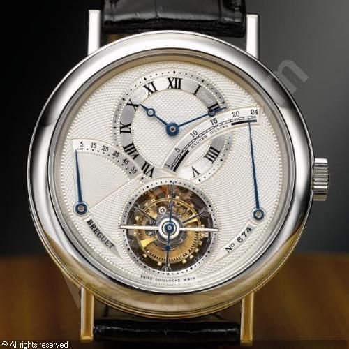
I love regulateurs, the point of them is to highlight the minutes....so I hate versions that run other features on the main dial, be it seconds, pointer dates, chronograph.....even worse are ones where, to be different, they have the hours on the main dial and subdials for the minutes and seconds.
The thing most likely to put me off buying a watch that I otherwise like the design of is needless writing on the dial.....whether it's 'Rotor Self Winding', not very good model names on the dial (like the Tudor Black Shadow) When Sinn came up with the 358 Jubilaum I liked absolutely everything about it except the inclusion of '1961-2011' on the dial. If it is not just a rebadged standard model then mentions of anniversaries should go on the back.
Power reserve indicators are my pet hate too.They totally unbalance dials and ruin good watches.....yes you GS.
Overly reflective crystals, I'd rather have single or double AR.
I don't mind a well done power reserve, like on the Lange Datograph, for example, but for totally unbalancing dials I nominate Breguet for this one
Admittedly the main offender is the 24h retrograde dial but even so, the scale for the power reserve needlessly bites in to the main dial....it could've been a wonderful example of a symetrical dial
Power reserve meters. Never seen one that looked like it belonged
Generally power reserve indicators ruin a watch face for me as well. However I accept that on the odd occasion when they are well executed - usually on a JLC - they can enhance the overall design.
Anything which pretends to be something it isn't. Example. I bought a MB Rieussec mainly for its unique design aspects and the lovely Minerva inspired Chronograph movement. However they did something with tha dial which made it look as if part of the dial was actually one of the movement plates. when upon closer inspection I realised this, I could no longer even look at the watch.
There are many examples of things appearing on watches which are not at all what they appear to be. This is my big hate.
-Any case diameter over 45mm
-Gold Plate
-too much writing on the dial
Dates at odd places (ie not opposite an index point)
Open dates
Anything too shiny
Very fussy crowns with bits attached
Dial too busy
Odd sized lug width
Integral bracelets
oh, yes, skeleton hands, polished centre links and odd-sized lug widths. I'd forgotten about them. <shudder>
Also wannabes / homages -- not re-issues (like the PRS-82) nor "inspired by" (like the new Time Factors' Smiths) but the sub-a-likes et al. That's where Eddie gets it right so often: a historic name on the dial (which he has every right to use) and the a re-issued or "inspired by" watch which makes them the polar opposite of fakes (illegal use of name and straight copy of someone else's design).
Also, ETA ebauches that become "in-house" movements after the smallest amount of decoration also do my head in (yes, you, IWC and Panerai)
That'll do for now.
Wonky dates - don't mind dates at 4 as long as they are vertically aligned.
Skeletons or cut-away dials.
That's true but not everyone uses those sealing methods, and for 99% of chronos, accidental underwater activation can cause problems. If they bug you, you're pretty much limited to Omega or Breitling, which both fall foul of your "no dinner-plate" rule :)
This is the second time this thread has come around I'm sure. Recently I've decided my pet hate is expensive watches that have visible manufacturing flaws or dust/lint etc. You double your price in five years, I want the goddamn thing perfect, yeah?
...but what do I know; I don't even like watches!
Cut indices (ala IWC Portuguese)
Cyclops
Polished centre links
This:And these:
I saw a watch recently where the day was at 3 and the date was at about 4.35. Shocking; can't remember the brand but I think it was a Ball.
Poorly aligned chapter ring (Seiko usually).
Cheap, rattly bracelets - no excuse nowadays.
Two tone.
Large cases with sapphire on the back showing the tiny movement.
California dials
Skeleton dials
Sub dials which half obscure numbers/hour markers on the face
Rubber straps on expensive or dress style watches
Rattly bracelets
Probably several other things I can't think of ATM!
 Posting Permissions