
 Reply With Quote
The position of the dial feet would probably be a problem if the PRS17 dials are used I would think?Originally Posted by GeoffD


As I'm in a very good mood today (McLaren 1-2) I'll give it a go.
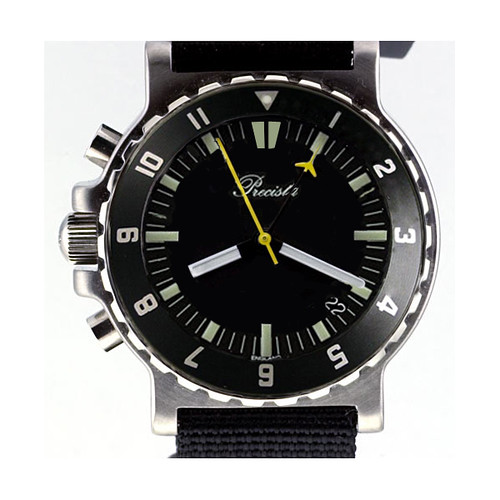
Is someone trying for an EZM1 clone perchance?
The position of the dial feet would probably be a problem if the PRS17 dials are used I would think?
OK for Pete (Guncrossed)
PMEZM
(Poor Mans EZM)
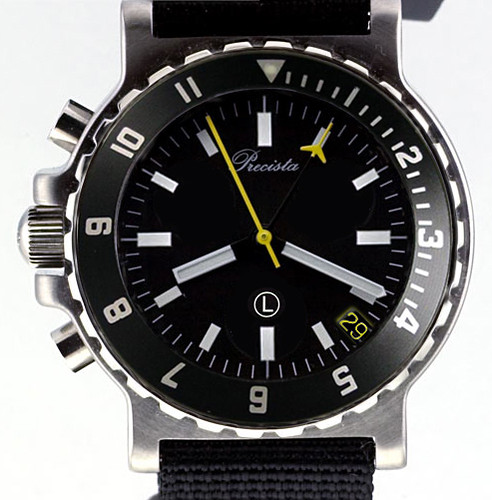
I say leave the Precista white and and keep the hands as they were.
Thanks Geoff,
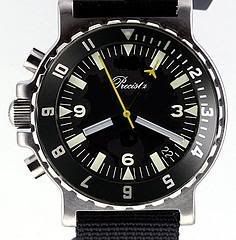
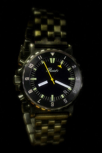
My old EZM

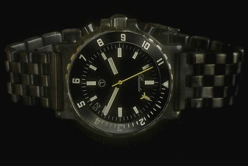
Having got so used to the yellow on my own 17-C, I wasn't convinced at first. However as I spent time working on it, it definitely grew on me. A bit more subtle than the yellow I think and would help differentiate it from the 17-C even more.

I have removed the L and the 12 for a more ?British? look.
I think the black date is fine. It?s out of the way ... and it seems to be very important for some users ... and as it?s a quartz, you don?t have to keep adjusting it, if you haven't worn it, for a few days or weeks.
Red ones and green ones might be a good idea too ... but also ... you might want to stay ?pure? with ?yellow being the new black? in the ?technology of colour?.
john
Costume jewellery. Ouch!!!
... but I would prefer the cleaner look. (This is by using the PRS-17A/Q dial.).
john
Costume jewellery. Ouch!!!
I like the yellow hands also and if it helps out that they are the same as the PRS17C then I guess that's a bonus for Eddie.
The original concept was for it to be as little hassle as possible, using available parts with just the movement mod and new dial.
The version with the sub dial was unintentional as I was blanking out the sub dials I noticed it looked a little like the Tutima version so saved it.
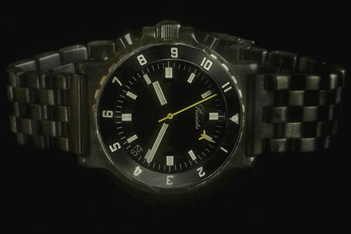
I still like the initial version, with the Precista in white and the yellow counter hands. The red is way too much!
I think it looks too busy or crowded with the PRS 17 dial; it will need to be a new dial anyway I think due to the feet.
I also think it could be useful to retain the minute marks on the bezel, even if it is a 12 hour one rather a diver.

Both of these designs are fantastic.
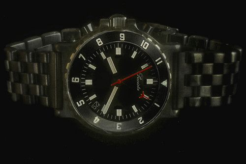
I would change the red Precista to white.
I really need to get photoshop on my PC!
:)
Michael
I really like the look of this one.
:)[/quote]
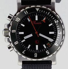
I am of the same opinion the date in yellow looks great
Patrick
How about keeping it as it is but change the date and L to red?

Hello gents,
I?ve been a regular lurker on this forum for several months and this project has convinced me to finally come out of the shadows as I think it?s a brilliant idea. As far as colors go, I?d prefer red over yellow ? more subtle and stealthy than yellow yet equally eye-catching and distinctive, and works beautifully in the EZM1 that inspired this design. However, I do agree with Si that the red as rendered in GeoffD?s excellent photoshop images is a bit much, and instead would suggest one of two alternatives: white hands with red font for the Precista logo, which would be keeping with the spirit of the original Sinn design, or red hands with a white logo as MichaelBe suggests. In either scenario the date wheel should be white on black ? red, besides posing a possible procurement challenge for Mr. Platts, does not lend itself particularly well to visibility. With a 12 hour bezel and lefty orientation, this should be an absolutely wicked piece.
I really like it... :)
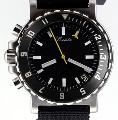
I think this version is the best:
Go for this one!
I don't think the red is as legible as the yellow. If it has to be red :( then I think it is a bit overpowering to have the Precista and the L in red too.
I don't think the aim should be an EZM1 clone - I see it as a great variation on an existing watch.
The Precista looks best in white (and down a bit!)
And I think the above is the most useful bezel insert design - though I guess there could be bezel insert options or swaps feasible?
I've learned to my displeasure that red seconds hands disappear on a black dial. They are great on lighter dials, however. I think that really bright orange or yellow are better on black dials.
Best wishes,
Bob
PS Anyone want to buy a couple of hundred red seconds hands? (Just kidding. They are great on lighter, e.g., silvered, dials.)
RLF
I think I agree Si, althogh I like the original bezel also, as you say perhaps an option?
I'd be in for one
My own view is that this should have a 12 hour bezel rather than a dive bezel because it's not intended to be a dive watch. Red looks good but if it was used for diving, red is the first part of the colour spectrum to disappear underwater.
EddieBecause absorption is greater for long wavelengths (red end of the visible spectrum) than for short wavelengths (blue end of the visible spectrum),
the colour spectrum is rapidly altered with increasing depth. White objects at the surface appear bluish underwater, and red objects appear dark,
even black. Although light penetration will be less if water is turbid,
in the very clear water of the open ocean less than 25% of the surface light reaches a depth of 10 m (33 feet).
At 100 m (330 ft) the light present from the sun is about 0.5% of that at the surface.
Whole chunks of my life come under the heading "it seemed like a good idea at the time".
Same here I would buy one
Patrick
This is actually a good reason to have the name, depth rating, if given, etc., printed in red.
Best wishes,
Bob
So that all the irrelevant information disappears, leaving the dial appearance less cluttered?
Eddie
Whole chunks of my life come under the heading "it seemed like a good idea at the time".
or in scientific terms: it looks really cool
I prefer the new dial (top) to the 17 (bottom).
john
Costume jewellery. Ouch!!!
Maybe too much like the EZM?

I never thought I'd say that ... but I prefer the cutlery on the left.
john
Costume jewellery. Ouch!!!
IHMO yes. keep the dial of the original chrono sans the subdials.
But only when using it underwater. At other times, e.g., when posing, it can have all manner of nifty things on it. :)
Best wishes,
Bob
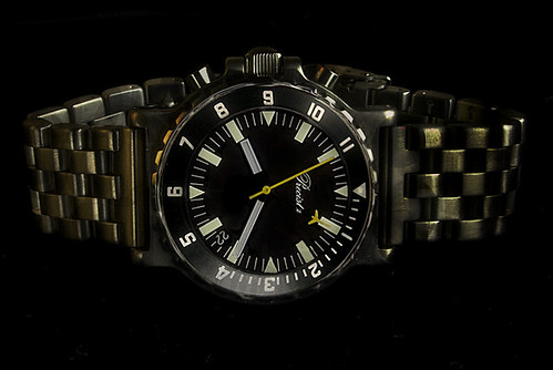
How about a pvd version - With one of Eddies new bracelets?
:twisted: :twisted:
.
Is this going to be a PRS-17-D or PRS-17-MT ??? :scratch:
I think the back should be engraved MISSION TIMER.
john
Costume jewellery. Ouch!!!
How about PRS-17CD (Committee Design) :D........... ONLY JOKING !!!!!!
I still suggest "Gunscrossed" :wink:
I don't like that. Gives me a mental picture of 'crossed guns' ... perhaps we need a mission name?
By the way ... how about having a full lume one with black hands and red chrono pointers. The sky is the limit. 8)
john :lol:
Costume jewellery. Ouch!!!
Thats the whole idea. No full lume for me thanks. Keep it simple please.
As it should John, it's my Kennel Club 'Affix' (sort of like a trademark), the "Old Cross Guns" being where the origins of the Kennel club registered Staffordshire Bull terrier lie!
http://www.sbtrescue.org.uk/origins.htm
I don't think if the watch takes off it needs a name?
I like the idea of a full lume version.
So if I've followed this right - we are somewhere around here?
and red hands as a comparison
.................................................. .................................................. .......
I have a few observations concerning my PRS-17-C that may be helpful in designing the PRS-EZM:
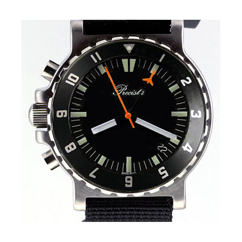
(1) The minute counter (short yellow tip) disappears in low light conditions over the white indices ... bright orange would be preferable IMHO. I agree with Bob that red is a worse choice than bright orange over a black dial.
(2) The hour indices need to go to the edge of the dial so that the minute hand cannot cover them completely as it does now.
(3) A subdued date is fine, but a watch with no date is a no-go for me.
Hope that helps. :)
Cheers,
Martin ("Crusader")
i like this one :D
i be up for one :D
Based on aesthetics alone, I think the red (aka PMEZM) looks best but I defer to those who have experienced practical shortcomings with visibility in red-on-black combinations.
I do like the suggestion of bright orange hands, either just at the tips of the second and minute counter or along the whole hand.
Cheers,
Had a bit of time this evening, so thought I'd try and incorporate the more popular ideas into one design.
i.e.
Keep the "clean" look of the 17-C
Clearer markers for the 12 position and the qtrs
Hour markers to edge of dial
Any Closer?
In order to enable the functional use of the bezel to its more useful role:
i) The indicies between the 12 and 3 are a useful feature.
They also maintain a good balance between clarity, crispness of look and of function.
ii)The font stype is apt, and the grip well balanced from this perspective of 'face-on'.
The 12 indicies are a good touch in the above form, and easily legible esp in ower light-they are instantly recognisable.
Indices to the dial edge for the hour batons are a v.g. idea (Martin), imho.
Yellow on back is the better colour, as compared with red and orange regarding elgibility, as well as aesthetic appeal and mission timer heritage of brit. mil. force use.
Best wishes,
AP :) 8)
P.S. MISSION TIMER is a good one, as would be COMBINED OPERATIONS WATCH perhaps, as an alternative,or, OPS TIMER
That looks good Geoff!
Excellent stuff!
While I usually favor numerals on the dial, I find this design absolutely convincing. :)
The problem is seeing the very short yellow portion of the minute totalizer as it passes over the light indices, which is for nearly half the time. That's where the advantage of orange over yellow becomes evident, as the yellow will not be distinguishable from the marker underneath in low-light conditions.
Cheers,
Martin ("Crusader")
Geoff, that dial looks great -- legible and clean as you please.
Would you mind working your Photoshop wizardry for an orange-handed version to compare?
I've had a play with doing a couple of orange chrono hand versions, but with the small areas involved it was not easy to see a real difference from the red. I'll try doing a larger image and see if it looks any better.
Orange can be many shades between yellow and red so this is somewhere in the middle.

One for me please Eddie!
mmmmmmmm orange, sweet.
:thumbup:
Ted
 Posting Permissions