Reply With Quote
Originally Posted by Cirrus

Just out of pure curiosity, could you, and/or anybody else preferring it, please say why you like the idea of the dark British Racing Green (?) colour tip to the second hand?
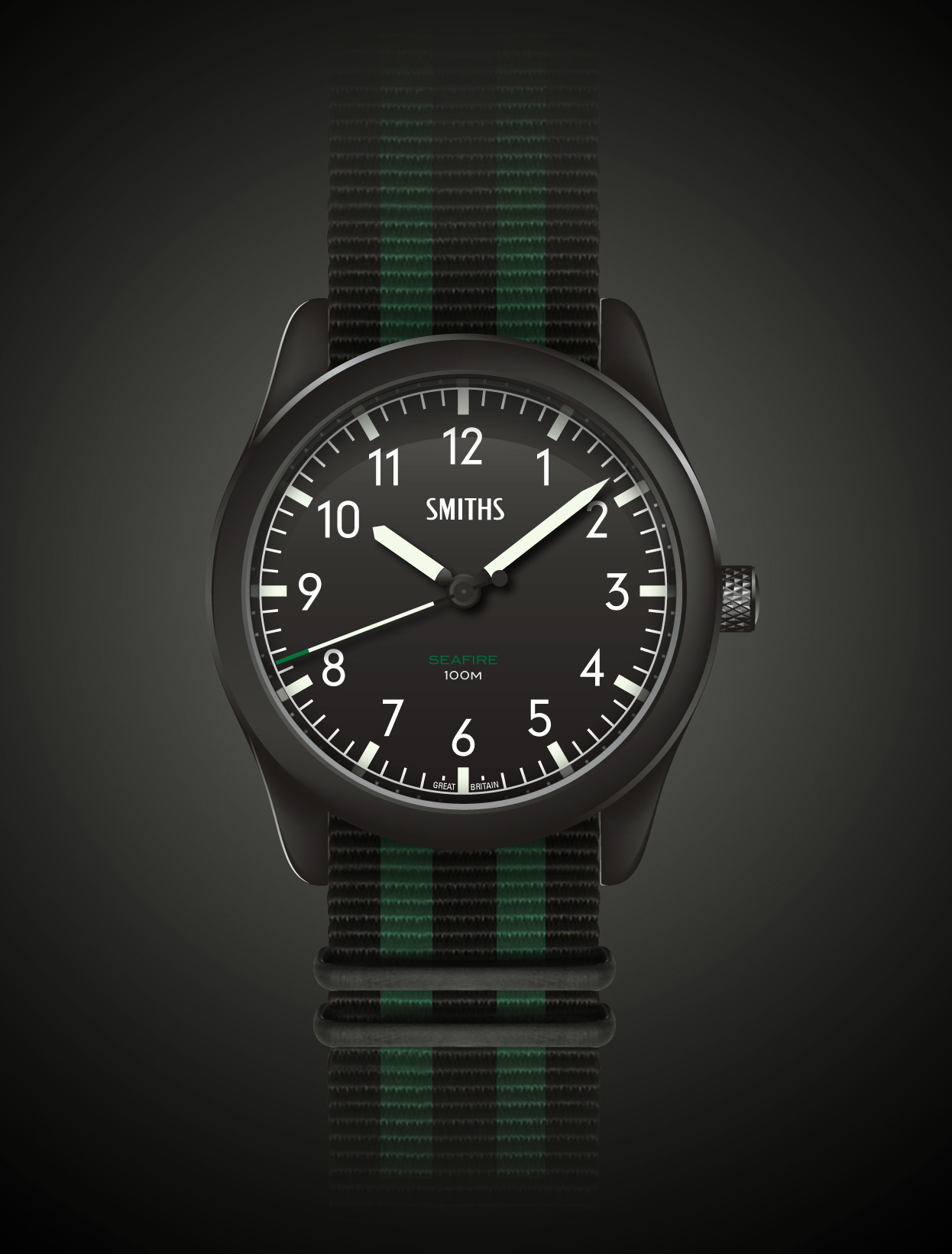
I ask because just like the same colour font "SEAFIRE" on the black dial nearly disappears into it, so does the dark green tip of the second hand as CP rendered it at post #44 earlier in this thread and put up below. As such, the visible white portion of the second hand doen't even come near reaching the hash marks of the second/minute chapter