
 Reply With Quote
Whoa! Nice!
Any thinking about the size of this one? If the lugs are 20mm on your rendering, that would make it ca. 38mm diameter? or a tad less?


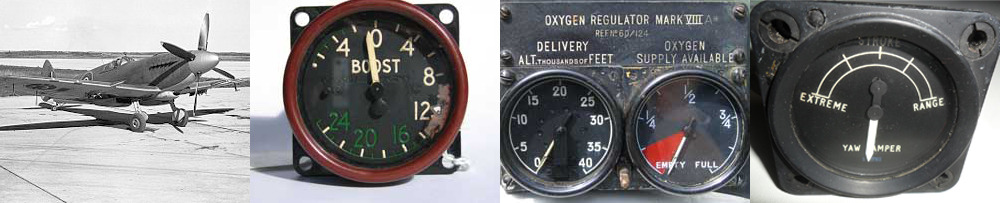
I've always liked the simplicity of cockpit instrument panels, and the watches inspired by them.
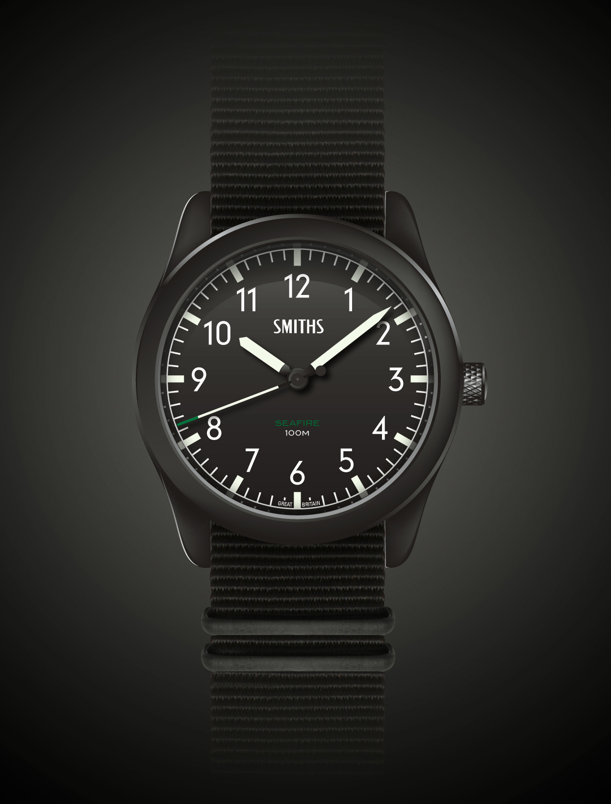
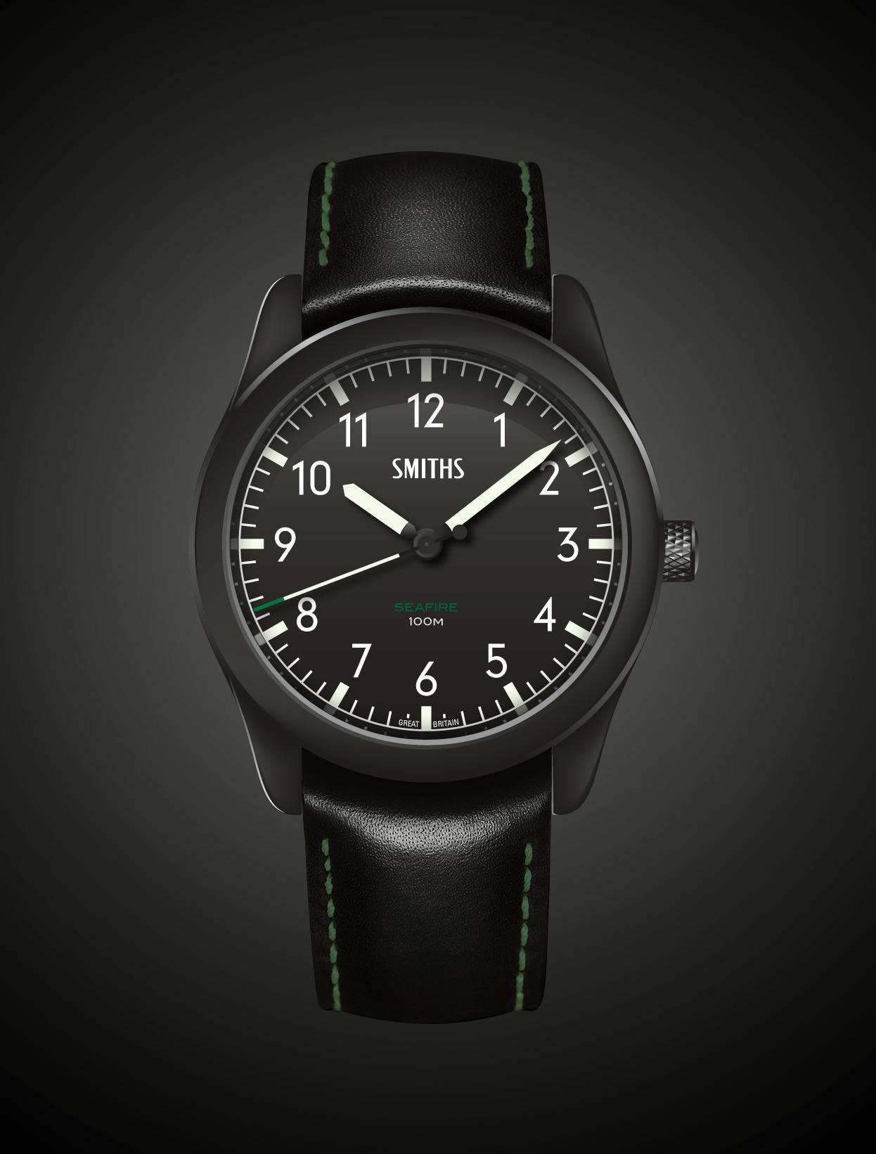
As Smiths instruments were actually used in some of our most iconic aircraft, I thought that there should be a Smiths watch to suit and fortunately Eddie agrees.
So I present the Smiths Seafire, inspired by Smiths Dials used in the famous Spitfire* and Seafire planes.
Further information about the plane:
http://en.wikipedia.org/wiki/Supermarine_Seafire
*The Spitfire trademark is not available.
There are no further details as yet, so let the discussion commence what spec would you like from a watch of this style?
Whoa! Nice!
Any thinking about the size of this one? If the lugs are 20mm on your rendering, that would make it ca. 38mm diameter? or a tad less?
Very nice.
Especially if it was 38mm case with 20mm lugs.
I can see that one doing rather well. Nice work.
Like the green on the dial, but in the light of the Spitfire instrument panel photos, what about some red as well? E.g. a quarter of the chapter ring being red? or a red tipped seconds hand?
Very nice - can see that being popular!
Agree with the red tipped second hand though.

Nice work on the design! I really like the size (assuming the 38mm above is right), the clear layout of the dial, and the discreet use of colour (nice choice of green too). A poster above mentioned adding some red, and seeing some pictures would be good to make a comparison, but my feeling would be that any more/different colour would make things a bit busy (IMHO) and detract somewhat from the simplicity of the cockpit instruments this is inspired by. Looking at the instruments shown, another colour (red/green) is used only on one dial at a time and not with both on the same dial.

I think it wins in its simplicity to be honest. It is a cracking design.
The only petty thing bugging me is the base of the hands. Too much black crossing white going on for my OCD.
That looks good. I agree with the suggestion of a red-tipped second hand.
How about a large date aperture? This could be a nod to the pressure-setting window of an altimeter. Would link nicely to the knurled crown which apes the adjustment knob on traditional altimeters and heading bugs.
I like the idea of a hand-wind movement in this.
I like that very much; clean and simple as a watch should be. I don't think the issue of the name "Spitfire" being unavailable is actually an issue - "Seafire" is much better as it is stands the watch on its on own.
I like the idea of tipping the seconds hand, but I would do it in the same green as the Seafire name.
20mm lugs would be ideal, and hand-wound movement obviously ;)
I like it as it is.
The submersible is one of the easiest watches to read.
And this one would be just as good.
A plain and simple, no date, pick up and go watch.
Does it need to be an auto ?
I can see this being a second watch, or occasional wearer for most people.
Handwind or quartz would be good enough.
Comparable to the PRS10 and the military 29's.
You know what, I like everything about that.
I like it as is. Especially the subtle creaminess of the indices and hands. I would not like it so much if they were white.
Gray
For me, pretty good. I would do the following:
Green tipped second hand (or at least a bit more green)
remove the 'back' bit of the second hand (the circle bit)
Make the crown slightly less sticky-outy
Technical terms there, obviously.
Everything is great on that - knurled crown, just the right amount of text on the dial. The only thing I would like to see is maybe a red or red tipped seconds hand.
Edit - not keen on the 'seafire ' name. It sounds too much like 'ceasefire'. Are the 'supermarine' or 'hurricane' names available? 'Smiths Hurricane' has a nice ring to it.
Last edited by seikopath; 12th August 2013 at 12:20.
Good luck everybody. Have a good one.
No, Supermarine is Bremont's diver and Hurricane is not available.Originally Posted by seikopath

That's going to be another winner, great work! Personally I'd prefer a bit more green (seconds hand or a number on the dial...?) and a date.
Last edited by Marios; 12th August 2013 at 12:35.
I love how it looks and great work as always Chris...
Only problem for me is as soon as I saw it I thought - 'It's a Bremont'. I have nothing against Bremont, like some of them a lot, but the styling is a little too close IMHO - it is being done already by someone else. I recall Eddie talking to Bremont brothers about a project - wasn't this was it? :) Or am I making connections that simply don't exist?
I do like the Seafire name.
Rob
I like this a lot. 38mm would be the perfect size.
Like a few posters though I would definitely prefer a handwound movement.
I wouldn't change the look at all other than to add "Great Britain" at the bottom of the dial.
Well done, another winner of a watch there. I would very much like to see this one come to fruition.
Great design, and i like the rendering just as it is, everything is nicely proportioned. Either auto or hand wind is fine, please- no quartz.
I was thinking Damasko.
Eddie will know how big the market is for an affordable Pilots cockpit watch.
Get the price right - and it's a winner.
This is very nice... I agree with the comments about a touch of colour. I always like how Damasko do it - seem to get a nice level to it and can lift the watch. The green is a nice accent. But if this was produced as is it would still be fantastic.
I'm not aware of any Bremont connections Rob. Quite rightly this watch, as with Bremont's, take influence from the same subject so there'll be similarities in style but hopefully Eddie could produce something for a few £'s less than Bremont's offering.
Simple, crisp design, I like that a lot :)
I've looked and looked and looked at this and read all the comments and I've concluded:
- I wouldn't change the actual watch design at all but I agree with some that the crown should be smaller
- It should be 38mm with 20mm lugs
- It doesn't have to an auto; hand-wind would be my personal preference but I'd be happy with a Ronda quartz movement in it - keeps the cost down and makes it the classic pick-up-and-go watch
- I quite like the nobbly bit on the back of the second hand, gives it a bit of balance
- Having said that, if it were released exactly like this mock-up I would certainly buy it
It's a cracking effort OP, thanks and well done. The more I see it, the more I want it....NOW!!!!
David
Last edited by TaketheCannoli; 12th August 2013 at 13:14.
Fair enough Chris, shared influences is a very valid point. I also agree 100% that we need a Smiths instrument watch, as a child of the '70s I was brought up on Smiths dials and gauges.
Hopefully Eddie could produce something for a lot of £'s less than Bremont's offering! :)
Rob

Looks good, I'm definitely interested. I regret not getting the PRS-10, and I'd be hoping for a moderately sized, fairly affordable utilitarian watch with a quartz movement, or failing that a hand wound. Lume on the second hand would be nice (maybe a dot on the "nobbly bit").
Fantastic effort. Nice touch with the round part of the second hand but do agree with previous posts with regards to the length of the crown.
Would love to see it manual wind.
Last edited by davida; 12th August 2013 at 13:50.
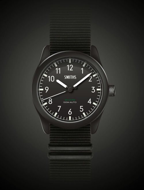
Revision 1
Amends:
Green tip Seconds hand
Great Britain on dial
Hands match hour indices
Crown 90% smaller
^Nicer in my eyes!
Me too. I didn't like the sound of the green tipped seconds hand but I like it, a lot.
A few thoughts...
- I like the idea of a manual wind
- It's be great with a '68 style inner domed and beveled sapphire - or maybe even double domed.
- Definitely better without a date - don't even mock one up :-)
Gray
Revision is very nice - I think the green on the second hand is a nice touch.
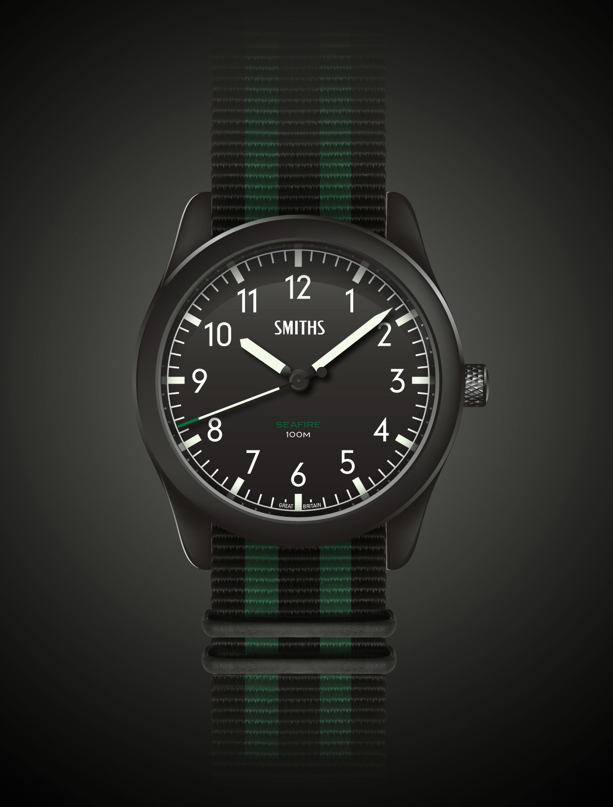
How about a green stripe accent on the black nato to set it off? That or a black leather with green stitching.
Would match the green on face and second hand nicely.
A manual wind movement seems fitting for this design in my eyes too.
Revision one looks great to my eye.
Personally I would like it to be 39mm.
Wouldn't mind what movement was it it.
I would want a sapphire crystal though.
Name is fine and I really like the Green.
About the only thing I would alter on the revision is to delete the second hand knob... or move up the white accent on the other hands so the knob doesn't (appear to) obscure them as it transits. Even that wouldn't bother me so much ;)
Very nice, makes it a bit more distinctive. Completely agree about a strap with some green detail on it. Would a leather strap be more in keeping with the aviation theme?
Seems I'm in a minority of one, but I'd rather this was 40mm or so than 38.
Can't fault anything else, but suspect for me it would go the same way as my PRS18A at 38mm and get overlooked for being too small...
Manual wind with a display back would be nice - or could have some nice detailing on a solid caseback to tie in the spitfire / seafire theme.
Well done it's a great design with the revision, looks pretty much perfect. Strap wise I'd go for a green NATO with PVD hardware rather than going for a more complex stripe and keep it simple.
Phwoar! That's it, don't change a thing!
Agree with the 38mm / 20mm lug space...
If there's no big design change to be taken into consideration, why not making it 200M WR?
I love this design, the revision with the extra green is lovely!
I quiet like the second hand knob... adds a nice shape to the dial. It wouldn't bother me crossing the white at all. But you could increase the back on the hands from the centre fractionally, so it sweeps past that to avoid it. This is probably the best of the bat design we have seen on here in ages. Revision makes it even better. Well done OP!
^Too much green IMO. A black nato or leather would match it better.
OK, where do I pay? This would be a great addition to the Timefactors offering....and to my watch box ;)
David
I was thinking a single thin stripe of green down the middle.
^YES!
That looks great Chris! Sure we can have a multi striped nato, single green striped one and a leather with green stitch. The perfect package.
 Posting Permissions