Reply With Quote
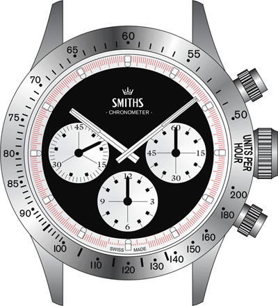
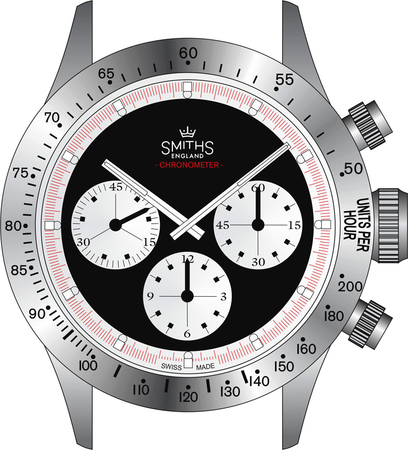
''Chronometer'' should be in red IMHO ;)
Originally Posted by swanbourne


I thought the crown device on the seconds hand was actually quite clever. Hey ho.

''Chronometer'' should be in red IMHO ;)

Where is the date and cyclops going?
Respect the past, live the present, protect the future
One thing that I wondered about this style is whether the minute had can carry enough lume to be of any use. No idea myself, but interested to know..
Any shorter and people will be saying it's too short. ;-)
It's fine.
Just ditch the "CHRONOMETER" text for perfection.


That is definitely the truth.
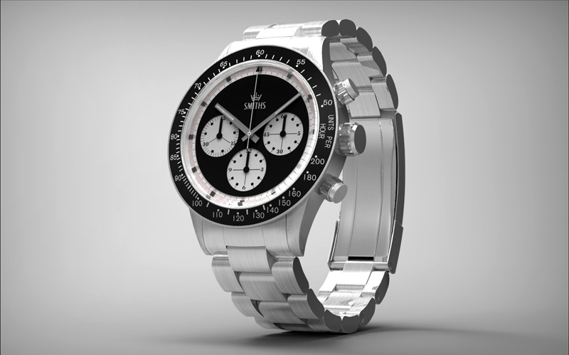
I think that is the best of all the versions, followed by just Smiths then having England under the curved Smiths mark. I'm not so keen on the versions with chronometer underneath, but I think its more the punctuation dots/dashes either side really.
I've held off buying a Timefactors piece before as most borrow heavily from pieces which could be in my price range if I wanted them. This is taking it's cues from a piece that would never be in my price bracket and so I am very excited to see how it ends up.
I very rarely go for chronos, but I like this a lot.
I have a niggling gut feeling that the dial feels a bit bottom heavy, but I have no idea what to suggest that might alleviate that.
Last edited by Coops365; 9th October 2012 at 16:25.
Grand date at 12
Respect the past, live the present, protect the future
No date, please. I don't think we should over analyze it too much. The last version with the Smiths writing and crown motif is spot on - no need to tinker with the design either.

Ditto here. Maybe a textured dial? or perhaps the 'L' in a circle? or increase the coronet's size, with 'SMITHS' passing through the horizontal centre of the coronet? (Okay, that last idea is pretty ghastly.)
-m-
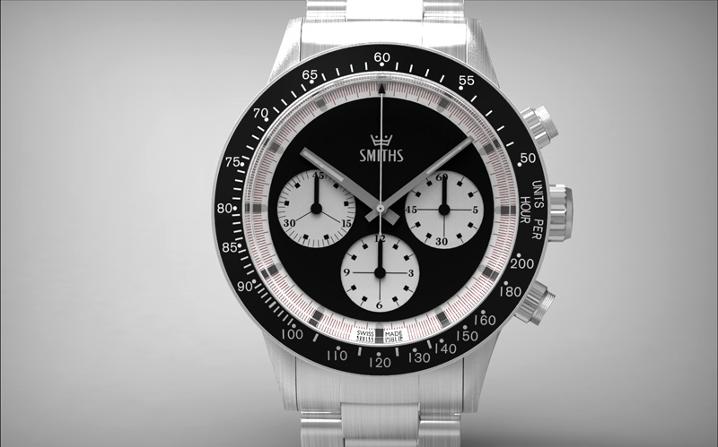
Very nice, but my eyes keep focusing on the sub-dials. I don't like the font of the sub-dials (maybe match the bezel font?) or the square blocks capping the markers. Like the crown, but printed above SMITHS rather than on the second hand.
Regards
Gotta say that last pic with Smiths & the crown is spot on.
Yup.
.
As they say around here, nae bad!
Eddie
Whole chunks of my life come under the heading "it seemed like a good idea at the time".
Hard to do a chronograph that doesn't look cluttered, it looks spot on!
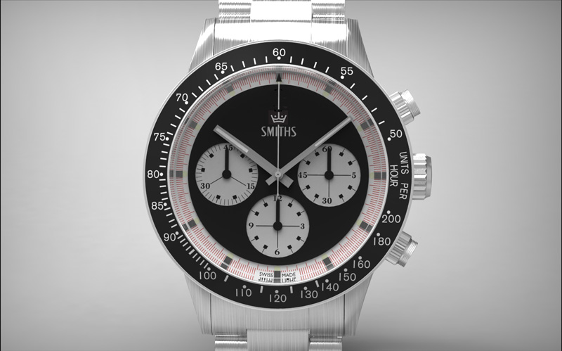
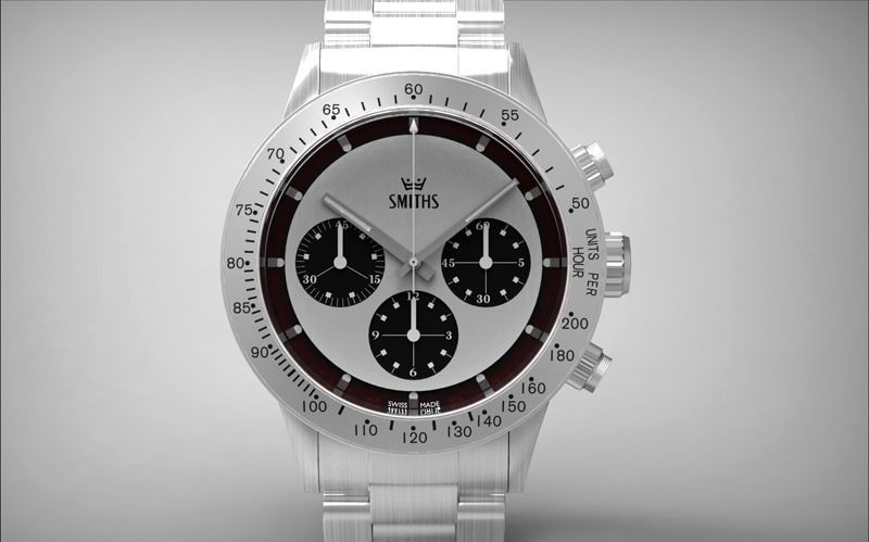
Will there be a choice of white or black dial, or just one? If it's one I vote the white dial.
I had that same question, +1 on the white :)
Where do I sign up?
That upper quadrant looks too to me.
I preferred the crown/Smiths/England/chronometer combo.
Reassuring to be in the minority.
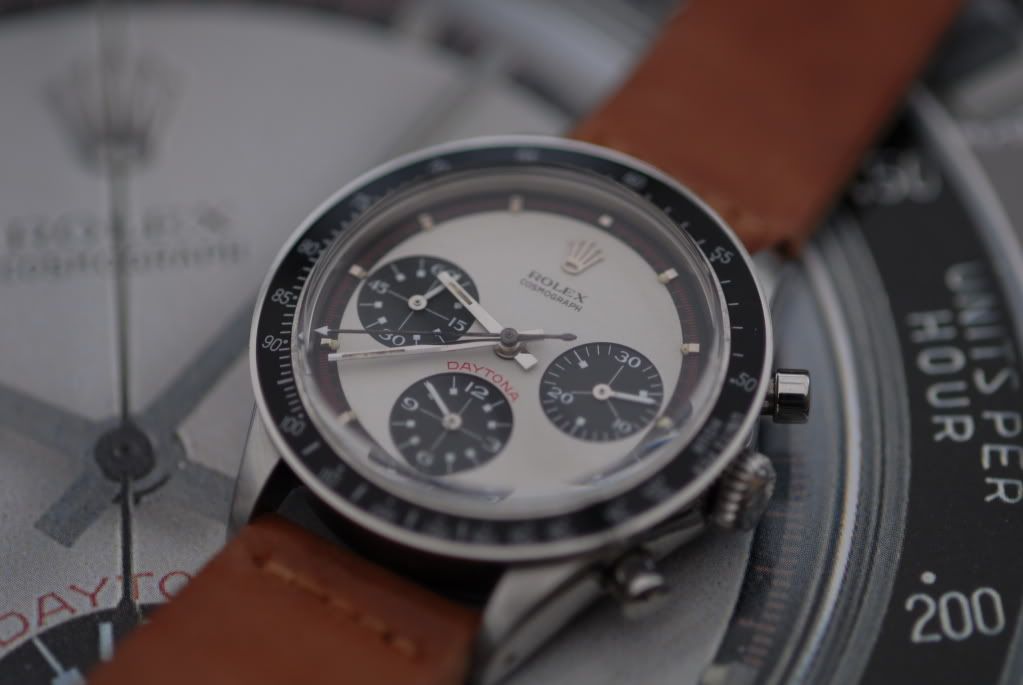
I was very critical of the gaffer knocking a Daytona homage recently. I take it all back.
Wow, all those are exceptionally appealing but this one...
...is the winner for me. Lovely.
P.S. Incredibly good renderings in their own right too!
+1 to that.
- - - Updated - - -
+1 to that.
- - - Updated - - -
+1 to that.
- - - Updated - - -
+1 to that.
I much prefer the dial without Chronometer and England on it!
- - - Updated - - -
I much prefer the dial without Chronometer and England on it!
Not sure what happened there but I posted twice?
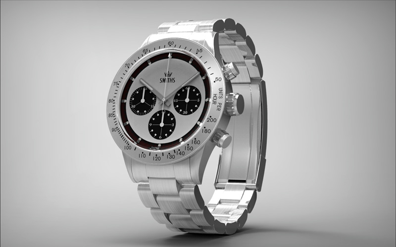
The white dialed version should have black hands.
You make it and they will come.
Eddie
Whole chunks of my life come under the heading "it seemed like a good idea at the time".
Ooh yes! To quote our friendly cousins: "I'd be all over that!"
How about a white dial with the chapter ring as per the black dial rendering? ie with seconds & milliseconds marked in red........as opposed to the plain red chapter ring shown in the picture.
Not my cup of tea, but I can still appreciate an attractive design when I see one. Well done!
Andrew
- - - Updated - - -
Not my cup of tea, but I can still appreciate an attractive design when I see one. Well done!
Andrew
I had wondered what all the double entries were about, but now I see that I've got one myself...
Seems to be a database/software/gremlin glitch when 'replying to' or 'quoting'.
I think you should stop listening to any further opinions (apart from this one, of course), and make the above, exactly as it is now. Pitch perfect.
Martin
What he ^ said
Absolutely 100% +1.
Me too, I think. I understand the attraction of a nice clean dial but it looks almost sterile with just the "Smiths" at the top.
I don't think "England" plus "Swiss Made" are a particularly good combination but "Chronometer" would fit pretty well.
Yeap, 100% my preference too.
Would be nice to see a rendering with Smiths and Chronometer on the dial without the England.
+1 for the white dial chrono! Very nice indeed!
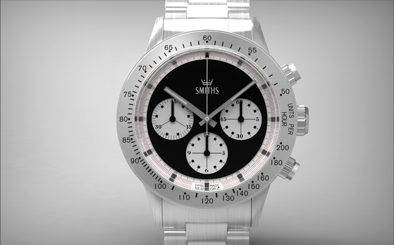
So this will be a chronometer rated watch?? Very nice indeed. For me, the black dialled version looks the business. As for the Smiths logo, the Smiths with the coronet above it, and England underneath would be my design choice. I don't see the need to advertise that the watch is a rated chronometer, but i see no harm in a watch saying it's English with pride- and that's coming from a Welshman. I am getting soft in my old age.....
Lovely watch, and i think it is wonderful that Eddie listens to the forum members input when it comes to designing watches. All of Eddie's watches under their various brand names deserve a special place in horological (i think that's how you spell it) history.
As an American, I quit like the
SMITHS
England
Chronometer (in red)
logo, on a 'white dial'...!
I love the 'arch' to the 'SMITHS'
I like a number of things about this but overall it just doesn't grab me personally. Maybe it's the render but the face just looks a little too flat/matt. A little bit of pattern or texture on the face or maybe just a little more ceramic like gloss and it might brighten up a bit. I know the old Daytonas and the like were simple matt faces like this (or the ones that this looks closest to in design terms anyway). But they also had other little touches that livened it up like funkier numeral fonts. The sub dials were also a bit larger weren't they - touching closer to the edge of the main dial which helps draw the eye away from the face itself. Personal taste and all that though....
I really like this the only thing for me is the different font on the subdials although presume this is for a reason.
Any idea on pricing yet?
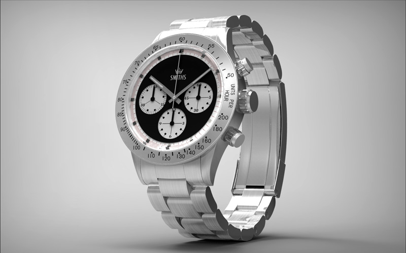
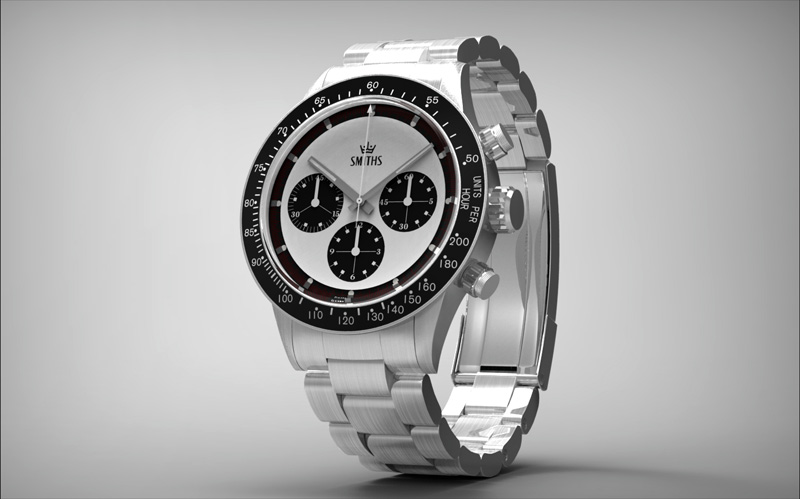
This photo ^ does highlight perhaps that the hour hand is indeed too long in Eddie's latest renders.
Martin
Hows about 'Smiths' & the crown logo up top (as shown in a few of the renderings already), with 'chronometer' in red arched over the lower sub-dial (where Daytona sits) on the photo previously posted?
I thought it might be a good idea to provide both dial and bezel options in the package, giving the option of 4 different permutations from one watch.
Eddie
Whole chunks of my life come under the heading "it seemed like a good idea at the time".
Now that would be a great idea!
I'm still trying to work out what happens when the minute sub dial passes 45, does it somehow snap back to 45/0 on the hour so you can continue reading the minutes during the second and subsequent hours?
That would be fantastic!
Great thinking, now if you'll just keep that thought with the PRS 22 and offer an option with the word 'Precista on the dial, à la PRS53, for those of us that love the model but would rather eat worms than wear a sterile wristwatch.
By the way, will this chronograph/chronometer be the most expensive Timefactors offering ever?
 Posting Permissions