Reply With Quote
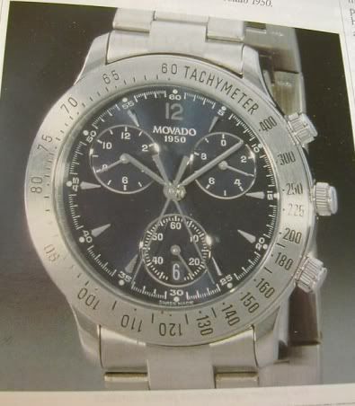
I like it! I remember seeing it originally at another forum (MWR it was I think). For some reason, while I' m not fond of this case, compared to the PRS-28, but I like it as a chrono, go figure.
This might be a silly question but here goes. If it quartz will it still have the same dial arrangement, i.e. central second and minute counter?
VA