


 Reply With Quote
Lovely looking watch ruined by the printing of the word vintage on the dial, for me that makes it appear like a fashion watch.


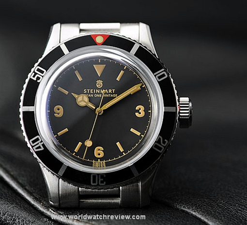
Movement: Automatic caliber ST.5 11 1/2'' Swiss made
Case: Stainless steel, polished and satin
Back: Stainless steel screwed, engraved
Diameter: 42 mm (1.65 inches), without crown
height: 16 mm
Weight: 195 g incl. steel bracelet
Dial: Vintage black
Crystal: Highly domed sapphire crystal, double anti-reflection coating on the inside
Bezel: Stainless steel black
Indices: Superluminova Vintage Old Radium
Lug width: 22 mm
WaterRes: 300 metres/990 feet 30 ATM
Strap: Stainless steel 22 mm, screwed, or leather strap 262
Buckle: Stainless steel, safety clasp

Lovely looking watch ruined by the printing of the word vintage on the dial, for me that makes it appear like a fashion watch.
In fact, it is precisely that word on the dial that is holding me back from buying it. a real shameOriginally Posted by cbh

Funny, I too would have considered one but for that.

I have one. Wearing it right now. It's a great watch and, surprisingly, doesn't feel homagey. "Vintage" on the dial is barely readable except when positioned right or under a lens - in any case, that's the name of the model, what's wrong with having it on the dial?
Gray
for me without that one word, vintage, it was perfect
Just stared at my Rolex Sub from approximately 18" and I'm struggling to see most of the writing. I certainly couldn't at a glance and if I didn't actually know it said Rolex Oyster Super Duper Wotsit, the truth is I'd probably struggle.
On the wrist I doubt you, or anyone, would notice.
Isn't it kind of a fashion watch for WIS? What with vintage Subs being er fashionable?
I think it looks pretty good and for the price you don't mind if it gets knocked around a bit. Very much a watch fit for purpose.
I can't make my mind up between this and a MkII Nassau. I like the Nassau's lugs and build quality, but I'm not sure I want to face the risk of pay first and hope that the watch is made at some point in the next year. Wouldn't look forward to the inevitable customs and import charges either.
I like the Steinhart's Explorer type gilt dial and hands and domed acrylic. It's an advantage that VAT is already paid and there are no import charges.
The more I see of the Steinhart the more I'm swayed.

I like it. One of the nicest in the range.
Lovely
but
the crown is too generic.
The teeth are too close, too small. The crown should be more aggressive.
Shame
Last edited by oldandgrumpy; 9th May 2014 at 21:33.
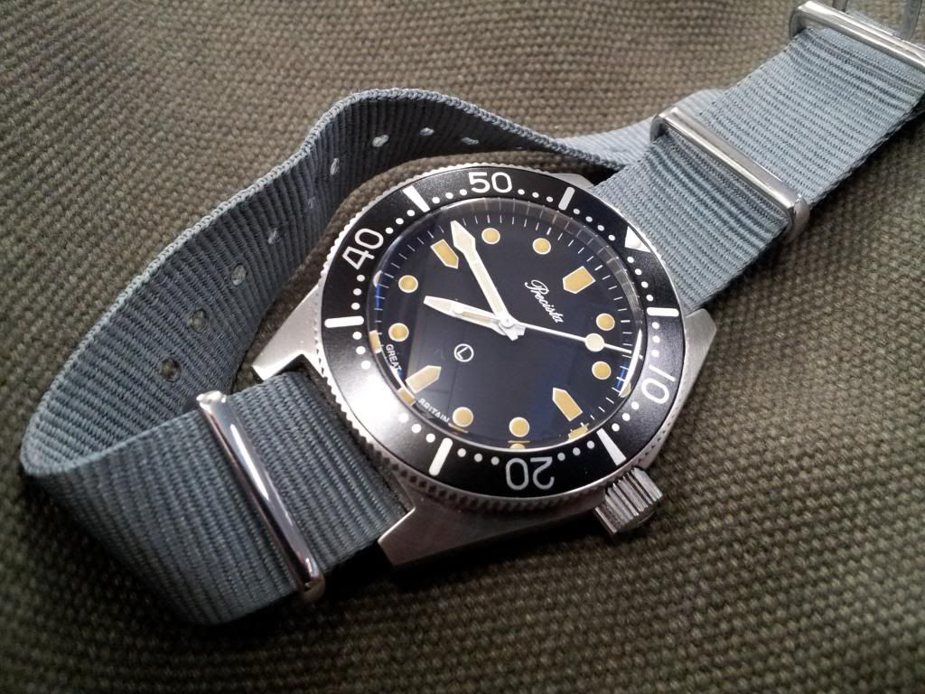
Its nice, but I prefer the PRS82

I'm a dissenter too. It's too big, too long, and too brown. I hate the red detail on the crown tube, hinting at the faux-bay based on the same case to come. The lume pip treatment is weak... I really wanted to like this, but I can't.

I'll second that.
I'll third that....
it's a bit too big, but one of the nicest homages in the Steinhart line up (imHo of course)
That doomed sapphire is what so many neu-vintage should be sporting, I'm looking at you black bay...
If it floats ya boat, get one... as long as your eyes are open about what it is, I doubt you'll be disappointed
i also think it's too big. All that faux-vintage stylie, and they make it 2014-sized. (OK 2005-sized.) Too big, too wide, too heavy for the style. However, I like the gilt trip, and buy what you like etc.
...but what do I know; I don't even like watches!
I have both, 2 totally different watches in my opinion.. love them..

Last edited by goregasm; 9th May 2014 at 23:10.
maybe it's true, maybe I should see it on my wrist
The more I look at this the more I like it. Traditional looks but modern spec appeals to
The red on the bezel ruins it a bit for me.
I quite like it, though the brand spanking new shiny bezel looks a bit odd next to the heavily 'vintagised' hands and dial. Still, nothing a bit of sandpaper couldn't fix ;-)
Swing and a miss. But here's how they could have knocked it out of the park:
1) Lose the "vintage" on the dial. It's just dumb, and as far as being small and unnoticeable, I say it's like a speck of dust under the crystal - once you know it's there, it's the first thing your eyes look for when you look at the watch. Eventually it drives you mad.
2) Take a hint from mod-happy collectors and age the dial and case a little. If Steinhart wants it to look vintage (and they must or they wouldn't have named it "vintage"), why stop at copying a vintage design and using beige lume? Tea stain the dial and hands so that they appear to be suffering the effects of degradation, and put the case and bezel in a rock tumbler and beat them up a little. As is, this is the opposite of Joan Rivers - something new trying to look old.
3) Stick with the vintage dimensions. Bigger is not always better. You'd never convince my wife of that, but it's true.
4) Sell it with a riveted bracelet. I'm not sure if a solid link bracelet can be created with rivets, but that's the look the watch needs.
you are right....
Had mine a while, moved it straight onto the recommended 'vintage' looking strap and hardly wore it.
On the bracelet though it's very nice and it's currently on a thick beige suede strap where it looks great. I imagine me wearing it more during summer for knockabout stuff.
In short, great value for money. The Vintage word... Who the hell cares and why? It's the 'Ocean One Vintage'. Watches usually have their model name on the dial!
Last edited by DB9yeti; 11th May 2014 at 09:07.
I quite like it to be honest
I have one and feel that this gets an unfair bashing. Steinhart make really good watches at a price point that puts many other brands to shame. When mine arrived, I examined it under a 20x loupe and it was really well finished and keeps very good time.
Lume is weak, but the whole vintage thing is really overplayed by critics. When Bell & Ross brought out their vintage lume; Panerai ,IWC and a raft of others all offered this aged lume and I don't recall the same backlash.
Steinhhart are an easy target for critics as they are a small firm with no huge ad budgets or PR campaigns. As they have no heritage to contstantly remind us of, they come in for a harsh treatment. However, when I was checking reviews of the Ocean One Vintage - many owners were also comparing to their Rolex models. That is a high bar to compare to.
As with all watches, it's easy to be swayed by members' opinions, but it's really worth sticking to your guns and going for it. Despite all the criticism of the vintage thing, I don't see many coming up for sale from disappointed owners.
Is it an homage?,or a copy!.
Well I guess it's an homage cos it says Steinhart.I did look at this a while back and considered buying one.
I like it,but as mentioned the "vintage" word needn't be their,we all know what it's trying to imitate.
I quite like Steinhart in general. What's not to like? Great quality and some good looking watches, all without a price inflated by marketing costs.
And when they do occasionally come up for sale, they go for almost list price. Very low depreciation!
I like it, but it's too big for me and, arguably, a bit too big period. I'm a big Steinhart fan, but I do wish that they offered all these designs in a sub-40mm case.
sorry,did not want to trigger controversy.
I really like the steinhart, only I would have preferred that the dial had been without that word,
and to be honest, if I find one of the second pulse, I'm sure I'll buy it
I like it a lot...and I think that I can get it without paying VAT...
First impression is that it just reminds me of loads of other watches. The visual discrepancy between the numerical fonts on the dial and the bezel just seem to add to the impression of a 'bitsa'.
Good luck everybody. Have a good one.
I agree with this ^^^, the numerals on the dial don't seem to fit and, as others have said, it would be much better if it was 40mm. Close, but not quite close enough.
For a few hundred quid - I disagree. The size is bang-on for a contemporary piece too.
I've never owned a Steinhart and this particular watch isnt my style, but I do like that 'Vintage' on the dial. To my mind it lends the watch a certain credibility, a self-assured truthfulness - it is what it is and that is not a pretender.
That is a great looking watch. Don't care about the v word it's just delicious.
I want to like this.
But it's too much like an MR2 dressed as a 355.
If you know what I mean.
- too big, yes
- "vintage" on dial non optimal, absolutely (even if not as terrible as a 007 second hand ;)
- but what rlly puts me off is the Steinhart logo, looking so immature, so unprofessional, so tasteless. I would imagine a company selling toys to use such a logo. I am sorry, very sorry--but I just cant help it. But then again, I wouldnt buy a watch with "Marcello C" on it.
PRS-82 is where it's at (or CWC RN diver, which also has vintage lume). Stunning piece, I would just relume the bezel dot (watchlume.com sells vintage lume, its really a 3 minute job anyone can do).
Last edited by JMH; 12th May 2014 at 22:59.
and in fact I just bought this
http://forum.tz-uk.com/showthread.ph...th-great-price
now just it be in my hands, I will tell you my impressions
for the moment thanks to antongiu and thanks to TZ-UK
 Posting Permissions


