
 Reply With Quote
I like that. Especially the '120 mph' version with the dulled out zero.


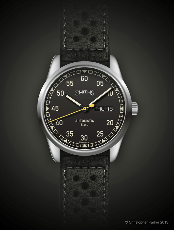
60mph dial with steel case
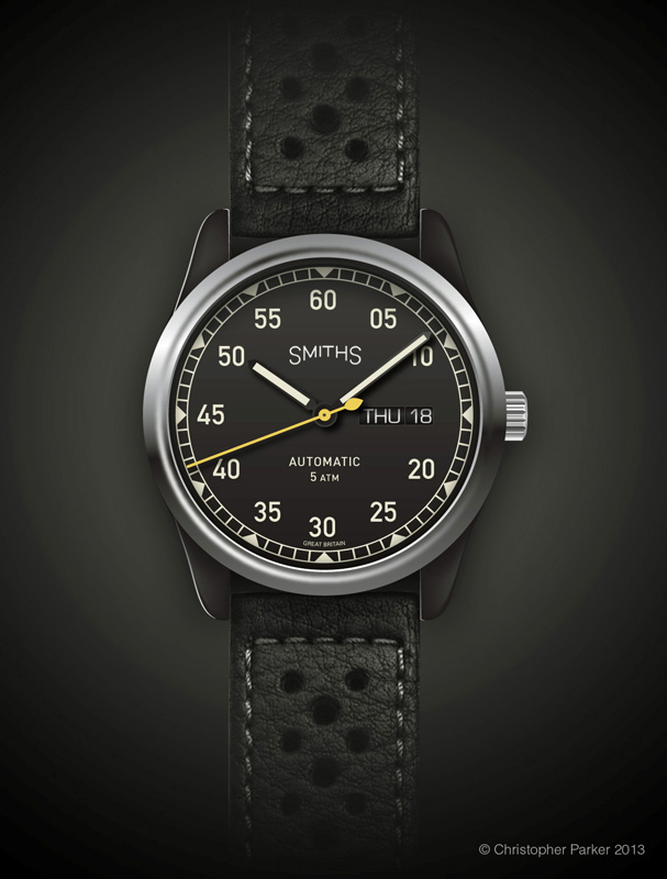
60mph dial with PVD case a polished steel bezel
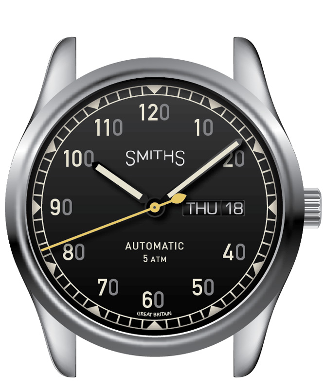
120mph dial with steel case
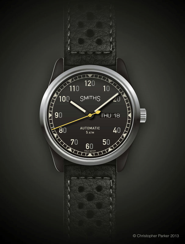
120mph dial with steel case and polished steel bezel
120mph dial with steel case and polished steel bezel (alternate dial)


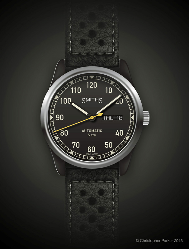
You may recall that I mentioned the possibility of a Smiths speedometer inspired watch a few week ago and Chris Parker has been working hard to visualise my ideas, together with a few ideas of his own. The watches below are presented for consideration and comment.
If none of the above designs appeal, feel free to add your own design.
Eddie
Whole chunks of my life come under the heading "it seemed like a good idea at the time".

I like that. Especially the '120 mph' version with the dulled out zero.
The first two-digit one - aren't the 3-digit ones too busy, and they don't indicate the way we tell the time - e.g. 10 past 9 has the minute hand pointing to a '20'. I know it would usually be a '2' but we're so used to it that we don't even have to think about it.
I would find it irritating. Really like the first one though. Silver hands with lume would give even better legibility against that black dial. Love the yellow seconds hand!
Last edited by mostly_lurking; 3rd October 2013 at 15:04.
Much prefer the "two digit" design to the "three digit" one.
Lose the "5 ATM" on the dial; it's superfluous (IMVHO).
______
Jim.
+1 on the pref for two digits. the three digits just look like a gimmick.
Congrats - TF is on a roll at the moment! This looks like a great design.
Good luck everybody. Have a good one.

I like those. Can't really decide which I prefer, think I'm leaning towards the version with the grey zeros.
Any idea yet what the case size would be?
Edit - no, I prefer the 120mph without the grey zeros!
Last edited by dougjb; 3rd October 2013 at 15:22.
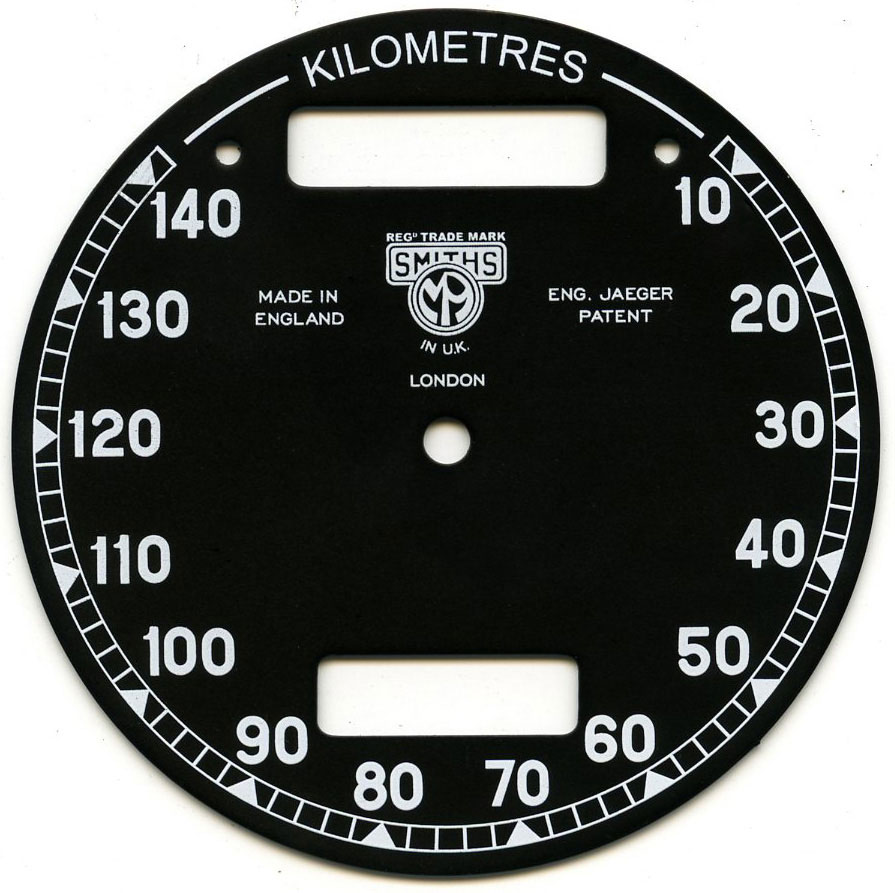
Before the question is asked, I'll explain the thinking behind the PVD case with steel bezel. If you look at an old motorcycle speedo, it's usually a black case with a chrome bezel and that's the look I was after.
Eddie
Whole chunks of my life come under the heading "it seemed like a good idea at the time".
I love first one. design wise I would lose triangular markers @1,2,4,5,7,8,10,11.
The triangular markers a cue from this dial...Originally Posted by Normunds

Really like the idea of this and I think that the last dial (three digits the same colour) is the best, it is based on a speedo after all and I wouldn't by a car or bike that could only do 60mph!
I really like this idea - it's very reminsicent of the clocks on my dad's old early '60s Norton. My vote is for the PVD case, steel bezel and grey-zero three-digit numbers.
I really like the second one - that dial design for sure. I really like the triangles in the minute track.
Not a big fan of the day and date though (I never am, I guess!). I personally think this one screams for total symmetry... and the windows adds to much to an already busy dial.
This is a perfect use of the Smiths mark you have chosen!
I love these, but not with the three digits. It's a cute idea in theory but in practice, a bit jarring (I find). The Smiths logo is especially nice. I like the way the date/day display evokes an odometer. But I always prefer to do without a date.
Second one for me.
A good looking watch and I think the two digits suits it best. Pvd case works nicely too.
Three digits is fun but I think it'd get annoying.
I got that immediately. Yes, with a PVD case and polished bezel only, it gives a complete speedo unit feel.
EDIT :
Love the curved Smiths logo
Last edited by oldandgrumpy; 3rd October 2013 at 16:18.
That's my vote, in non-PVD.
Interesting.
If I were buying one, it'd have to have be one of the 60mph versions. But as I don't think I will be, I'd say the 120mph versions are more interesting and unusual (in a good way!).
I like the second version, lose the 5 atm though.
It would be nice if the PVD could have the crinkly finish that some instrument binnacles used to have.
I like the last one best,but i think it would be better without the date
Great design. Strangely I was at the Gaydon Motor Museum only a week ago and saw a car speedo which I thought would make a terrific watch - not just the face, but also the hands too.
now I think about this its correct.
most of my old bikes had speedos like that.
there are speedos from the old days that register even less than 60
so I would say the second one pvd with 60, the 120 just doesn't look right to read the time.
could the date be put above the 60 to replicate the speedos milometer?
There are many things to like about this design: the minute track and triangular markers, hands, yellow second hand and case shape are all good from my perspective. I particularly like the new Smiths logo - it gives the brand personality, links to it's historic past and is instantly recognisable. I'm hoping that this will become the de facto logo for all future Smiths. I take a previous poster's point about the 5 atm being superfluous, but from a design and aesthetic perspective I like the way the grouping of automatic and 5 atm mirrors the shape of the Smiths logo above. I'm also a big fan of the calendar complication - I'm finding it increasingly difficult to wear a watch without one as I sink further into senility.
So although all of these things are excellent, I'm afraid as much as I'd like to support the project, I couldn't with the proposed number set. To me form should always follow function and when it does it is most likely to inspire classic design. To me the enduring watch designs such as those stemming from a military source (Rolex Sub, Omega SM300, IWC Flieger etc.) are all essentially functional watches first, their iconic design follows from this. For me one messes with this at one's peril. I have no problems with single arabic numerals, or abstract ticks or indices. Even Roman numerals have their place although I'm personally not a huge fan and definitely not on a watch like this. But the confusion of speedometer and chronological information seems to me to be fundamentally wrong. I find them confusing: both cognitively and perceptually making the watch potentially very annoying to use. When I glance at a watch face I want the time to be clear to me immediately, I don't want to have to process extraneous information or expend extra effort interpreting the information. I also fear that tying the design to a speedometer (even if it is a Smiths) may, if not skilfully achieved and marketed, appear to be a little too gimmicky.
I really don't want to appear over critical, and I genuinely wish Eddie and Chris the best with the proposed design, but for me the numerals would stop me from buying even though I genuinely like the rest of the watch.
Love it, and the dull 3rd number. If only my old Spitfire could go that fast ;)
I totally disagree with Harry Tuttle there are military watches with a 60 dial ,they are easy to read and pleasing to view.
the new smiths logo is the best yet it just looks right.
there is no more iconic smiths speedo than the Vincent one probably as it was the first [I think] to have 150mph on the dial
http://velobanjogent.blogspot.co.uk/...-speedoan.html
The second one is great. As mentioned earlier, drop the water resistance from the dial. IMO you could also drop the word "automatic" and replace it with Great Britain. Water resistance, etc. works better on the back.
Yo Tut, there is mucho mucho empirical evidence that intuitive reading of the analogue face is dependant on position of the hands alone - as long as orientation is clear , ie you know where is the 12... the rest is just taste baby... I can't stand cali dials myself. The fact I find the mix of numerals annoying does not make the face any less easy to read.
Good luck everybody. Have a good one.
I was thinking the same. It's all very well getting inspiration from the aesthetics of the classic Smiths speedos, but I just don't understand the functional point of having 10 through 120 on the dial. It just seems like a gimmick to me. I can just about appreciate why you might have seconds indicated in the context of a military watch, but I don't much like how that layout looks. The rest of it is fine.
Martin
Can you add 'None of the above' to the poll?
Middle one of the three 120's for me. It hints at it's heritage without being too obvious, and remains easy to read. the dulled zero is like the unobtrusive way Everest appears on the Smiths
And mine.
When you look long into an abyss, the abyss looks long into you.........
I think the first dial, the numbers are relevant to timekeeping but in a clear speedo style, with the PVD case. I also like how you have the day and date to give a nod to the mileage display on a speedo! Orange seconds hand is also a nice touch.
When you have this Smiths one sorted.......

All are very nice but, the first one without 5 ATM would be a winner.
Number 2 works the best for me.
R
Ignorance breeds Fear. Fear breeds Hatred. Hatred breeds Ignorance. Break the chain.
date and day are too far from the dial edge. i would prefer them to be dropped. same for the 5atm line. the yellow second hand reminds me of a braun quartz alarm of old, and it is not meant as a compliment
black case and polished bezel is a very nice idea
Love the 60 dials, and really not a fan of the 120, and not just because I would have been terrified to go 120 mph in the one vehicle I've owned with Smiths gauges.
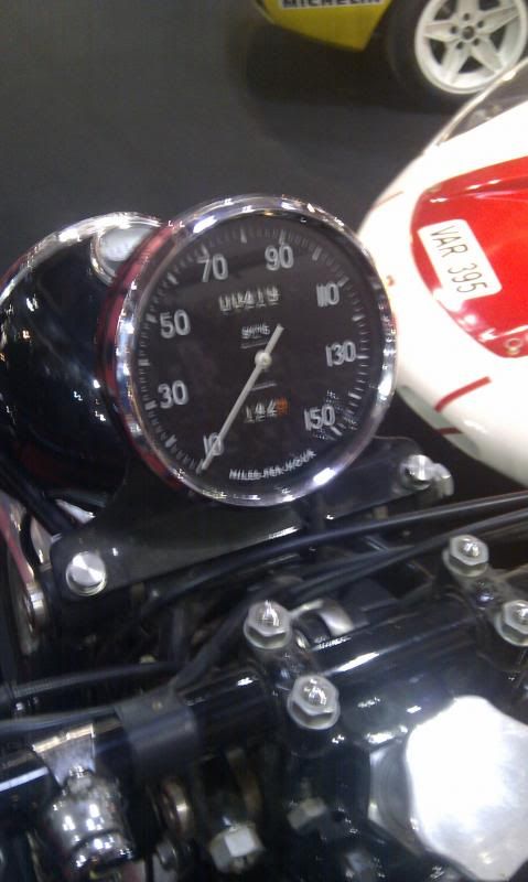
Here's a crappy phone pic' I snapped last year at a classic car and bike show. I think the bike was a Vincent. You can see the Smiths logo is clearly the curved base version, like on the visuals at the start of the trhread.
Really nice. Good work.
Although I think the 120 etc idea is really clever, I prefer the 05 > 60 dial, on the basis of aesthetics and logic.
Edit: By the way, I'd love it even more if the day/date could be centred above 6 0'clock... is that even possible?
Last edited by Draygo; 3rd October 2013 at 20:25.
that's what I said
:-)
I was agreeing. But didn't phrase it well (should maybe have italicised could or added 'indeed' after it) or quote you: apologies.
Would be nice though, wouldn't it?
+1
I have to admit I am not a fan of this at all. It looks tacky and awkward. If you absolutely must do something like this, what about making it a single-hand watch, like this?
That would at least make some sense as a pseudo-speedometer. It might even work with a second hand too, to give it some movement - perhaps a thin straight hand the same length as the main triangular one; either both hands the same colour, or one the same as the dial markers and the other the highlight colour.
Three hands all pointing in different directions, on a "speedometer" just seems wrong, especially with the hour and minute hands being different lengths.
Word up Seiko,
Like I totally agree that the primary perceptual cue is normally the position of the hands - which is why I think that many users (Petrus of course aside) find analogue dials quicker and easier to use than digital dials. However, the indices and numerals also convey meaning and if they are ambiguous, or are counter to the users normal habituated model of an analogue dial, then I fear mild cognitive dissonance may result. This dissonance would probably be experienced at best as a slight increase in the time required to read the watch, or if the user is already under cognitive load then frustration or error might also result. In effect I think these designs may introduce noise to signal to satisfy superfluous aesthetic or design objectives. If I were to put this watch into rotation with others with more traditional numbered indexes then there may also be a cognitive cost when I rotate between the two types of design. So like whilst I totally dig the rest of the design daddy-o, for me the numbers are a bummer, the 0-120 scale being least groovy of all.
Yes there are a number of watches that carry a 0-60 dial - I'm thinking particularly of the B-Uhrs but I'm sure there are others. I think that these watches fulfil a function where the primary concern is the minute scale rather than the hour scale (the hour hand being sort of vestigial on these designs). The B-Uhrs I'm thinking of have both: the minute around the circumference of the dial and the smaller hour index towards the centre. In this case I think that the minute scale is more prominent for a reason - that is for navigational purposes rather than aesthetic. In this case the design is centred around the display of minutes rather than hours. Whilst this is perhaps useful for a Luftwaffe Navigator I'm not sure that it's a design that works for me. But like I say if the speedo design works well for others then that's just peachy and I'm the one that will miss out.
But I'm in full agreement about the logo - it's dead good.
I agree mate, if it gets on your tits, it gets on your tits, and that will always be the first thing you see. Like having a perfectly stylish Sandoz day/date clone in slate grey with a transfer of your ex-wife on the dial.
Dem Seiko Navigators have dem on der dial and it dont cause me no cognitive dissonance anyway berruv.
Good luck everybody. Have a good one.
Didn't kno Sandoz dun that. I ain't got no ex-ball and chain bruv, if I axsed real nice would they bung somefing else minging on the dial?
Yeah but dem Seikos, dey is like GMT watches or sumfing. These guys are gonna turn dis kettle into a speedo innit. Even I kno like dere is 24 hours in a day. But I ain't never heard of no 120 minutes in an hour daddy-o.
was just backing you up not complaining lol
I think the designs lose a lot of this in translation, especially the asymmetry, which is what makes it look like an instrumentation dial and not just another watch. Here's a very rough concept I came up with with the intention of being closer to the original; yes, I realise the proportions are all over the shop:
Thoughts? I realise that date window is going to be controversial; I'm not even sure if it will physically fit, but I'm just throwing out an alternative concept.
First version (0-60, steel case) but in one hand form. Any chance of a render of what that would look like?
If only they could be cylindrically like an old fashioned odometer !!
What a great idea. I'm not taken with the subdued zeros, they just don't look right. A 120 mph dial with a polished bezel best lend themselves to the look of the old chronometric instruments (IOM).
A good look, so long as the hands don't jump round the dial as they did on my Triumph T100SS.
Last edited by PickleB; 4th October 2013 at 00:48.
Googled for some more photos; both curved and rectangular versions here:
As I recall, even the speedo on my Vespa went to over 60 mph - although it didn't need to. But that wasn't a Smith's instrument.
 Posting Permissions


