Reply With Quote
Blimey, I'm not familiar with PP so if I saw that on ebay I would assume its a bit moody. Especially the way the date window doesn't line up and so pushes the 3 out of alignment.
So no, personally, I dont think you're being pedantic.


There's an Aquanaut at watches.co.uk and the idea of selling my Cartier and something else crossed my mind to fund it. That was until I started taking a closer look....
I'm quite a detail oriented person and I think there are some serious flaws that would start winding me up (ho ho):
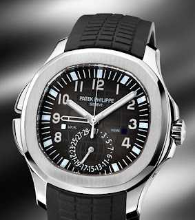
1: Why are the hour and minute markers at different angles? Surely they should always be radial - the higgedly piggedly positioning looks naff.
2: Why isn't the left side of the date apature flush with the minute markers. Surely the date wheel could have been made a little bigger to make the sizes consistent.
3: Wouldn't the minute hand look better if it was a bit longer?
4: I wonder, and this may not work, if the date font was a little smaller so the date apature was the same height as the hour marker would the dial look better balanced.
Am I being a pedant? Either way, I'm sticking with what I've got :)
simon
Blimey, I'm not familiar with PP so if I saw that on ebay I would assume its a bit moody. Especially the way the date window doesn't line up and so pushes the 3 out of alignment.
So no, personally, I dont think you're being pedantic.

I'll keep it simple, it may be a Patek, but it's an ugly, ugly watch.
Everything is wrong about that.
Keep saving and buy a Nautilus :)
Daddel.
Got a new watch, divers watch it is, had to drown the bastard to get it!

By Jove - I think you have some very good points!
What is the modern Jumbo like, as I have been saving 25p per day from my lunch money, so I can get one for my 40th! Only that money will only get me a nice used Rolex 16610 :(
Maybe Daddel is right and the Naughty is the answer to a problem I never knew existed. :P
It's just a matter of time...
Looked at the pic before reading your notes. It looked OK. But now I can't stop looking at the faults you brought up, especially numbers 1 & 2! I have sold a couple of watches due to 'issues' like that. When I got the watches I didn't notice, then after a while I did, then I couldn't look at the watch without the features jumping out at me :(
I noticed the date straight away.
As Daddel said, hang on a bit and keep looking.
Paul
GOT...TO...KILL...CAPTAIN STUPID!
Yeah - 1 and 2 are the killers for me. 3 and 4 I could live with.Originally Posted by marcus fenix
Thanks chaps - we all share the same OCD :)
simon
Yep, looks like cheap tac to me. Not at all what you'd expect from PP.
Best Regards - Peter
I'd hate to be with you when you're on your own.
Look at a 5165 or 5167 they dont have those issues. thats is an older patek but i agree the alignment is not good. i sold my 2008 5165 on rubber a few months back for £7400, based on that id say thats overpriced too at £10k for a 5065.
Oh good - as the one I held and had a play with - Jumbo on steel bracelet and a rose gold (but on a horrible brown rubber!!) looked fantastic and I was concerned I was just caught up in the moment - I prefer the numbers on the dial compared to the markers of the Naughty.
It's just a matter of time...
Cheers Tony.
The one I like is the new GMT version:
£23k though - proper lumpy :)
simon
Never cared for the aquanaut before, but now I loathe it! Looks like a kids watch, why both numerals AND indices... so you can learn to tell time?
'Orrid!
Horrible watch...I wouldn't pay a tenth of the price for one!
Are the hour/minute marker angles the product of design, perhaps, rather than a mistake? The offset of the hour markers against the minute markers being quite 'clever'.
That said, many of PP's designs seem odd, don't they?

Aren't the hour markers due to the (non round) shape of the dial? They're like that so the hour hand actually "points" to them at the correct angle.
Also, is the date window slightly trapezoidal & not square? I can't really tell from the photos I've looked at.
______
Jim.
No pedantry here. To quote Clarkson, that starts with s and ends with t, and it isn't soot. Point 1 and 2 I agree with, 3 not necessarily, and point 4 would not work.
That hour index thing is obviously because they wanted them to be square and to touch the edge, that's why they are rotated. Hideous. As if drawn by a 3 year old.
1 bothers me, looking at your picture. I have handled a few and never noticed the angles before but now they have been pointed out it would annoy me too. A few quid saved :D
Respect the past, live the present, protect the future

Argh bollocks :shock: :evil: :lol:
I'll have to sell mine now for a pittance :wink: have to say I haven't noticed this before. Will need to check my 5167 later. I tried on the new aquanaut gmt on Tuesday and I personally quite liked it - the pushers that change the second time zone (on left) balance out the crown guard on the right. If you look at the 5711 and the aquanaut side by side you will see a lot of similarity.
Coincidentally, one came up for sale yesterday on a French forum (link below), the problems you mention, at least the angle of hour markers, don't seem to be present.
http://cda.chronomania.net/forum_entry.php?id=53323
A Cyclops would definitely improve that
"A man of little significance"
Truly horrible watch and not worthy of the PP name - even if things weren't a bit wonky on the dial! Cynical attempt to get in on the big diver craze, I reckon.
Seems a lot more modern update that the OP posted version.
It's just a matter of time...
Not a pretty watch and now with your observations even less.
This.
Agree with the majority, its not a looker and the points you note are all valid.
I take it that the difference in the dial on this one is because it's a 5065 (not one that I was aware of before) which is not on the current Patek website. They seem to have resolved these issues on the 5167 which, I suppose, is an admission that they got it wrong. I agree with all of the OPs' reservations.
In the Sotadic Zone, apparently.
I love the Nautilus, but any and every Patek should be perfection - their reputation and position at the pinnacle of the industry demands and requires nothing less. The Aquanaut clearly has some issues...
So clever my foot fell off.
Wow. The Aquanaut used to be my favorite PP...until now. My eyes have been opened and the pedestal has crumbled.
Not that I would have ever bought one anyway. :roll: :lol:
http://www.patek.com/
go have a look at a 5167
The new one on PP site doesn't have the markers at silly angles. I'm back in :D
Respect the past, live the present, protect the future
Only so you can pass it on to the next generation I guess :D
Daddel.
Got a new watch, divers watch it is, had to drown the bastard to get it!
What is going on on the left-hand side with the 'crown guards that don't guard a crown'?! Do they serve an actual purpose other than ( I assume ) to balance out with the right-hand side? If so, weird design...!
N

Yuk !, I would have thought it was a fake, but even the diamond encrusted Aquanaut 2010 is the same. All the rest of the Models seem to be symetric
Pushers for the timezone function, IIRC from the Basel report on it.
...but what do I know; I don't even like watches!
Ahem, they are the pushers that change the second timezone indication - common on many watches - Ulysse Nardin, Oris, other Patek models. Do you feel silly now? :)
Yes I do! Thanks for enlightening me though.
Cheers,
Neil
I don't like them but have never noticed these details... Its a huge flaw for such a 'top' brand to have these little quirks.
 Posting Permissions