Reply With Quote
At least that gives me time to save up for both of them :DOriginally Posted by swanbourne
Dan


:D :D :D
At least that gives me time to save up for both of them :D
Dan

Nice work Chris (again) but I wanted some writing on the dial this time and it's planned for it to be fitted with a bracelet.
Eddie
Whole chunks of my life come under the heading "it seemed like a good idea at the time".
With all respect, Meister, the GMT is fine (in red of course) but the Speedbird text makes the dial a bit too busy? Well, just a thought......Proably all gmts have busy dials....
I dunno, it looks kind of classy to me. A lot of people don't like sterile dials.
Love it. That's the one.
The first 3 I looked at, Helson, Ocean7 and Benarus certainly do.
The Helson GMT Bucaneer with 500m rating;
The Ocean7 LM6 GMT with 500m rating;
The Benarus Worldiver GMT with 500m rating;
I'm sure there is loads more but that's the first ones I looked at......
Damn. Thought they were movements for the new PRS3 Quartz!

Now that I like.
Dave E
Skating away on the thin ice of a new day
I've never been a fan of the Speedbird script you've used in the past, this version is set in a version of Helvetica as are both sets of numerals.
Chris
I've never been a fan of Helvetica :D . Park Avenue is much better.
Eddie
Whole chunks of my life come under the heading "it seemed like a good idea at the time".
I'm not a fan of watches that have an obvious GMT feature with the word 'GMT' written on the dial. Just like some makers (Zenith, for example) put the word 'date' next to a little box with a display of the date inside.
So is it really necessary to have GMT? what about Precista (no need to hide your lantern under a bushel) and Speedbird III?
I tend to agree Simon, having said that I do hope the dial won't be sterile as that's my biggest gripe with my SB3.
My Sinn 656 just has the word "Sinn" written in fairly small script on it and that does the job nicely.

This is looking great, but I'd like to see it without the "Automatic", and the date with the same treatment as the SBIII (white on black @ 6:00).

i'm having a clear out to raise funds for a PRS and was trying to decide between a 50 and an Italian ---now I am in a proper quandary!
I'd stick to your original course personally... these are likely to be months/years away!!
Is it wrong to request GMT in lume?
Just as long as it's before we next get the World Cup.
I like this very much.
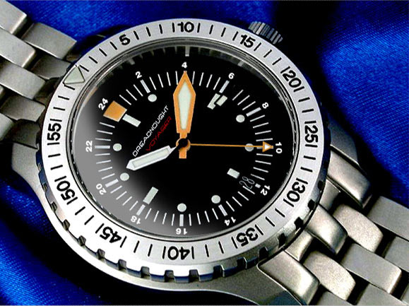
Enough with the Speedbird GMT, what about the Dreadnought Voyager?
Red GMT hand?

I like this VERY much!
What I like about this is the "B-type" ring being used for the GMT function.
... so... bracelet or not, I think this may look good on riveted leather.
I can live with or without the "GMT" but like the "Speedbird" wording in this font.
With the date at 3 I think the date dial has to be white.
If that's made I'll buy it even if I'll never need GMT.
If it looks like that, then I may well buy my first GMT. Looks great!
I think with all the confusion over number alignment and text, that all 200 movements should go into DN-GMTs :twisted:
Is someone who has better photoshop/image programme thingamy skills able to mock up a Speedbird GMT as proposed, but without the outer ring of arabics (keeping the 12 triangle though) - that is, just having the 24hour numbers, and the rest marked by indices?
Thanks so much in advance!
Yes! Agreed! :lol:
Plenty of time to save up again then! WTB post early next week, with any luck
You mean like this? :shock:
Thats horrible, can't see anybody buying into that idea.

+1
It's busy but that's a GMT watch for you. Leave it as is...
I'd be keen to see a few different options on the DN dial TBH
Personally I liked the first DN-GMT mockup the best. The 24h hand is not a problem to me as long as it is longer than the minute hand such that the tip pokes out from underneath when the minute hand is covering it.
Quite agree, I would imagine that even 200 would sell out fast.
And what's that going to do to the current DN prices?
I'd hand over cash now for the SBIII GMT if it's as pictured above in KP's image.
What does it matter? The value of some watches will always fluctuate and for the majority of folks it won't matter one bit...
I guess that'll depend on Eddie's pricing for the new model. :wink:
R
Ignorance breeds Fear. Fear breeds Hatred. Hatred breeds Ignorance. Break the chain.
I like it :D (Though I think the 5 minute markers should extend beyond the minute track, à la Sinn 556, and the GMT ring should expand outwards a bit. And the dial shouldn't be all smudgy :wink: )

Eddie - I hope you and your family are having a nice summer vacation this August.
You can put me down as firmly committed for one of the DN. It has been almost three years since my last Time Factors purchase. I'm starting to feel withdrawal pains.
The mock-ups for both the DN and Speedbird are excellent, though I agree that "blued" might be nicer on the Speedbird. It makes a nice distinction from the DN.
Cheers,
Patrick O'Connell, NYC
I like it a lot. I agree, extending the five minute markers is better look. It's less cluttered and keeps the s Speedbird vibe without being over the top. The clean space on the dial aids legibility.
Nice.
Nah, looks just plain wrong without the numbers on the dial IMO. Yes it's busy but I think it works how it is, and I really don't see Eddie going for the latest version of the design (smudges or no smudges ;) )
i think chris' sterile mock up of the sb is simply stunning
i too am no fan of the font used for the 'speedbird' script.
id much rather see something plainer on the dial, like a simple "SBIV" on the dial in white with maybe a small "GMT" underneath it in red.
although personally id rather see the 'gmt' script left off, i think its rather pointless.
Good luck everybody. Have a good one.
^
So, a sterile dial then, basically, which appeals to purists maybe but not to most? I don't mind the Speedbird font and would have liked it on the SBIII.
Interesting. Will those who have assertively declared their preference for a particular font, sub-millimetrically placed numerals, no numerals or no font, stick to their guns and refuse to buy it if requirements are not subsequently met in full? If so there would appear to be no rationale for making this one, as there appears to be scant support for the actual manufacturer's design!
...but what do I know; I don't even like watches!
All of these look good:
I've never seen a DN in person; from pictures it looks like the same exact case. I'm envious of folks that come up with designs this attractive.
Both will be stunning im sure and i seem strangly drawn to the dreadnaught so number 1 would be nice.
You're new here, aren't you? :wink:
R
Ignorance breeds Fear. Fear breeds Hatred. Hatred breeds Ignorance. Break the chain.
as i believe eddie has number 1 then how about 2 :bom:
Problem solved!
Eddie
Whole chunks of my life come under the heading "it seemed like a good idea at the time".
:lol:
Lots on here (not me of course) deserved that!
Brilliant!!!!! :lol: :lol: :lol: :lol: :lol: :lol:
(Still don't like the red GMT hand, though...) :mrgreen: :mrgreen: :mrgreen: :twisted:
I'm not as think as you drunk I am.
Can it have a white on black datewheel instead?
 Posting Permissions