Reply With Quote
snowflake hands on Tudor. Why, oh why they put those horrible hands on otherwise lovely looking watch???


Hello good folks,
A lighthearted thread!
Does anyone have a watch that has just one tiny little feature which then makes you irrationally unable to bear looking at or owning a particular watch?
In other words, what is the smallest horological hill you’re willing to die on?
For example, for me it’s the Omega CK2998 - I love, nay adore, everything about it... except the “lollipop” seconds hand. I just can’t stop noticing it, and it ruins everything for me. Utterly daft, but can’t get beyond it!
Last edited by ach5; 31st March 2018 at 08:12.
snowflake hands on Tudor. Why, oh why they put those horrible hands on otherwise lovely looking watch???

The absence of minute markers. I tried having a watch without minute markers and it drove me mad. Never again.
(Dons flame retardant overalls). For me it is the "cyclops"...
...so many lovely watches blighted by this deformity.
Luckily they made the seadweller - which they have since ruined wth a Cyclops!!!
My SD4k is, in my opinion, pretty much perfect and l have always appreciated the quality of rolex, but wearing a submariner years ago irritated me more than nettle rash - l just hated that wart over the date - it had to go!! I admire and appreciate many of their models, but the Cyclops serves little purpose other than to announce "look at my rollie!" in my eyes - it certainly doesn't make the date clearer unless you hold it precisely head on!
Each to their own.
Edit - The one exception l will make to this "rule" is if l ever buy a gold rollie - if lm selling my soul to the devil, lm going the whole hog!
Last edited by Umbongo; 31st March 2018 at 08:21.
Probably ceramic bezel inserts. No warmth or character.
Good reminder! And faded aluminum bezels No need to be scruffy - get a service!
Oh - and too much "patina" - especially fake.
Didn't take long for the words "smallest" and "tiny" to get forgotten....
Plenty. Having the date is bad enough, but the need for day windows I can't fathom. 24hr markings ruin otherwise nice dials and are only useful if you can't count past 12. Minute numerals (5, 10, 15, 20, etc) is another abomination. Oh, and crown guards on non-divers.
I hate Tourbillon watches. They look like someone forgot to finish them
Sent from my iPhone using TZ-UK mobile app
No micro adjust on a clasp. Bought one once - never again. Damn you omega
Sent from my iPhone using Tapatalk

Cyclops..good grief why?
Most Roman numerals. Too old fashioned and usually take up too much space, making for overly busy dials.
Except for the ones on the new Breguet Marine, those I like
Sent from my iPhone using Tapatalk
Angled date windows at 4 o'clock. Gross.
The date at 4 or 4:30. If you can't put it on straight then instead of unbalancing a dial just don't put a date on it. We all have smartphones, it's not that difficult to work out what day or date it is.
Power reserves on dials If you must insist, stick it on the back.
There's more.
"A man of little significance"

Yes, the angled date window.Originally Posted by RyanV

Also the said same date window too far inwards on the dial.
Stubby hands.
Watches that aren't circular apart from the jlc reverso. For some reason I love the reverso but every other watch has got to be circular
Sent from my iPhone using TZ-UK mobile app
A circular date window. I dont know why, one would think that on a watch with a round dial (and maybe round subdials too), a round date window would be more harmonious, but I just think it makes a watch look cheap.
The positioning of the date window in the IWC Mark XVIII - the Selita movement places it too far (for me) to the left of the outer edge. Once noticed, impossible to forget...
Morning Adrian. For me it would have to be power reserve meters... probably because they destroy any symmetry on the dial. I think Im right in saying that all GS watches have them (?), which eliminates an entire brand for me...
Simon
Just GS Spring Drives I believe Simon...
Anything below 50m wr and Roman numerals.
(2 separate hills)
3 things.....
Crown at 10 oclock position.
Bi-metallic anything.
Blue dials - all blue dials,
When you look long into an abyss, the abyss looks long into you.........
This too.
All (or at least all I can think of) Grand Seikos with a Spring Drive have a PR indicator... However, only some of their traditional mechanical ones have one and none (funnily enough) of their quartz watches do.
Lots, but my top three are, in no particular order:
1. Cyclops on anything.
2. Chronographs and complications no one ever uses.
3. The record groves on the Hamilton Khaki.
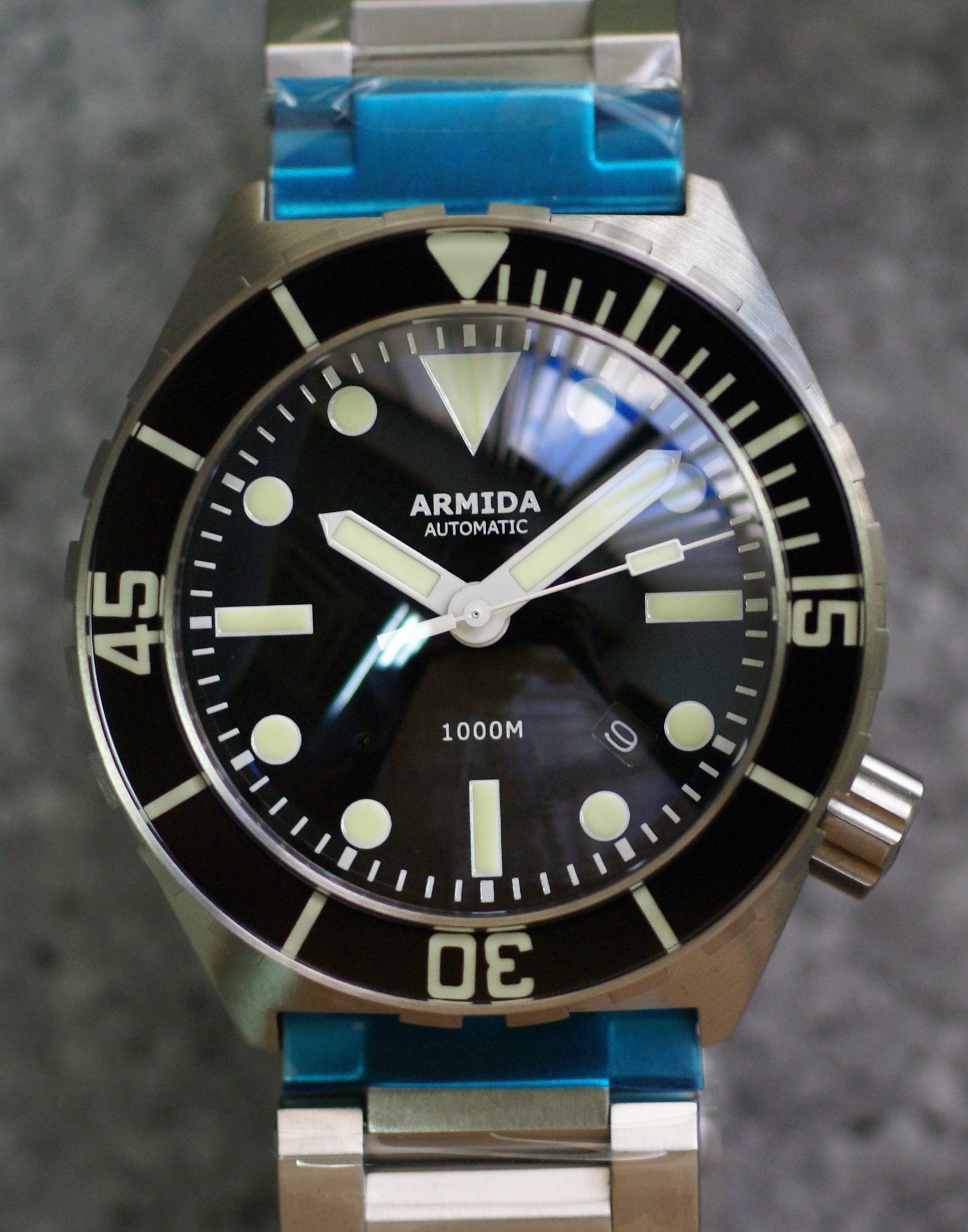
Date windows that aren't centered between the indices, like in this Armida :
I have refused to buy a few watches that I loved otherwise because of that.
Oh, and roman numerals
I'd go with the power reserve on the Grand Seiko spring-drive, which clutters the lovely dials. The really annoying bit is that the spring dives have an unusually efficient winding mechanism and don't need a power reserve.
And while I'm at it...date windows not at 3-0-clock.
I have a few.
When I first got in to watches I had a thing about signed screw down crowns that don't align the logo perfectly parallel with the watch case when screwed in. I quickly learnt however that even at the high end of this game I was going to have to get over that one.
Someone has already mentioned "small movement syndrome" like the MKXVIII. This I can just about survive but if the movement size impacts watch function then I draw the line. See the opposite problem of too large a movement on the Sinn 903 pushing the subdials out and partially obscuring the inner chapter ring. I like to think (hope) Breitling would never allow this.
Again someone mentioned power reserve dials. I actual really like them, but not on an automatic. Only on a manual wind. Some variant of a Speedy Pro with power reserve would be wonderful.
High end quartz (not necessarily HAQ) watches whose second hands don't hit the markers. Even if they do it in a consistent fashion.
IIII instead of IV in Roman numerals on the face.
Mixture of Roman and Arabic numbers on the dial. One or the other.
Longines Legend Diver crown positions, they are just asymmetrical and once I had it on wrist it would just bug me.
"munched numbers" on chronographs, just lazy imho.
Asymmetrical cases (even if its just a little bit) which includes crown guards
Date windows
Ive had some lovely watches but both of these things have made it relatively easy to flip them when Ive needed to raise funds
Yea, rather than general horological dislikes, I was more looking for very specific tiny little things that spoil an otherwise specific watch for you...stuff that is completely daft and irrational but specific to you...
I especially like the one above about the date window not being centred between two hour indices... have never considered this before, but now it will also drive me mad and would stop me ever owning that watch!
Made in Germany on the Sinn 556 dial. Why isnt it in German when Automatik is in German? Or why isnt Automatik in English?
Also, why does a Rolex Day-Date have a cyclops over the date, but not over the day even though the day is in a smaller text?
Does tiny or smallest work?
If it does your cabbage in, it does your cabbage in!
When you look long into an abyss, the abyss looks long into you.........
Faux lume and especially faux patina as in new Longines military watch
Sent from my iPhone using TZ-UK mobile app
Now, if l answered that question l would get the biggest flaming l have ever received on this forum. So l shant...
IWC Big Pilot. Love everything about it...then I try it on and it's absurdly huge on me. Why can't they just make a nice 42mm version? It would sell like hot cakes.
I echo the weird date placement issue. The previous JLC Master Control chronograph was ruined for me by the 4:30 date position. Also, I just don't like chronos with automatic movements. Don't know why but if I like a Chrono's appearance but then see that it's automatic I just go cold on it. Despite this, I still like the JLC chrono but the date issue ended it for me.
I imagine you're talking about the Speedie or Seamaster Diver. Do what I've done and swap on a PO clasp. The job is a doddle for both, and very simple on the Seamaster.
Sent from my [device_name] using TZ-UK mobile app
Not sure if this counts, as its more of a service issue about a small detail... I sent my Glycine sub combat back for a replacement dial as the orange chapter ring had faded. It came back with the new style logo, I couldnt live with it, it wasn't in keeping with the logo on the crown or clasp so sent it back to have my original dial put back on. The woman in the AD was very snooty and said I was making a big deal out of something so trivial - This caused quite an argument, so much so I received a very apologetic email from her manager with an offer of a sizeable discount on any future purchase.
Its funny, the lack of minute markers adds some zen for me to a watch dial.
For me its poorly sized movements (ie small) in over sized cases. Its sooooo obviously wrong!
The bezel markings on a ceramic Rolex Daytona, the graduated track on the left hand side and type in general makes it look like the bezel is off centre or egg shaped.
I wanted to get a 42mm Hamilton Khaki Filed auto for a while. Classic looks, good quality, great value. Then someone pointed out the position of the 15 on the inner ring of minute numerals. The date window means it steps in and out of alighnment with the rest. Now I can see nothing else and that watch is firmly off the list!
Also a couple not so small ones that have already been mentioned - cyclopse and ceramic bezel inserts.
So many gripes to mention, but I'll go with this - quartz watches where the hands don't land on the markers. Boils my spuds.
SGR
Patina. 99% of the time it's just old and ugly
Any Omega with 007 on it (im a Bond fan as well)
Snoopy also for that matter!!
Sadly I seem to have agreed with most of the annoying details highlighted in this thread. lol I would have to leave Power Reserve indicators off the list as I find them quite useful.
Cyclops/Mercedes hands/ and those big circular indices so popular on Subs and Sub-a-likes are all irritating.
Short stubby hands and oversized chapter rings so often found on Seikos are another gripe - just a cheap way of putting a 30mm watch in a 44mm case!
I would never buy a chronograph watch. Find it an ugly aesthetic and a more or less pointless complication that I'd never use.
It appears this site can be dangerous because there you are , you love your watch and then somebody just has to point out a little imperfection and thats, that the love is gone:)
1: Orange Monster - I really liked it but the hour hand is just to short and stubby . Immense lume but on a few occasions I misread the hour when a bit groggy
2: Skeleton Watches , I hate them with a passion . However expensive it may be it looks market stall fashion to me.
3: To much writing on the dial , superlative , ring lock , gas valve . I mean whats that all about?
 Posting Permissions