Reply With Quote
Why is this idiot wearing his watch upside down??
Dave


Lovely!Originally Posted by Binsull


Why is this idiot wearing his watch upside down??
Dave

Winner, winner chicken dinner.
Where are these pictures from?
I've also seen a blue gradient dial legend diver and a beetroot version also.

The Black one has been taken off ROLEXS Website....anyone know more?
I agree with you Dave, and did you see the interview? At (2m30s) the Omega guy says the following: "the most amasing is the hands - they look too short" damn right they look too short :)
https://youtu.be/9XKC2A3k2Mo?t=2m30s
Later at 3:08 he says: "it is so ugly that it is nice" :) - that is hilarious !!
https://youtu.be/9XKC2A3k2Mo?t=3m08s
Yes, well spotted Ben, very nice.

He's not. The watch is on his left arm over his glove, the blue is the back of his left hand and the orange velcro strap is around his left wrist.
Certina DS PH200M reissue. 42.8mm diameter. UK RRP £565.

Last edited by SimonK; 22nd March 2018 at 20:38.
That reminds me I found a picture of original:

Its still there, you have to configure the 'DIAL' tab.
I think they have just redesigned the website to show that all sizes now carry a new white dial, but all sizes seem to carry the black also.

It makes a lot more sense the right way up, although the watch is then upside down!

Last edited by Tooks; 22nd March 2018 at 21:08.
IMG_1045.JPG
Seemed familiar !!
Sent from my iPhone using TZ-UK mobile app
Norbert
IMG_1045.JPG
Sent from my iPhone using TZ-UK mobile app
Norbert

Any price announced for the new Seamaster?
Does anyone actually have snaps of their own from the show? I remember members used to go and share their experience IIRC which was something to be look for.. I suppose with all the social media, instant messaging and semi-pro blogs and bloggers looking to capitalise on it, it's too expensive/much trouble these days?
Fas est ab hoste doceri
New Certina.

Anyone know roughly how long we now have to wait till you can buy any of these? Tudors website statement of coming soon isnt particularly specific
Sent from my iPhone using Tapatalk
Supposed to be worldwide from July....
Ok Im off to make a gmt advent calendar
Sent from my iPhone using Tapatalk
My comment was not because the design resembles a Kickstarter watch that rips off an IWC. It was because of the clunky hands, "fun" dial colour, and (the absolute calling card of any KS effort) dismal font choice and logo.
DEFY ... oh dear. Imagine looking at that every time you checked the time. Or having to explain it. "Well, you see, I'm a man of individual tastes and I defy convention, you see, my watch even says DEFY on it". At which point, she leaves.
Yes, I'm aware of the history. No, it doesn't look any better because of it. Zenith can make refined watches. This isn't one of them. A mismatch of ambitions, styles, references, oversized logos, fonts and overall unrefined clumsiness should remain the hallmark of KS and CarpetWarehouse offerings in my opinion.
^^^^ Fully agree.
I have to agree, that is all my eyes see every time I look at it. Fortunately, I actually prefer the open work - first time ever for me. The skeleton date wheel that keeps showing up on various Tags and Hublots suits the aesthetic and I like the symmetry of the bridging. Keeps the "fun" blue to a minimum too! One to go and ogle in the metal.
Using an 80-hour automatic movement... at that price I might get one of those... if it's not too big.
ETA: Good to see it's also using a perspex crystal (with a scratch-resisiatnt coating). Info here: https://www.certina.com/presskit
Last edited by Dark Side of The Loon; 22nd March 2018 at 23:13.
Omega Seamaster 1948 Limited Editions
https://timeandtidewatches.com/intro...ited-editions/

I like this new annual calendar diver from blancpain.
I do like that.
It looks to be around the £3750 mark so the £4k guesstimates of several months ago were not too far out.
Lovely watch. Dont like the hands tho
Sent from my iPhone using Tapatalk
Anyone found anything further on this beauty?
Pretty frustrating that there are legions of journos at Basel, and the marketing teams of the brands themselves, and yet here we are...
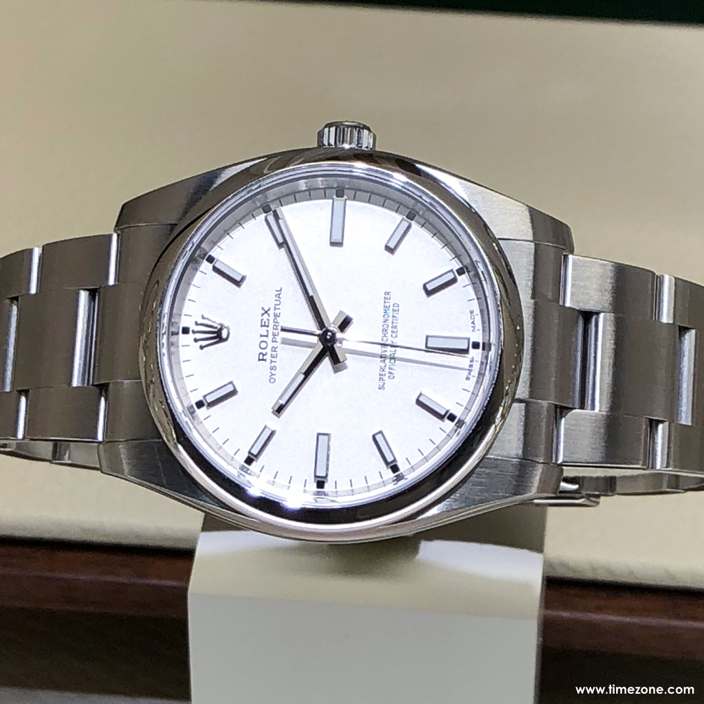
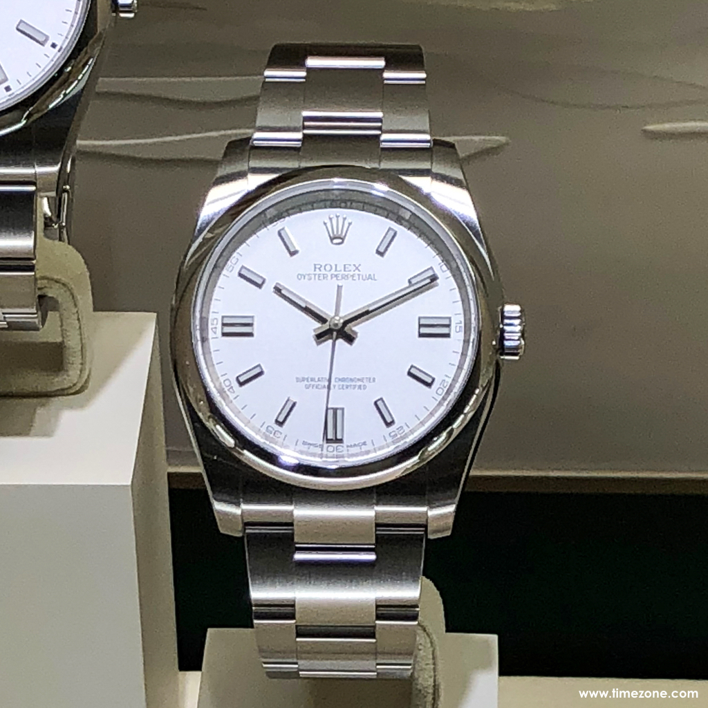
Doh! I figured it out - the first photo is a 34mm OP, not a 39mm. That explains the different sized, but still lumed, batons, and the reduced distance between the hand stack and the "Superlative...." text on the dial.
I have since found this photo on Instagram and all is right with the world. This shows a 39 as per the website renders, and another 36. That black dial 39. Wow. The jubilee GMT and it's waiting lists are out of my league and my patience level, but this is right up my alley.

Doesn't matter. Left our right wrist, hand up or down the 12 sits at the bottom when looking at someone wearing a watch
Last edited by sweets; 23rd March 2018 at 10:04.
I like it though with a small wrist those long straight lugs make me nervous
Look at post 261, the original photo has been rotated through 360° so the watch would be the right way up for us to like (sic) at.
So the wearer is not the idiot, however, the press people who rotated the picture are, because for the published image to be right, the wearer would have to be dangling from the ceiling.
Madness.
On another note, 80 hour reserve, £565 and my initials on the dial make this an attractive proposition
ps - now corrected the sp - idiot me.
Hodinkee have a piece on it now.
https://www.hodinkee.com/articles/lo...ch-introducing
Finally! Thanks for sharing.
Yes, thanks... interesting to see that the ageing is done individually - was hoping that was the case.
Its like seeing someone you kinda fancy has been hitting the gym for a few months and now really getting your heart racing!
(and dumped that stupid thing they always wore. aka the crown tube!)
Goldsmiths in braehead have nobody on a list at all for any Tudor apparently . Surprising that
Sent from my iPhone using Tapatalk
Not strictly Basel, but something announced....
The strongest micro brand at the moment? Gotta be close to it.
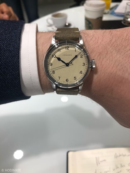
Agree on the middle one, that looks superb and one of my few highlights so far. I like the military too but showed it to my wife last night and she hated it which will make a future purchase highly unlikely. Apparently each dial of the military is slightly different which will be a nice touch.
You're right, that slim line makes all the difference. Is this the year brands remembered how to make thinner watches?
I still find the rivet bracelet a bit too 'faux' for my liking. Sure an original rivet bracelet that's actually survived unharmed is charming on a vintage watch, but bracelets are one area where modern watches are just better.
Very nice constructed "front loading" case and beautiful new thin movement.

Got a new watch, divers watch it is, had to drown the bastard to get it!
This is the watch I liked most this year. Seems like a real winner. Was also thinking whether the riveted bracelet would ultimately bother me too much....
Hodinkee have a point. Other brands may bring the bling, but Longines are getting into the habit of being the manufacturer that produces the really interesting stuff every year via their heritage collection
Liking this although little worried about the size

The riveted bracelet would really bother me to the point of not buying the watch.
A bit of a mouthful this one ........... Chronométrie Ferdinand Berthoud FB 1R Edition 1785.
A limited edition of five pieces.
Now, that is patina!

Last edited by j111dja; 23rd March 2018 at 22:25.
B&R have come up with a few interesting designs this year... this is great as its what it should be basically and functional!
http://forums.timezone.com/index.php...=0#msg_7516825
 Posting Permissions