
 Reply With Quote
Finally they got rid of that brand name that more often than not had too much of a presence on the dial!
Sent from my iPhone using Tapatalk


The new releases from Christopher Ward .
https://www.christopherward.com/watches/new-releases

Finally they got rid of that brand name that more often than not had too much of a presence on the dial!
Sent from my iPhone using Tapatalk
Some nice ones there. Odd that they are using the new Swiss/Union Flag combined cross logo on some of the watches and the new 'Christopher Ward' sans serif text on others. I wonder what that's about. Isn't that diluting the brand image?
With the amount of logos they've bashed through in recent years; I think diluting the brand image is the brand image.Originally Posted by markrlondon

Hehe
Nothing says 'Christopher Ward' like:


Definitely a bit funkier and more contemporary- a good move in all ways for then I think. Seems a nice change in direction with those designs
Sent from my iPhone using Tapatalk
I do like that C9 but £2.5k?
Sent from my iPhone using Tapatalk
It's a tough one, as I really dislike the sans serif text logo(especially with the positioning) so prefer this, but every time I see this logo I can't help but see....

Ah yes. But can Tissot do this?

I was a little excited at first and thought all new releases wouldn't have the current "Christopher Ward" logo until I reached half way down the page!
I think the C7 Rapide with Blue face and the orange/blue strap makes quite a nice unusual colour scheme.
Not entirely sure on the font of the numbers, i quite like it but it looks a bit comic-like....
The artist formerly known as 'Christopher Ward'
Like the look of the blue C7 rapide
I quite like the Panda dial C7 Rapide Chrono Quartz
z
Formerly, formerly, known as:
Sent from my XT1562 using Tapatalk
I like the C8 Flyer Automatic - not sure about the chronographs - something not right about the numbers...
Maybe the similarity is not entirely by accident ;)
The moonphase is quite nice, but the logo lets it down
What's with those huge numbers? Are they getting inspiration from Ball watch co?
That logo has always reminded me of Invader's early work.
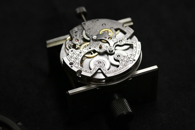
However, when used to decorate the movement, it does look rather smart, IMVHO...
There's a special corner of hell reserved for people who put markers for the seconds on the subdial, but omit minute markers from the main dial.

The numbers on all the Rapides are just awful. I think there are still enough design peculiarities across the range to prevent me from ever being interested in owning one...
Simon
Sent from my iPhone using Tapatalk
Maybe I'm being dumb but how does the new logo represent CW or should I be squinting my eyes a bit more than I currently am?
Agreed, it does look rather good.
The twin cross logo? I read the explanation of the new logo in CW's in-house magazine: It's a combined representation of the Swiss flag and the Union Flag, representing the combination of Christopher Ward and Synergies Horlogères.
Apparently.
I actually like the logo / symbol, it's not immediately obvious what it means but once you know, it does represent a Swiss movement that fits into an English case. Ok the English bit is not so clear but you get the idea of something Swiss fitting into something at least.
It's an improvement on all their other logo attempts and actually quite modern. The movement using it looks great.
Sadly I can't say I'm particularly keen on any of these releases though.
Sorry I have no idea if that's the case, for all I know it just means an English company partnering with the Swiss, whoever makes the cases, either way the logo works fine for me.
That's interesting, I didn't realise their cases are made in England, wonder where they are manufactured.
Some of these new cases do look very nice indeed, a bit Bremont inspired but certainly nice and sleek.

Sorry I have no idea if that's the case, for all I know it just means an English company partnering with the Swiss, whoever makes the cases, either way the logo works fine for me.
Iwht they were manufactured by SH in Switzerland.
The weakness of the logo is illustrated when what it represents only becomes apparent when the logo is presented either in colour (i.e. red and white) or with accompanying explanatory text.
https://player.vimeo.com/video/165315914
At least they haven't quite reached the Grand Seiko level of logo multiplicity yet.
If you can explain to me where the Union Flag is in that logo, I'd appreciate it. I can't see it.
To me it looks like the Swiss Flag and its reverse, meaning Swiss + non-Swiss.
Or possibly they are big supporters of the Red Cross? Incidentally, someone suggested the logo should be in colour. I don't think the ICRC would allow anyone to put their logo on a watch dial (barring their own special editions that you can buy from their shop at the Red Cross Museum).
I think Mark meant the Saint George's Cross, not the union flag.
And while it's a stretch, I suppose it can be considered as a representation of the Saint George's Cross, although as you point out, that makes it look just like the Red Cross symbol. Oops.
I think acknowledgement is due to Hello Communications for its design efforts on this one.
This is very nice and the first CW that I like:
https://www.christopherward.co.uk/wa...imited-edition
The use of just a logo on the dial is odd. If you see a picture of a watch that you like and it has no brand name on it, how exactly are you supposed to go about finding out anything about it? It looks like a bad design/marketing move to me.
I can't think of any watch companies that have just a logo and no name on the dial, are there any?
Rich.
Some amazingly literal analysis of the logo going on here, I'd sympathise with the poor graphic designer who had the TZ forum as a client!
I suppose it is possible someone could see the watch being worn, and then not be able to track one down to buy it, but more often you'd be seeing it in a picture of the watch in an advert, or on line, or with marketing material attached, and come to know who's logo it is that way. Usually we can't see the brand name on a watch clearly anyway. We just recognise the logos and signature design cues unless we're really close up. In the case of CW I'd actually think it was an advantage not having the name on it, it's a bit cooler having an enigmatic symbol. It's not as if the brand name has so much cachet it adds glamour to the watch as 'Patek Philippe' might, without wishing to be mean.
You're exactly right. It's certainly a bold move, but I wish them every success with it.
Rich.
Sub Dials look too big and, in my opinion, it makes them look squashed together.
Also, make your bloody mind up, Christopher.
I meant both. The cross of St. George is part of the Union Flag. :-)
As described by sean, the two crosses in the CW logo apparently represent the Swiss flag and the cross of St. George in the Union Flag.
Ha. Talk about damning with faint praise...
SGR
I think the one for £3k with the bits of ally from the WW2 hurricane engine puts CW into Bremont territory.
Why can't we just have a decent UK watchmaker (at, say, Omega pricepoint & quality) that doesn't do novelties ?
Hello! That'll be the cheque, then....
Wouldn't be the first time a comms agency has seen a client coming.
SGR
Wow, so they've managed to do away with one of the most controversial logos in the watch market and replace it with...
A logo that makes it look like those cheap watches that aren't actually Swiss that have a Swiss logo & something like 'Swiss balance' written somewhere (when they're Chinese quartz watches)
Why didn't they just do an intertwined Cw or something, have some brand ID still but just keep it simple.
The CW logo generator (picture totally stolen from WUS):

They were pretty cool in the beginning.
Maybe they do drugs.
The cross of st George is clearly apparent on the Union Flag, but the Swiss flag has no historical connection that I know of to the cross of St George. But I'm open to enlightenment.
Still don't do it for me.
Logo looks like Tissot
Logo looks like Swiss Army/Victorinox
Logo looks like a Chinese attempt to appear western
Too many better options out there unfortunately and ones which a) have a bit more character, b) seem a bit better value, c) are more desirable/aspirational and d) would plummet in value like CW seem to do
More totally confused thinking from the Christopher Ward "design team" I'm afraid.
This new logo is simply pants! (I had to soften the word I first thought of). Not sure why they've done it, or why it only seems to be applied to the sports watches. They seem to be continuing with the Helvetica script on the dress watches - which was another change I didn't like. The new (and possibly temporary) logo, doesn't suggest Christopher Ward and doesn't seem to have any connection with errrm......... anything.............save for a vague hint of a Swiss flag for those who have seen countless other Swiss-associated products and possess impressionable minds.
As for the strap line "Swiss movement - English heart" - surely the movement is the heart of a watch and they already said that was Swiss! English Design/English Spirit/English inspiration/English ....(add Thesaurus entry here....., but please don't try to sell us two hearts!
All this design and marketing "effort" must be costing them money, because inevitably prices have crept up yet again. I'm not sure they are clear where their market lies.
For a company that owes its very existence to marketing, this effort is a shambles and overshadows what may be an acceptable, if somewhat generic, series of watches.
Last edited by UKMike; 2nd September 2017 at 08:54.
 Posting Permissions
