closing tag is in template navbar
timefactors watches


TZ-UK Fundraiser
Page 1 of 2 12 LastLast
Results 1 to 50 of 66

Thread: New Aqua Terras are (finally) online

  1. #1
    Master Wooster's Avatar
    Join Date
    Jun 2009
    Location
    Jammy Git county, apparently
    Posts
    3,551

    New Aqua Terras are (finally) online

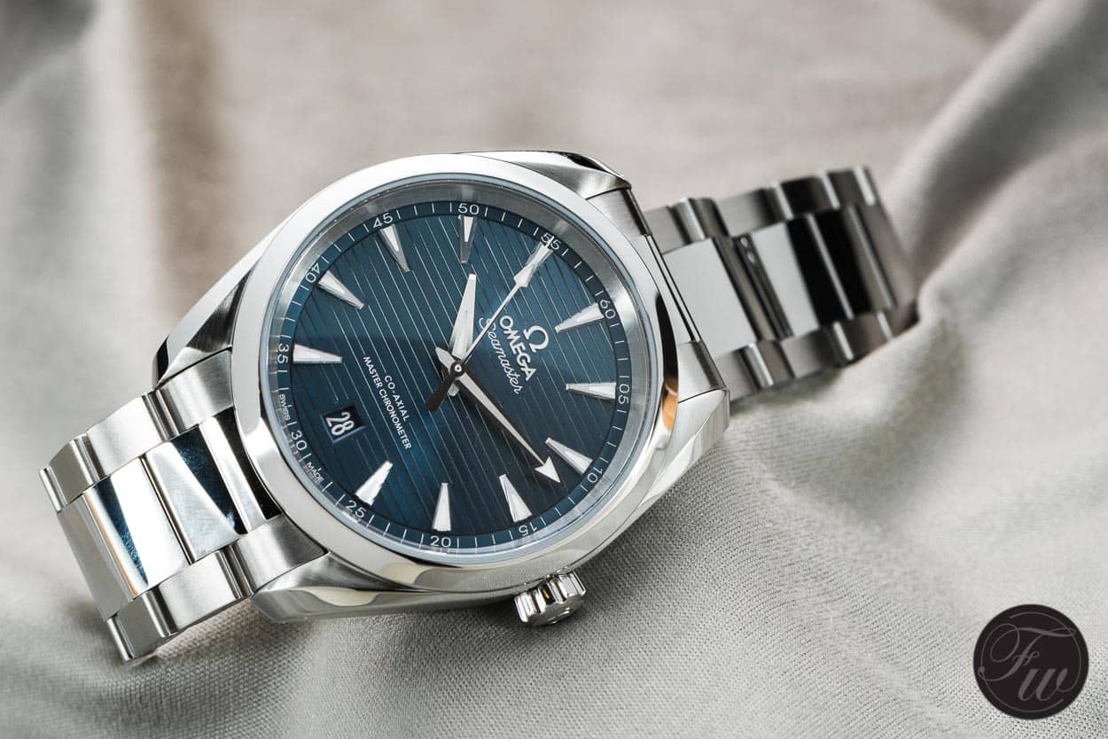
    Omega sure needed lots of time to update the site, but finally the 2017 AT's are online. Some interesting choices for both the 38 and the 41 versions.

    No news about the non LE Railmasters though, as much as I noticed.

    Cheers,
    Christian

  2. #2
    Master
    Join Date
    Aug 2012
    Location
    UK
    Posts
    5,429

    New Aqua Terras are (finally) online

    Thanks - they're here.

    Still can't work out if it's an improvement over the old style tbh. They have the dreaded polished centre links, don't know if a conical crown is better, don't know if changing the direction of the 'teak' dial or moving the date is an improvement either, it seems neither worse nor better, but I can't say I'm bowled over by the new symetrical style. They haven't made a mess of them, but I don't find myself looking at them and desperately wanting to trade in the old model either. The case back looks good at least.

    Maybe gentle evolution is right for the AT, the 38 version is still perhaps the best sized watch I own. It ain't broke and maybe it doesn't need too much fixing.
    Last edited by Itsguy; 17th August 2017 at 23:22.

  3. #3
    Wish there was more news about the non LE rail masters!


    Sent from my iPhone using Tapatalk

  4. #4
    Master seffrican's Avatar
    Join Date
    Aug 2012
    Location
    Europe
    Posts
    2,471
    Blog Entries
    1
    Like the new case shape, don't think much of the horizontal lines, like the new position of the date window, don't like the shape or outline of the date window. The crown is a bit meh. Overall, not an improvement.

  5. #5
    Master
    Join Date
    Feb 2015
    Location
    London
    Posts
    1,510
    Quote Originally Posted by ostrichfalafel View Post
    Wish there was more news about the non LE rail masters!


    Sent from my iPhone using Tapatalk
    Went into the Royal Exchange boutique yesterday. Apparently arriving October, £3600 retail on bracelet

  6. #6
    Craftsman
    Join Date
    May 2017
    Location
    Brentford
    Posts
    487
    Quote Originally Posted by IanBear View Post
    Went into the Royal Exchange boutique yesterday. Apparently arriving October, £3600 retail on bracelet
    3600? O.o wow

    Sent from my SM-G930F using TZ-UK mobile app

  7. #7
    Master vRSG60's Avatar
    Join Date
    Oct 2009
    Location
    Barrowford - Lancashire
    Posts
    3,182
    Nice.
    I keep forgetting I own an Aqua Terra

  8. #8
    Master
    Join Date
    May 2010
    Location
    UK
    Posts
    9,823
    I like this one, but not too many of the others


  9. #9
    Craftsman
    Join Date
    Dec 2015
    Location
    Bedfordshire
    Posts
    300
    Quote Originally Posted by ach5 View Post
    I like this one, but not too many of the others

    Ooo I really like that one!
    The way the horizontal lines break around the logo is quite pleasing.


    Sent from my iPhone using Tapatalk

  10. #10
    Master vRSG60's Avatar
    Join Date
    Oct 2009
    Location
    Barrowford - Lancashire
    Posts
    3,182
    An interesting take on it.
    Attached Images Attached Images

  11. #11
    I have a current line AT 8500 which I love, not at all tempted to get one of these new ones tho. Not sure on the date position or the horizontal lines, the use of colours is nice similar to the other new Omegas. Not for me

  12. #12
    Craftsman
    Join Date
    Nov 2016
    Location
    Aberdeen
    Posts
    307
    Quote Originally Posted by vRSG60 View Post
    An interesting take on it.
    I think thats the Rory McIlroy edition. There's a green version for Sergio as well.

  13. #13
    Quite a nice dial/handset - the crown really bugs me though!

  14. #14
    Master
    Join Date
    May 2010
    Location
    UK
    Posts
    9,823
    Quote Originally Posted by futon river crossing View Post
    Quite a nice dial/handset - the crown really bugs me though!
    I thought I was going to look back at it and have the watch ruined forever... but on specifically studying the crown (which I hadn't noticed before)... I like it!

  15. #15
    Master
    Join Date
    Feb 2010
    Location
    Cheshire
    Posts
    1,791
    Think the date placement is good, not necessarily an improvement but nice. Very subtle what they've done with the actual case shape though, can't put my finger on it, think they've made the lugs shorter which gives it a slightly more squat look. Crown ? Too fussy for me. Overall though, prefer the original 8500, the 2500 was the best of the lot though.

  16. #16
    Master
    Join Date
    Aug 2012
    Location
    UK
    Posts
    5,429
    Quote Originally Posted by Gomers View Post
    Think the date placement is good, not necessarily an improvement but nice. Very subtle what they've done with the actual case shape though, can't put my finger on it, think they've made the lugs shorter which gives it a slightly more squat look. Crown ? Too fussy for me. Overall though, prefer the original 8500, the 2500 was the best of the lot though.
    The main change to the case is the removal of the subtle crown guard that made the right hand side of the watch slightly wider, and this will also have changed the lugs slightly. Maybe this was what sparked the obsession with making the watch more symmetrical, and also revealed the crown which now looks more prominent - and of course isn't a symmetrical element, so that theory can't ever quite work in practice. That's the beauty of a date at 3, it ties in with the crown, reflecting it. From there, I guess they tried tinkering with the crown shape to make it blend in more, and perhaps it's easier to use.

    The AT is a great watch, probably a modern classic, Omega's answer to the Datejust, and yet they can never quite resolve its different elements. They keep trying - should it have PCLs, or a crown guard? Should the date window have a surround that ties in with the indices, do the indices feel comfortable on the teak dial, and which way should the teak dial go? It's still a great watch but they can never quite get all the different elements perfectly in harmony. Arguably the best effort had the brushed centre links and no date surround, like the older applied indices AT quartz, even though the date looked a bit unfinished. Yet adding a surround in the style of the chunky indices didn't work out either and was soon changed back.

    The more I look at these new ones, the more I think that it's still a work in progress, a perfectly good watch, but not destined to go down in history as the ultimate AT. Then again, it will need to be seen for real to be sure.
    Last edited by Itsguy; 18th August 2017 at 12:18.

  17. #17
    Master Caruso's Avatar
    Join Date
    Nov 2012
    Location
    Worthing
    Posts
    2,603
    Quote Originally Posted by Itsguy View Post
    The main change to the case is the removal of the subtle crown guard that made the right hand side of the watch slightly wider, and this will also have changed the lugs slightly. Maybe this was what sparked the obsession with making the watch more symmetrical, and also revealed the crown which now looks more prominent - and of course isn't a symmetrical element, so that theory can't ever quite work in practice. That's the beauty of a date at 3, it ties in with the crown, reflecting it. From there, I guess they tried tinkering with the crown shape to make it blend in more, and perhaps it's easier to use.

    The AT is a great watch, probably a modern classic, Omega's answer to the Datejust, and yet they can never quite resolve its different elements. They keep trying - should it have PCLs, or a crown guard? Should the date window have a surround that ties in with the indices, do the indices feel comfortable on the teak dial, and which way should the teak dial go? It's still a great watch but they can never quite get all the different elements perfectly in harmony. Arguably the best effort had the brushed centre links and no date surround, like the older applied indices AT quartz, even though the date looked a bit unfinished. Yet adding a surround in the style of the chunky indices didn't work out either and was soon changed back.

    The more I look at these new ones, the more I think that it's still a work in progress, a perfectly good watch, but not destined to go down in history as the ultimate AT. Then again, it will need to be seen for real to be sure.
    Agree with a lot of that, especially the early ones with the cleanest design.

  18. #18
    Craftsman bigmul's Avatar
    Join Date
    Jun 2010
    Location
    NE29
    Posts
    739
    A step,backwards IMO, date at 6 is awful, not keen on the stripes and no clue what they were thinking about the bracelet/strap "integration"....vile!

  19. #19
    Apprentice
    Join Date
    Aug 2017
    Location
    London
    Posts
    15
    I think the design is a step backward.

    My opinion would be:

    Keep the teak orientation vertical
    Get rid of those bloody polished centre links
    I like the new date position, gives the face symmetry
    The hour hand needs work
    Maybe some new colour options

    Way back I was saving to buy the Blue AT at 41.5mm, I was close to pulling the trigger, when on the third time trying it on, the penny dropped that the centre links were a deal breaker.

  20. #20
    Craftsman
    Join Date
    May 2017
    Location
    UK
    Posts
    457
    Quote Originally Posted by ach5 View Post

  21. #21
    Master
    Join Date
    Aug 2012
    Location
    UK
    Posts
    5,429
    Ha ha brilliant, that's true glamour!

    I'm not really feeling the dial yet based on photos, it's no Nautilus... Maybe better in real life? You can only hope so.

  22. #22
    Master tiny73's Avatar
    Join Date
    Oct 2009
    Location
    Back in Blighty
    Posts
    3,978
    First time I've really seen these but like the Aqua Terra a lot, especially the blue one. The bracelet/strap lik integration looks quite elegantly done. The seamaster 60th anniversary however, is a class above that...

  23. #23
    Craftsman
    Join Date
    Dec 2015
    Location
    Scottish Borders
    Posts
    467
    Blog Entries
    1
    I do like the Aqua Terra almost bought one on a few occasions

  24. #24
    Grand Master ryanb741's Avatar
    Join Date
    Jun 2008
    Location
    London
    Posts
    19,772
    Let's see this in the metal first. Suspect they will be lovely. New Railmaster at £3600 RRP meaning can be bought with discount at less than £3k looks like a ridiculously good deal - the silver dial is my favourite version. 40mm too

    Sent from my SM-G935F using Tapatalk

  25. #25
    Craftsman ziphos's Avatar
    Join Date
    Aug 2017
    Location
    Warwickshire
    Posts
    759
    I like this new version, the only small criticism is the length of the hour hand, to me it's very slightly too short.

  26. #26
    Master
    Join Date
    Jan 2016
    Location
    Aylesbury
    Posts
    2,350
    Certainly seems somehow to bring out a number of different looks. The stainless steel bracelet gives it a conservative style yet the integrated rubber seems to have styling queues from Bulgari?? I actually think it looks excellent on the strap. With a modern style appeal that breaks away from pseudo vintage . I'm impressed.

  27. #27
    Craftsman
    Join Date
    Sep 2016
    Location
    North East England
    Posts
    859
    Quote Originally Posted by ach5 View Post
    I like this one, but not too many of the others

    That dial just reminds me of a Local Authority UPVC front door I'm afraid.


    Sent from my iPhone using TZ-UK mobile app

  28. #28
    Craftsman
    Join Date
    May 2017
    Location
    UK
    Posts
    457
    What I'll never get with Omega is why do they have to f**k with their designs all the time. The old (two generations back) AT was perfect. The one before this wasn't bad either. I wish they were a bit more like Rolex in that regard, i.e. somewhat boring but consistent.

  29. #29
    Craftsman Waldorf's Avatar
    Join Date
    Aug 2015
    Location
    Lancashire
    Posts
    308
    Have all the Aqua Terras been revamped, other than the quartz model?.

    Cheers

  30. #30
    Master
    Join Date
    Mar 2009
    Location
    North of nowhere
    Posts
    7,414
    Very nice.


  31. #31
    Master
    Join Date
    Sep 2010
    Location
    Finland
    Posts
    1,405
    ^ There is quite a lot going on on that watch, two-tone, distinctive dial, special endlinks and the rubber strap with stitching - maybe a bit busy.

    I do like the white dial one posted before, kind of reminds me of Nomos Club - must be the colors. I think I still prefer the original teak dial.

  32. #32
    Master
    Join Date
    Jan 2016
    Location
    Sussex, UK
    Posts
    5,128
    Quote Originally Posted by Bobbyf View Post
    That dial just reminds me of a Local Authority UPVC front door I'm afraid.


    Sent from my iPhone using TZ-UK mobile app

    Not just the Omega.


    Sent from my iPad using TZ-UK mobile app

  33. #33
    Master
    Join Date
    Mar 2009
    Location
    North of nowhere
    Posts
    7,414
    Quote Originally Posted by china View Post
    ^ There is quite a lot going on on that watch, two-tone, distinctive dial, special endlinks and the rubber strap with stitching - maybe a bit busy.
    I can't quite tell if the end link pieces are actually part of the strap. I wonder if it had a plain strap it would eliminate the busyness of it.

    I still like it though I have to say. Nice to see a pale dial with dark hands, makes a change from flipping silver on silver.

  34. #34
    Master Alansmithee's Avatar
    Join Date
    Jul 2013
    Location
    Burscough, UK
    Posts
    9,578
    Quote Originally Posted by Filterlab View Post
    I can't quite tell if the end link pieces are actually part of the strap. I wonder if it had a plain strap it would eliminate the busyness of it.

    I still like it though I have to say. Nice to see a pale dial with dark hands, makes a change from flipping silver on silver.
    If this is to go by, I think they must be:


  35. #35
    Master
    Join Date
    Mar 2009
    Location
    North of nowhere
    Posts
    7,414
    Oh yes, very nice.

  36. #36
    Craftsman
    Join Date
    May 2017
    Location
    Brentford
    Posts
    487
    Quote Originally Posted by Sparjar View Post
    Is this just me or this is is the milgaus white all over ?

    Sent from my SM-G930F using TZ-UK mobile app

  37. #37
    Craftsman
    Join Date
    Nov 2010
    Location
    Lon-doodly-ondon.
    Posts
    427
    It's funny how changing the direction of the lines seems to have such an impact. The fact that I have an opinion on something so small makes me feel like a crazy person.

    I much prefer the older model.

  38. #38
    Grand Master ryanb741's Avatar
    Join Date
    Jun 2008
    Location
    London
    Posts
    19,772
    Shut up and TAKE MY MONEY!!!!

    Very modern take on the classic 'one watch' which of course it no longer is as it's so sporty so ironically Omega have made a Datejust competitor that's superior in virtually every way (movement, finishing, anti magnetic resistance etc) and yet the watch has lost the versatility of the Datejust and the previous Aqua Terra in terms of being able to dress up or down so whilst I'll be all over this like a rash I can see lots of 'normal' watch buyers finding it too sporty for an every day watch. Would seem that the Globemaster and not the Aqua Terra is the Datejust equivalent now.

    Sent from my SM-G935F using Tapatalk

  39. #39
    ^
    It's a nice enough watch, but let's not get carried away here; with Swatch Group's bean counters in charge, you definitely ain't getting Rolex quality.

  40. #40
    Grand Master ryanb741's Avatar
    Join Date
    Jun 2008
    Location
    London
    Posts
    19,772
    Quote Originally Posted by Belligero View Post
    ^
    It's a nice enough watch, but let's not get carried away here; with Swatch Group's bean counters in charge, you definitely ain't getting Rolex quality.
    I'm sorry but without digging up the bones of previous threads I beg to differ. Modern Omegas are every bit as good as their Rolex counterparts and in some instances are superior. But I'm sure this has been done to death before so let's agree to disagree :)

    Sent from my SM-G935F using Tapatalk

  41. #41
    Banned
    Join Date
    Jun 2017
    Location
    warington uk
    Posts
    126
    Nice watch

  42. #42
    Master
    Join Date
    Jul 2014
    Location
    Yorkshire, England
    Posts
    1,423
    After looking at the pictures on this thread I have come to the conclusion that I can only get on with vertical stripes on a watch dial! Weird I know, and I am unable to explain it, but horizontal stripes (or even worse, the AP "waffles") are just wrong.
    As for the AT, the previous version was definitely on my list as a future purchase - and the new one isn't.

  43. #43
    Master
    Join Date
    Jun 2014
    Location
    Ireland
    Posts
    1,383
    Blog Entries
    1
    Quote Originally Posted by ryanb741 View Post
    Shut up and TAKE MY MONEY!!!!

    Very modern take on the classic 'one watch' which of course it no longer is as it's so sporty so ironically Omega have made a Datejust competitor that's superior in virtually every way (movement, finishing, anti magnetic resistance etc) and yet the watch has lost the versatility of the Datejust and the previous Aqua Terra in terms of being able to dress up or down so whilst I'll be all over this like a rash I can see lots of 'normal' watch buyers finding it too sporty for an every day watch. Would seem that the Globemaster and not the Aqua Terra is the Datejust equivalent now.

    Sent from my SM-G935F using Tapatalk
    Very nice!

    Does this version only come in 41mm? Don't see a 38/39mm version of it?

  44. #44
    Master seffrican's Avatar
    Join Date
    Aug 2012
    Location
    Europe
    Posts
    2,471
    Blog Entries
    1
    Quote Originally Posted by Belligero View Post
    ^
    It's a nice enough watch, but let's not get carried away here; with Swatch Group's bean counters in charge, you definitely ain't getting Rolex quality.
    Rolex can't afford their own bean counters? They need to charge more for their watches.

  45. #45
    Craftsman
    Join Date
    Mar 2016
    Location
    London
    Posts
    337
    Actually quite like this, wonder if they'd ever make one without the date window...

  46. #46
    Grand Master oldoakknives's Avatar
    Join Date
    Sep 2012
    Location
    United Kingdom
    Posts
    20,106
    Blog Entries
    1
    Quote Originally Posted by ach5 View Post
    I like this one, but not too many of the others

    I do too but can't see it on a bracelet.
    Ian

  47. #47
    Still think the original 8500s look the best but I am biased!


    Sent from my iPhone using Tapatalk

  48. #48
    Master
    Join Date
    May 2014
    Location
    N/A
    Posts
    2,989
    Love the look of the rubber strap versions.

    I bought the below a couple of weeks ago for a holiday watch and it has really got me in to white dial watches having mostly had black watches previously. The white 38mm on rubber strap is very tempting, especially as the metal link is part of the strap. Can easily be changed for a leather and go from sports watch to a more dressy look.


    Last edited by Binsull; 21st August 2017 at 11:21.

  49. #49
    Looks a bit 'meh' - and makes me feel a bit old tbh. Since when did a 3 handed steel Omega cost over £3k? And what's more get described as a bargain? - emperors new clothes methinks


    Sent from my iPhone using Tapatalk

  50. #50
    Master Wooster's Avatar
    Join Date
    Jun 2009
    Location
    Jammy Git county, apparently
    Posts
    3,551
    Good article on Fratello: https://www.fratellowatches.com/omeg...er-aqua-terra/

    Here's my favourite...


    I sold my Skyfall due to lack of symmetry and to thickness. The new model deals with both complaints. Could have done without the polished mid-links though.

    Cheers,
    Christian

Posting Permissions

  • You may not post new threads
  • You may not post replies
  • You may not post attachments
  • You may not edit your posts
  •  

Do Not Sell My Personal Information