
 Reply With Quote
I'd beg to differ. I am a fan of Grand Seiko but that is despite the tautological branding which they now appear to have tidied up.
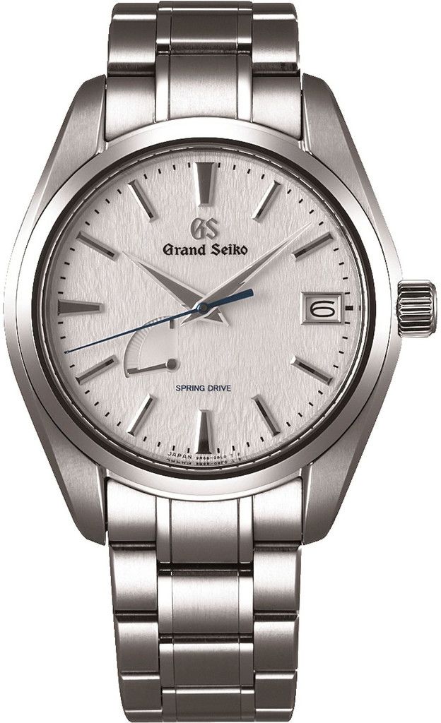
That said, I wonder if I can get a discount on that SBGX115 with the "old" dial?


One of the best watch faces of all, well it used to be....

I'd beg to differ. I am a fan of Grand Seiko but that is despite the tautological branding which they now appear to have tidied up.
That said, I wonder if I can get a discount on that SBGX115 with the "old" dial?
I'm so used to the dual branding that it just looks like they forgot something now! Absolute class watch this. Gorgeous.
It's more due to the different style of pictures I think, although it takes some getting use to the reduced text.
Sent from my Moto G (4) using Tapatalk
I think the old dial could be worth more eventually!Originally Posted by draftsmann

Sent from my Moto G (4) using Tapatalk
The first is a far superior photograph, which skews me in its favour.
Sent from my A0001 using Tapatalk
Prefer the old one by a mile (difference in photo quality or not).

I would take either...
Sent from my HTC One_M8 using Tapatalk

New style is much better.
It seems to me that there is a lot more texture in the zastrugi of the original dial. Perhaps that is misleading, but I prefer more texture.
Dave
Looks better at an angle in their video, though briefly and at low resolution. But I must admit that in that straight on shot the various elements do feel a bit like they're floating about and need to settle, maybe the sizes of the logos / writing could do with a tweak. You'd probably need to see one in real life to be sure though, things do look different at different scales.
Mostly the re-brand seems to work. I'm interested in seeing how it works across the rest of the range, especially on the basic 9F quartz models. Hoping I won't like it too much more than my current one, GS has turned out to be an expensive enough hobby already without the cost of a cosmetic upgrade.


The first picture is magnificent. While I'm generally a fan of less is more I think the new dial will take time to grown on me.
Sent from my iPhone using TZ-UK mobile app
I'm ambivalent about the new vs old branding; just wish they'd lose the power reserve indicator.
Old styling for me. The new May take time to grow on me..
looks like wallpaper my mum used to have, I didnt like it then.....
Feels like the power reserve is throwing it off, there's less of an issue on this model: http://www.grand-seiko.com/collections/SBGR305/
In the older model it's hidden more by the clutter of the writing, though in real life it's also much less prominent than it appears from giant macro photos, being tiny and blending more into the dial.
I have to agree with the statements that the dial looks as if they have forgotten something. Not a fan.

^^this. Of all the grand seikos it's this specific model that is the one for me if I ever own one.
Sent from my iPhone using Tapatalk
The Grand Seiko watches are a class act; can't get too worked-up about the writing on the dial. I mean , Rolex write an essay across their watch faces, and life goes on.
Ye. Not to mention the completely OTT 5 lines of text on the dial of the Tudor Pelagos in house
Sent from my iPhone using Tapatalk
New dial on the same watch looks horrible. It isn't just eyes adjusting. They need to redesign the dial entirely instead of just deleting one line of text and dragging another to the top. Based off the two pics I would go for the old dial every single time.
Interesting how some jump in with comments about Rolex/Tudor on a thread about a new GS Model:-)
I understand the reason for removing the Seiko brand name from the dial, but I'm not sure that the new version looks right.
The textured detail of the dial the applied markers and hands are all fabulous, but at least the text on the old dial draws your attention away from that god awful power reserve indicator.
Last edited by klunk; 25th April 2017 at 07:00.
I agree that the only thing needing to be removed was the power reserve. Without it the new watch (well both really) would look much better.
Yup, agree on removing the power reserve indicator.
Sorry. Given the content it was relevant tho, as it was a comment about the amount and content of text on the dial. Just giving another example.
Sent from my iPhone using Tapatalk
Trying to adapt a successful design is always going to be something likely to disappoint, as the important balance between the elements is lost.
For example: the reduction in the number of logos makes the PR more dominant, more of an interruption; the plain font for Spring Drive, when coming directly under Grand Seiko in gothic, contrasted with it - now it's on its own, it's looking very plain and a bit embarrassed.
I was attracted to Grand Seiko because I believed they represented the highest quality quartz, automatic and hand winding watches that I could afford to both buy new and maintain. I also saw their low profile brand awareness as a bonus. Never did I consider them the most exotic or desirable designs, certain European brands do that better IMO.
The 'Grand Seiko' and 'GS' logo in gothic type script are to my eyes, if I'm honest, something of a mess. I am open to learning what relevant cultural influence this typeface has to Seiko. Certain earlier GS models with a cursive script are more elegant. Citizen A660 Chronomaster models are a modern example of this.
All this wasn't enough to stop me buying mine, but they need to come up with something better if they are heading further upmarket.
I agree the original looks best. This Snowflake is the last watch I would ever sell. I just love it.
I like the power meter too. I think it suits the watch and the Spring Drive movement, especially when you hand wind it.
Just lovely.

Where did the OP's picture come from? I'm wondering if it's a prototype. While several models appeared with new branding on the promo video, the snowflake among them, they haven't yet made it to onto the GS website or to shops. I wonder if they are still considering the design challenges of various models as they roll the new style out through the range. Though obviously it would be highly optimistic to assume this is not the final design. Surely they can't wait too long either as sales may stall in anticipation of the new models.
Just remove the power reserve and either would be perfect
I don't disagree that the power reserve on the older models is not an issue; it's certainly less pronounced with the text next to it than on the new model.
Yes. Also the new model would look better without the spring drive text imo.
I used to really dislike the power meter, but I have gradually come to enjoy (controlled) asymmetry on watch dials and now like this element. The new 'SPRING DRIVE' text does however look rather lonely when seen onscreen, but may look better at real size!? I shall find out fairly soon (I hope) as I have one on order (actually ordered nearly 4 months ago, before several price increases and the new text).
Couldn't agree more. However - even if it's not the subject now - I welcome the new strategy of having only Grand Seiko on the dial. Makes sense, specially in Europe.
Sent from my SM-T230 using TZ-UK mobile app
I prefer it now, but I still can't get with that offset power reserve...
Prefer the newer version, the old Seiko GS Grand Seiko branding looks odd to me.

Much want!
Not spring drive but an example without the power reserve for comparison.

Same, i love the new direction. However I would have preferred "Grand Seiko" at the top, and the logo at the bottom. They can scap the spring drive designation also.
Remove the snow angel!?

Here's another popular model, the SBGM021 shown before and after:
There's subtle changes afoot such as a new sans serif type face on GMT and automatic.
The Grand Seiko Japan website now shows all the new dials.
Sent from my XT1562 using Tapatalk
Ah finally! (HERE)
As expected the popular basic 9Fs are now in a choice of 40mm or the original 37mm.
Seeing them all together, the change works well. And the snowflake looks better at a more sensible scale.
It works best for me when there's a bit of balance to the dial though, with a littlest more at the 6 side, e.g. this one.
and again.
Andy
Wanted - Damasko DC57
It would appear that the relatively new quartz divers (the ones with the Marmite-y bezel numerals) have been discontinued. We're left with only automatic and Spring Drive divers.
Perhaps the new style will grow on me, but I really do like the older dials..
A don't like the power reserve indicator on any watch face.
Damn it Mark, I am going to have to scratch that itch now!
Yes, I know the feeling. The bezel numerals had grown on me and I thought I was going to get round to one of those in due course.
If they were Rolexes then prices would rocket now. ;-)
I'm in the minority here but, for me, less is definitely more. I found the fact that the text 'Seiko' appeared twice on the dial was irritating. If 'Grand Seiko' really is an individual brand, the Seiko was unnecessary. After all, a Lexus is not a 'Toyota Lexus'.
 Posting Permissions

