

 Reply With Quote
If it doesn't say 'Automatic' then it must be Quartz...... That's why.


Really, I know it's a bit of information, but I honestly don't get why they feel obliged to plaster it all over otherwise beautiful dials.
The irony is, it tends to be the simpler dials that 'benefit' from it.
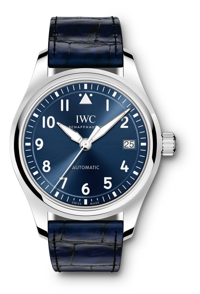
This particular one was sufficient to put me off buying this otherwise beautiful watch altogether:
And these guys can get it right:
(I know it's on there, but it's so small as to be practically invisible)
I don't think any of those is enhanced by having the word on the dial. And I certainly don't think that symmetry is a good reason for doing it.
It's not an evocative or romantic word like "Chronomètre" or "Perpetuelle" or "Superlative", words which I can kind of understand manufacturers wanting to adorn their dials with.
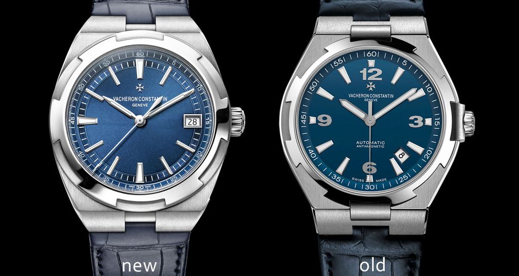
Notable mention goes to VC for realising the error of their ways
If you're interested enough to wonder whether the watch is an auto, a manual wind or a quartz, the chances are you'll already be aware for that model anyway.
Does anyone think that the word still has value on the dial?
If it doesn't say 'Automatic' then it must be Quartz...... That's why.
For a Citizen or a Seiko on sale in H Samuel then yes, I get that. But on a Panerai or an AP?Originally Posted by Jim W

Maybe it is superfluous on a Panerai or an AP. But Joe Public doesn't know that, and the manufacturers are always looking for new converts.

Pity the poor VC collector trying to remember which, if either, of these is an auto
Pure hell :(

I agree with the OP statement, they ruin some beautiful dials with "Automatic" on them.
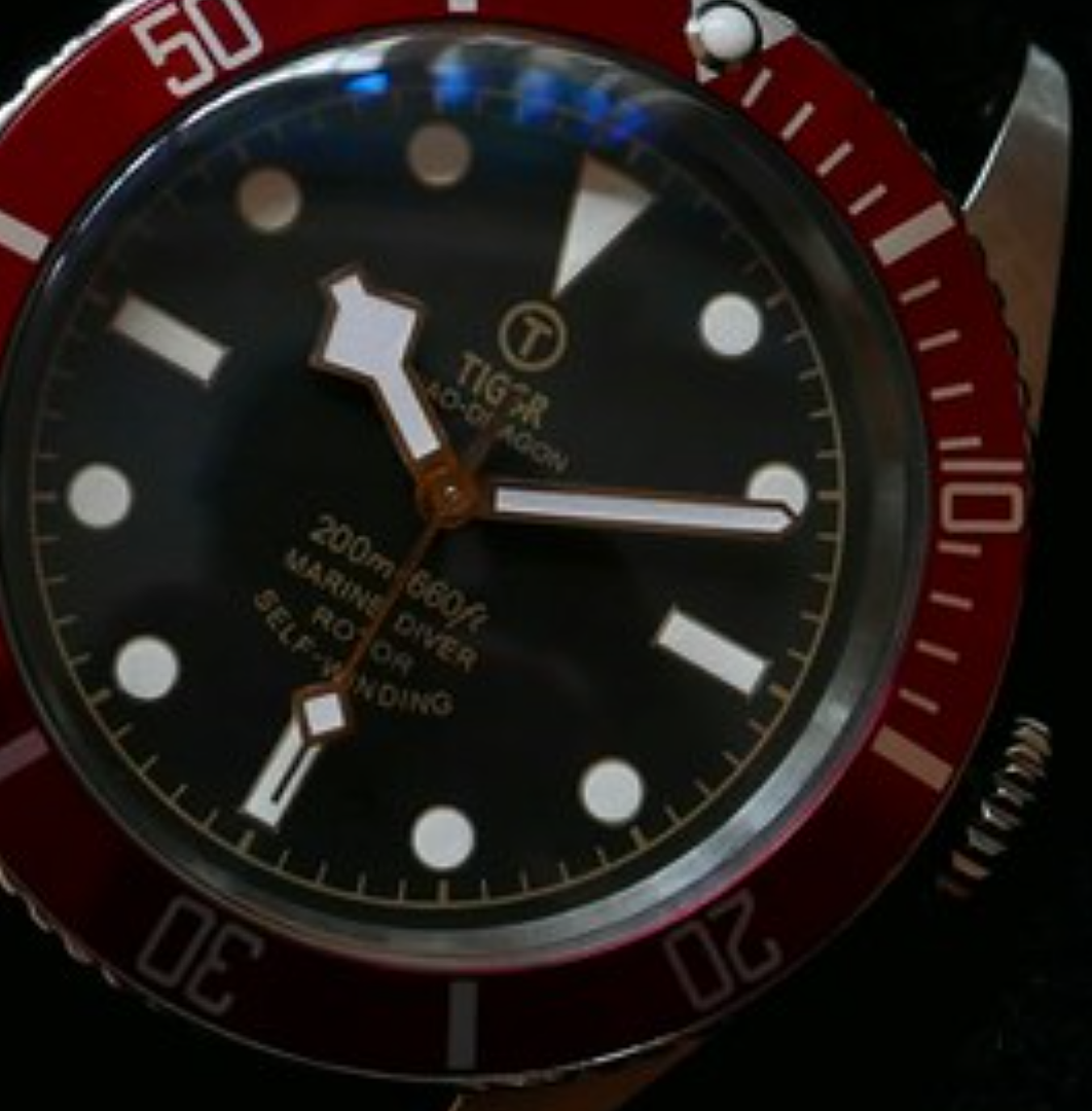
For example the new Tudor Black Bay now has "chronometer officially certified" plastered all over it and the older dial has less text and is far nicer.
I like there to be some text on the dial, but yes, it can go to far or be too prominent. The ones which always make me laugh are where they feel the need to write "sapphire" on the dial as if that were the only redeeming feature of the watch. Always space on the case back for unessesary information.
I don't mind it on a dial, the germanic "Automatik" on a Sinn 556i is quite endearing.
Too much text I object to, e.g. Tudor Pelagos
Dave
Sent from my iPhone using Tapatalk
And those pics could almost make me wish for a dress watch!
Dave
Sent from my iPhone using Tapatalk
I see there is a unused space for one more line.
Automatic For The People
Give Me Self-Winding Convenience Or Give Me Death
'Automatic/ique/ik' are all good, along with 'electronic' and 'quartz'.
'Metres/feet/atm' also good.
Anything else feels like putting 'GTi' on the dial IMHO. All completely subjective though.
Is that a quote from an American president?
A bit Eddie Izzard
https://m.youtube.com/watch?v=rMMHUzm22oE
Sent from my iPhone using Tapatalk

Automatic on a dial? Rather have a holiday in Cambodia.
Each to their own but I prefer the word automatic on the dial to one that is too minimalistic. I think it adds balance to some dials. I suppose it doesn't have to be the word 'automatic' to achieve this but I agree with one of the previous poster's sentiment in that there are only so many words you can get away with on a watch until it becomes tantamount to 'GTI' or the like.
It's marginally more useful than the fashion for regulator watches to have the word Regulateur on the dial.

Aesthetic balance I would say. That VC ^^^ without any text below the hands looks a little lob-sided IMO.
"Oyster Perpetual Date Superlative Chronometer Officially Certified"

It could say
Watch
Rotating bezel
Made of metal
It's about balance, designers think the dial looks better with a logo above centre and text below. So if text is required to create balance there few options to choose from: model name, water resistance, movement type.
I agree that too much text is a very bad thing! People hardly need reminding about the features of their own watch and their friends (if they have any), couldn't care less about the weird habit of wearing old-fashioned, clockwork watches.
I understand that faced with the potential collapse of the luxury mechanical watch market, the next Rolex sports watch will have on the dial "Oyster Perpetual Date Superlative Absolutely Super-Spiffing Chronometer Officially Certified And Much Better Than Your Watch And It Cost More So That Makes Me Better And Richer Than You"
Because of this it will be 75mm diameter, machined from 999M steel and the entire crystal will be a cyclops magnifier. The bracelet will be fitted with the familiar Glidelock clasp and should retail for around $20,000 with a waiting list of 15 years. Form an orderly queue.
This
A bit cheesy, isn't it?:-)
Awesome, where can I add my name to the list?
Sent from my Pixel C using Tapatalk
I'm already on the list at my AD. Second, apparently!
I prefer the legend "Rotor - Self Winding"
Yes please, could you let me know the model?
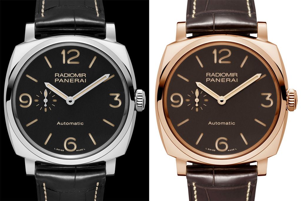
With the PAMs from the OP's picture I get why, as the there are similar Radiomir which are manual wind. The one on the left looks like a PAM00620, if it is, it is the slightly thicker automatic version of the PAM00512 manual wind. Which incidentally, the latter, is the one I went for, after comparing the two side by side. The slimmer case, plainer dial with a 'better' movement won out.
Last edited by nunya; 28th March 2017 at 08:51.
Whilst it doesn't bother me normally...
The 'Automatic GMT' annoys me on this watch.
I think it's the GMT text that tips it over the edge.
I know it's a GMT I bought the watch.
John
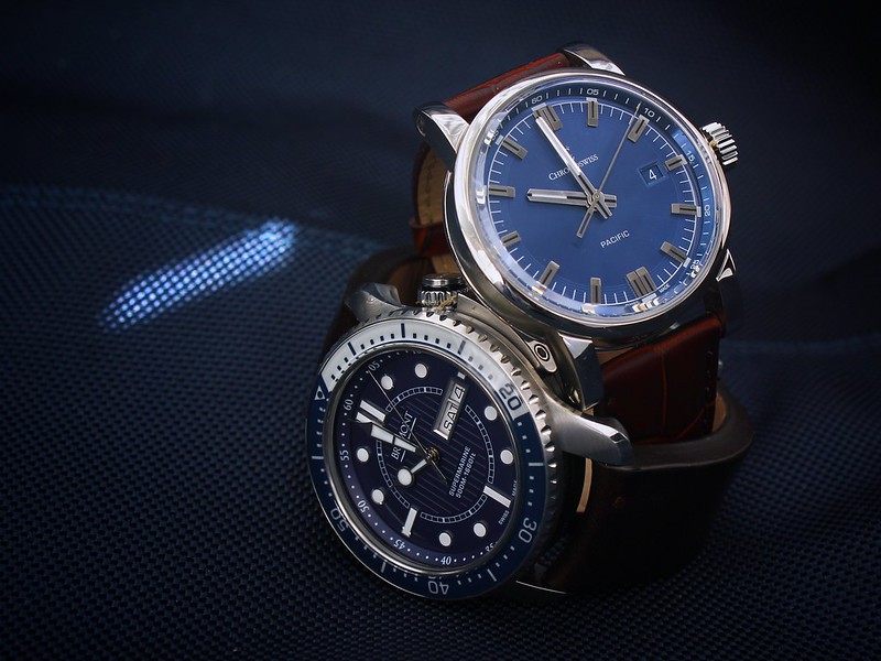
Not sure either of these are quartz...
z
Last edited by zelig; 28th March 2017 at 11:52.
I've never really understood it but it often doesn't bother me, unless it's huge and glaring like the new Cocktail Time at Basel.
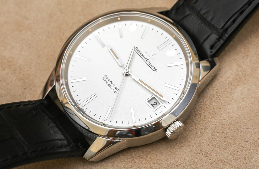
I do appreciate that JLC didn't do it on the Geophysic though. It's an automatic, but ticks at 1hz, and doesn't say automatic on the dial...I'd happily have everyone think I was wearing a quartz
You've seen a Corum bubble, I take it.
The Max Bill auto says
JUNGHANS
AUTOMATIC
The manual says
JUNGHANS
design
Don't know what that proves
With display backs is it really necessary to have 'Automatic' on the dial or is it law perhaps in swissland ?
in the 1950s or 60s having Automatic added a certain Caché to the watch as most were inconveniently manual wind
now its the opposite
Now that is cool!
A complication that makes it tick true seconds like a quartz.
Rolex had one too. An MD´s watch pre quartz. Nowhere near a stylish as this JLC.

FIVE LINES for the love of GOD!
Cringeworthy - that's all I have to say.
You see the same with cars, especially mid range cars - 4x4, or I remember some cars in the 90s having an 'airconditioning' badge on the back.
Cat or Catalyser were quite common too
Schofield nail it with their new Daymark - even their name is hidden on the dial & certainly not an automatic in sight !
http://schofieldwatchcompany.com/shop/daymark/

Last edited by MB2; 28th March 2017 at 16:44.
I prefer seeing the word "Automatic" on a dial as opposed to "Quartz" though as I feel the latter is often unnecessary.
"Automatic" might be shown on less expensive examples as it will easily distinguish from their Quartz counterparts? Just a thought...
Sent from my iPhone using TZ-UK mobile app
As you say the text is often so small it's just a blur to my eyes anyway so why not just leave it off.
It's a Patrimony Traditionnelle Small Seconds, Paris boutique edition (75 pieces)
 Posting Permissions