Reply With Quote
I'm regretting it now...Originally Posted by paskinner


Why be bothered Tony if YOU like it, YOU appreciate and have it for YOURSELF?!
The real irony would be illustrating that you are bothered by it.


I'm regretting it now...

Uffff, and some HP brown sauce...
But just the idea of the smell gave me acid.
The aquanaut I sort of like.
Problem is that it comes with a PP engine and even in quartz that means being held over a barrel for the maintenance.
Buying a 'replica' with a no worries quartz would solve it but the price of wearing a fake image is heavier still.
Imo PP is like that breakfast; ever soooo rich but....
The HP brown sauce btw is now produced by Heinz in the Netherlands, basically a replica with 'fake' branding ;-)
which becomes even more poignant when you realize what the 'HP' stands for.
Last edited by Huertecilla; 22nd February 2017 at 11:43.

Not that I will ever be in the position to get one, but I don't find them ugly. However, there would be plenty of other watches I would pick over them. I just do not click with most high end brands. Which is a bad thing as I lust after watches that are either just out of reach or well within reach!
Jeepers, I'd be interested to see the reaction if a bunch of Nautilus owners singled out a particular watch at the lower end of the price spectrum that was owned by a number of members of the forum and dedicated a thread to ripping it apart and questioning the character of the owners of said watch. Pretty unnecessary, no?
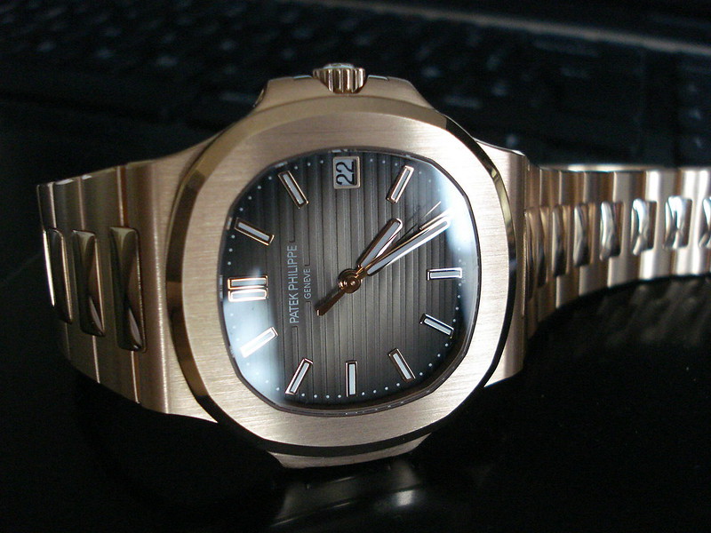
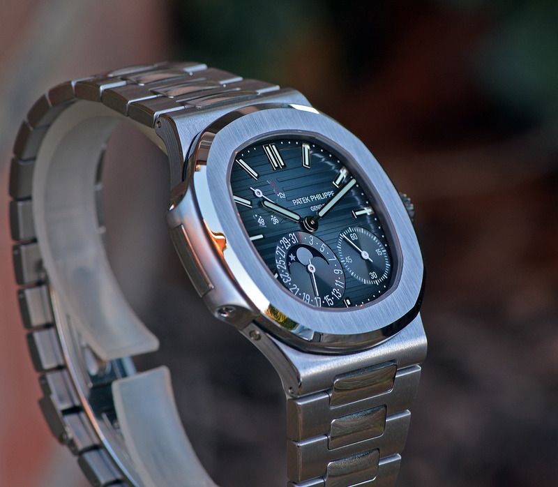
Hmmm. This is a very alluring piece. Beautifully shot too.
In spite of the potential for trolling and bruised feelings, there's a genuinely interesting side to all this. If so many people find the Nautilus 'ugly', how did it end up being one of the most expensive and desirable watches out there? Partly it's due to the era - many 70s designs are a bit challenging, and in that decade the design may have more obviously read as cool and luxurious. Changing it over the years would have been a bad idea as it would lose touch with its heritage, and no longer function as a symbol of its own success.
But in any case, why would they change it? To become an icon, a design must be unusual and have extremely recognisable elements - the ears of the Nautilus, the octagonal bezel and hex 'screws' of the Royal Oak, the Rolex cyclops. It's these unusual elements that people often react to, and they're criticised for deviating from the standard perfect form of a watch. But without them the watch wouldn't be interesting or memorable. Genta in the 70s had a genius for creating watches that were not just unusual, but were the kind of unusual that might just be very, very expensive. And being unusual and recognisable, they became not just expensive watches, but also universal symbols for expensive watches. They go beyond the beautiful or ugly, they have a pure desirability to them, they symbolise desirability.
The slight 'ugliness', or brutality, is part of the recipe that makes that possible. It's often suggested that these watches (I'll include the RO here) are so beautifully finished that this overcomes the 'ugly' design somehow. But this is missing the point. The slightly brutal, tough side, the engineering that's so plain to see, gives them a masculine edge that brings out the flavour in the fine finishing and contrasting surfaces, and vica versa. It's this contrast between something very refined and something tough and masculine that is the essence of these watches, in the same way that contrasts bring out the flavour in all art forms. Without the 'ugly' side, they would be far too pretty, sparkly and feminine, like wearing a diamond bracelet.
It's hard to appreciate any of this from a photograph though - you need to see it in three dimensions, to understand how the light moves over the surfaces, to realise how unexpectedly thin the watch is, to see the dial changing. Then instead of finding it ugly, you may realise that the challenging, 'ugly' elements are an essential part of an excellent recipe. In the end it's the kind of 'ugly' that looks very at home on the wrist of someone who may own a yacht or two, and somehow Genta knew that.
Fortunately they're a touch large for me, which is a relief all things considered.

Last edited by Itsguy; 22nd February 2017 at 14:11.
I don't find them ugly at all and i like the history of PP and the quality BUT the issue i have with say the 5167a which is the one i wanted to buy is that when i went to try it out it was too small.
However this is an issue i have with many watches.
Many people find Casios ugly but i love mine.
Wow... some intelligent and thought provoking commentary... what a treat! Good post sir.
My guess is that the enduring fame of the 5711 is because it is close to being the cheapest Sports Patek.....it is the incredible power of the Patek name that works the 'magic', not the design of the Nautilus itself .
You get the contradiction that the watch is, arguably, badly over-priced . But at the same time it is a world champion of retained value. Which makes it excellent value. A series of contradictions.......
For most of its life, the Nautilus was the ONLY sport Patek. There's only two currently and the Nautilus line is the more expensive one. Gerald Genta watches appeal to a lot of people. It's absolutely not an "entry level" thing.
And, a load of BS.
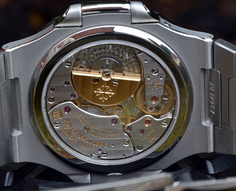
A bit harsh I'd say. They do have top notch finish, a pretty movement and the added value of the brand name may not be tangible but IS very real.
I 'm not particularly attracted to the PP sports range.
In my opinion they have much nicer stuff up for sale.
However to each as he / she likes it...
Didn't know what these were butt I've had a look and they are a peculiar looking beast aren't they, not for me but I wouldn't say ugly
Sent from my Lenovo YT3-X50F using Tapatalk
So...if you were given the choice between the Rolex Daytona 116500 or a PP 5167/5711/5712 then what would you take? Only catch is this is being gifted to you and you're not able to resell/trade it at a later date.
With current prices, it's amazing that a Rolex Daytona 116500 is practically the same price as a PP 5167
I would (actually did) pick the previous version Daytona over either. It's a robust watch, with a super durable movement, an adjustable clasp, service is reasonably priced and doesn't take 9 months unlike PP.
A Sport Patek would make a great 20th watch in my collection, but I'm not at that point yet.
Today I photographed a 5711 for a magazine feature, first time I have been up close and personal with one and all I can say is what a beautiful piece. It looks great on my slim wrist and I would have one in a heartbeat if I could afford it. Has to be steel and that blue dial, all the others are just extra fluff that's pointless. (IMHO)
It really is a great design, surprised at how slim and light it felt on the wrist.
Id have the 5711, that's where I put my money, and I've ordered a 5167. To be fair, I already own my favourite Daytona though - but I'd still have taken the 5711.
It's just a matter of time...
5712, 5711 and 5167 in that order. The Daytona way after that. That is what I did. I might yet buy the Daytona. The 5167 is since promised to a member.
For me 5711 and 5712 about evens - the 5711 is probably the sensible choice, then 5167 and 116500 probably about evens too. I'd keep the Platona over all of them though.
Podium shot...

Last edited by cmcm3; 22nd February 2017 at 23:40.
5712, 116500, 5712, 5167 in that order
Andy
Wanted - Damasko DC57
Pics of my ugly watch
Last edited by andy tims; 23rd February 2017 at 11:56.
Andy
Wanted - Damasko DC57
and 10 Euros buys you more reliable, more accurate time keeping:
https://www.casio-europe.com/es/prod...on/f-91w-1yer/
and if you need more WR just add evo
Which illustrates that the podium dwellers are not about time keeping but about something else. So are they still watches* or ticking status jewelry?
*A watch is per definition an accurate time keeping instrument. The state of the minimum accuracy has for some 45 years now been +/- 15 secs/month.
Now, since the early eighties, the mechanical has been marketed as something else. That they are heritage, history. About time tothe implication: To differentiate luxury 'watches' from proper watches.
They sure are fugly

Awesome! That's a great trio. Given you have the 5712/1a, I would be tempted by the 5711/1r. Plus I love the diamond marker dial on the Platona. But...Awesome!
Very nice!
Never tempted to add an aqua?
Your definition of a watch as having to be accuarate to +/- 0.5 seconds a day is bizarre and unrecognisable to the majority of the world. Regardless, I have never claimed they are the ultimate time telling machine - I have no need for that level of accuracy. They are just things I like. Is that ok with you?
I bought them because I just genuinely like them. If that is as a result of some deep-rooted insecurity or inadvertent over-exposure to weird father and son adverts or any other character flaw one may wish to ascribe to the owner of such watches, then so be it... I'm 36 so I dare say there's f-all I can do about it now...
If I agree to only refer to them as "luxury watches" from now on do I get a pass?
Last edited by cmcm3; 23rd February 2017 at 00:32.
Thank you! I love the 5711r and was tempted by it instead of the Platona but having carefully compared and spent a lot of time considering the Daytona won that battle. I also seriously considered the baguette diamond dial Platona (I love how the baguettes look similar to regular markers) until I had the two in my hand at the same time and I instantly new it would be this one.
Much appreciated! Aquanaut is a tough one for me because I prefer the 5164 but can't get my head around the premium for the GMT function. And, yes, I do appreciate the irony of that statement before anyone chips in!
Last edited by cmcm3; 23rd February 2017 at 00:48.
I really like the 5164 and could do with a GMT, however I really dont like the way they incorporated the date. Kind of preferred they left it off instead of using that style!!
All this Patek talk has made me shoot off an email to see the status of my 5711 order!
Mmmm, it's the sub-dial that does it for me on the 5164 - different strokes!
Stay patient - it's well worth the wait for those that appreciate them. Finger crossed it won't be too long!
I had a 5711 in white which looked lovely in person.
Somehow I couldn't get on with it and was rarely wearing it and traded it for an ALS.
Still, I wouldn't call it ugly.
Patek sports designs are a little quirky and I can understand that they may not be liked by everyone.
I don't think one can have issues with that as everyone has different tastes.
What seems is churlish is to imply that people buy them just because of the name on the dial. Or the quibbling about the
Price.
Yes im trying to be patient :)
How on earth do you decide when to wear the 5711 or 5712? What a awesome problem!!!
I intitally lusted over the 5712 for a good year or two but by the time I consolidated 3 Rolex for my Patek fund and put my order in etc I had swung in favour of the 5711 by a whisker!!
Very few (nobody??) needs a moonphase or a power reserve display on their (automatic re: power reserve) watch. They are fun features and make the dial interesting but that's about it. So if you're so and so on the looks, given the price differential the 5711 is the more sensible choice. This is not a sensible hobby however...
@cmcm3
Ha...im glad I'm not the only one who's fallen for those father son adverts. The 5712 advert with them in the Riva is great
The further plot twist to my fatally flawed character is that I can't stand kids so these babies are going to the cats protection league when I'm on the wrong side of the grass!
Deleted
Last edited by Analogue; 11th September 2017 at 19:05.

You'll maybe enjoy this analysis of them then: http://the-toast.net/2013/12/09/you-...ything-really/
Just sent this to the other half. She didn't find it funny. WIS based humour is clearly wasted on her...I burst out laughing on the tube.
"The old man will go out the window. Goodbye, old man."
My favourite line: Look at this disgusting, insipid boy
I bought an historic rally car with my 13 y.o. son and we drove it from Rotterdam to Malaga. Done an awsome raid together and currently together preparing another oldie for a raid this year.
The expense would buy me a Patek per year.
The cars will probably be net more too if we would care to sell them.
I have no doubt which quality time and a heritage he chooses and will treasure all his life.
Good for you. Each to their own. Not sure what is has to do with the principle underlying the OP though.
Euh, you are forgetting
1. that half the world population is female and VERY few of those would care for a watch less accurate than that.
2. that the vast majority of watches has a qco with that accuracy
3. how many of the F91-W family Casio sells for no worries accurate time without need to reset
4. that it is the minimum standard since the early seventies
Almost. 'Watches' between brackets and we are on the same page.If I agree to only refer to them as "luxury watches" from now on do I get a pass?
Now there are also luxury watches; as in luxury statements AND accurate but those are uncommon unlike during the seventies, early eighties. Hayek and Biver truly pulled off a master marketing trick.
The old Stern btw was one of the keenest pushers of quartz oscilator development. He was a true horologist; striving for the most accurate technology: Patek were the world leader at one time but when his son took over the development was abandoned. He concentrated on the way more profitable ljewelry 'watches' and after mounting their crop of the Beta21s in men's watches, they only produced some small calibers for ladies' watches.
So the only luxury men's watches with the PP brand one can buy are those seventies Beta21s.
Imo the distinction is something WISdom dearly needs. Your remark about the accuracy illustrates that understanding of horologic technology is just about down the drain nowadays. The 'I' has just about eliminated the 'S'.
Last edited by Huertecilla; 23rd February 2017 at 10:36.
With respect - but I think you are going WAYY off the reservation with your last 2 posts! My OP had nothing to do with watch affordability or accuracy - purely aesthetics. With hindsight I should have used more 'diplomatic' language (e.g. 'really unattractive') as I have obviously upset some owners. I wasn't expecting current owners to agree with me of course!
Responding to the off spring element in PP marketing mentioned and to the point of time keeping. The latter used to be a main thing in PP. That stopped mid seventies and is sadly just about no longer part of living wisdom memory.
Time keeping is no longer the primary thing; the branding, image and looks have taken over. Imo it does a great injustice to horology; the science of measuring time to perceive the luxury products as 'proper' watches instead of a primarily jewelry.
Because of its history PP is imo THE example illustrating that.
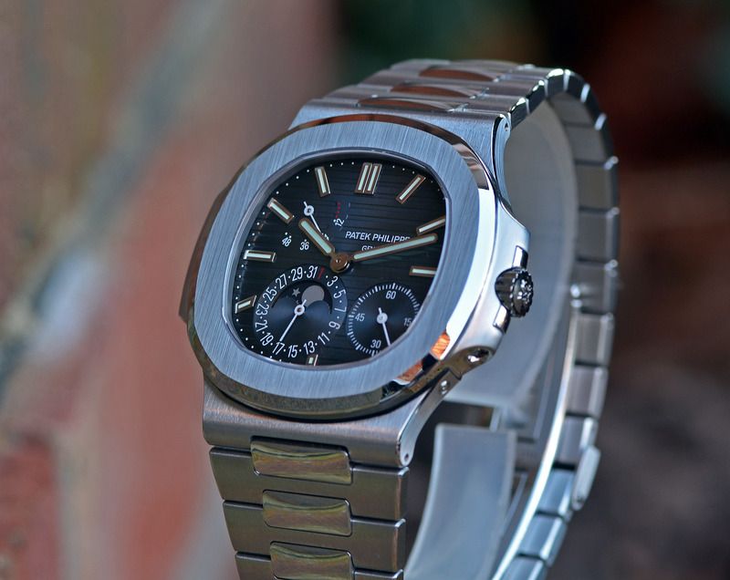
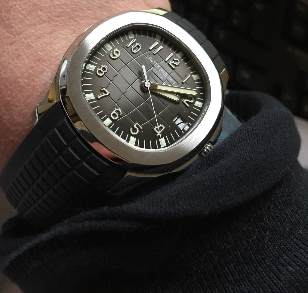
Heres mine.
I love the light play on the dial, the shape and retro-ness, the calibre of finishing and the rubber strap adds an element of different away from oyster bracelets.
I'm usually a Rolex or Panerai wearer and have no qualms about wearing them for anything but I'm aware of the aquanaut because it feels a lot finer and less bombproof in comparison.
Its timekeeping doesnt noticeably deviate unlike mine which ranges from late to very late.
I reserve the right to buy and wear what I want. It's a shame that those who do buy and wear what they want have to endure biannual lecturing on the subject in the lulls between finishing off cats and acquiring transient women.
There's a second element to the definition of horology which is the art of making clocks and watches. And in some cases it's art over soldering. Tough.
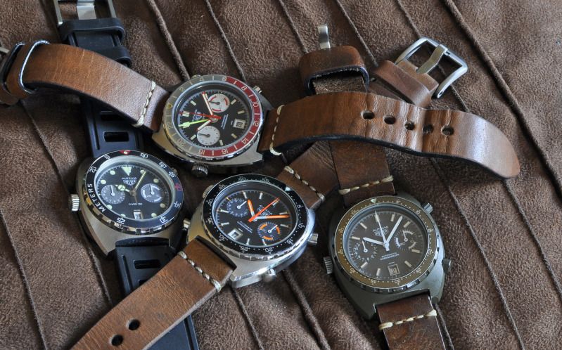
These are cracking pictures.. like I said not my cuppa I'd have the Daytona given the choice. I'm a right philistine around here anyway because I live vintage heuer and tag heuer watches of all ages... So the reason I don't like PP is probably due to dodgy taste in watches lol
Sent from my Lenovo YT3-X50F using Tapatalk
Quite partial to the odd Heuer myself too
Andy
Wanted - Damasko DC57
 Posting Permissions