closing tag is in template navbar
timefactors watches


TZ-UK Fundraiser
Page 3 of 3 FirstFirst 123
Results 101 to 113 of 113

Thread: Watches you'd like if it weren't for one detail

  1. #101
    Quote Originally Posted by galewis View Post
    I'm not quite sure what you mean by '..it's so it's lined up with 4:30', but I thought the reason why the window doesn't fall exactly between the 4 and 5, is that the date wheel is slightly too small for the case it's fitted in.

    It's one of my pet hates and you see it a lot on budget boutique divers.

    Gary
    It's because they're too cheap or careless to get a date wheel that's printed at the correct offset for a 4:30/135-degree placement, and just use a standard one that's meant to align at 3:00/90 degrees which ends up being at an oddball fraction-of-31 angle.

  2. #102
    Master
    Join Date
    May 2014
    Location
    West Yorkshire
    Posts
    1,788

    Watches you'd like if it weren't for one detail

    There are many for me like most on here. One I don't like that hasn't been mentioned is the Omega Aqua Terra with an arrow head on the minute hand and not on the hour hand. It just looks odd to me.
    Sometimes I read these types of threads and wonder how we find watches we like.


    Nice though
    Last edited by oiljam; 13th January 2017 at 18:15. Reason: Photo added

  3. #103
    Quote Originally Posted by Miocene View Post
    Actually, I've come round to your way of thinking in the past couple of days. It almost should be a mess, but it manages not to be.

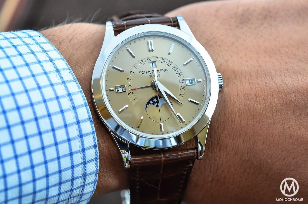
    As for the Patak, I've never noticed the reduced size of the 5 and 27 before. Probably related to never holding one, but I do think that would annoy me every time I looked at it.
    Though I'm not so keen on the mustard lume, I think Breguet did a pretty good job with the type elements.

    Regarding the Patek 5140, the problem goes far beyond those crudely-shrunken digits. The entire result is a textbook example of what not to do, from the clumsy stretching distortion, to the sloppy alignment, to the type selection itself. (Arial and Calibri: because nothing says "$100K-level attention to detail" like evoking a default Excel spreadsheet.)

    It can't even be called amateurish, as anyone with even a passing interest in the craft of lettering and typography would know to avoid these blunders. What's really difficult to understand is how a family that made its money from selling high-grade dials a few generations ago could demonstrate such complete incompetency in one of the most essential skills of dialmaking.

    It's a pity, as the lovely 3940 that preceded it had the masterful hand-lettered work that you'd reasonably expect in a quality watch of this type:


    So there's a prime example of one detail that ruins a watch. :)

  4. #104
    Grand Master Der Amf's Avatar
    Join Date
    Oct 2015
    Location
    UK
    Posts
    11,974
    You can be sure that I'll never buy a perpetual calendar whose year display fouls the date function ;)


    More relevant to my watch buying activities, hands with red tips get on my wick and all.

  5. #105
    benwoodroffe
    Guest
    Quote Originally Posted by MrSmith View Post
    Tudor dive watches
    if they were 1-2mm smaller diameter and thin enough to fit under a cuff then i would probably be wearing one right now.
    yes i agree, why are they so tall when they're housing ETA 2824-2 movements?

  6. #106
    Master WatchIng's Avatar
    Join Date
    Apr 2015
    Location
    Rural Suffolk
    Posts
    1,238
    Any Greubel Forsey - except for the price!

  7. #107
    benwoodroffe
    Guest
    Quote Originally Posted by Belligero View Post


    German-manufactured products have been marked "Made in Germany" since 1887, even the domestic-market-only ones. There's no "Hergestellt in Deutschland" label.
    "Swiss made" isn't exactly Swiss speak either.

  8. #108
    Grand Master Sinnlover's Avatar
    Join Date
    Sep 2014
    Location
    London
    Posts
    11,095
    Quote Originally Posted by benwoodroffe View Post
    "Swiss made" isn't exactly Swiss speak either.
    The majority of Swiss watches don't have two languages on the dial though.

  9. #109
    Master
    Join Date
    Oct 2002
    Location
    Leicester, UK
    Posts
    7,995
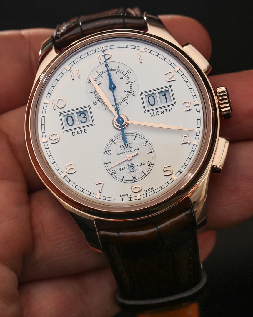
    Dials that have to explain themselves ... every time you look at them ...


  10. #110
    Quote Originally Posted by Tinker View Post
    Dials that have to explain themselves ... every time you look at them ...

    Ha! I think that's the winner!

  11. #111
    Grand Master Saint-Just's Avatar
    Join Date
    Apr 2007
    Location
    Ashford, Kent
    Posts
    29,025
    Quote Originally Posted by Tinker View Post
    Dials that have to explain themselves ... every time you look at them ...

    Funny that. I was trying to imagine the same watch zeitwerk style where the left windows would be the hours, the right ones the minutes, the short hand the months and the minutes hand the day of the month, with a dial printed accordingly
    'Against stupidity, the gods themselves struggle in vain' - Schiller.

  12. #112
    Master Timelord's Avatar
    Join Date
    Dec 2002
    Location
    Wales
    Posts
    5,767
    The new Stowa logo. Why on earth did Jorg Schauer decide to change it?

  13. #113
    benwoodroffe
    Guest
    Quote Originally Posted by Sinnlover View Post
    The majority of Swiss watches don't have two languages on the dial though.
    Patek will often have Geneve (french spelling for Geneva) and Swiss (English spelling for Suisse) on the dial.

Posting Permissions

  • You may not post new threads
  • You may not post replies
  • You may not post attachments
  • You may not edit your posts
  •  

Do Not Sell My Personal Information