
 Reply With Quote
I couldn't agree more.
*sorry for the poor quality photo!


always is a good thing.
I couldn't agree more.
*sorry for the poor quality photo!
Likewise - from the current crop...
( Improvised light tent with a notepad in a hotel room)
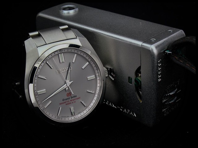
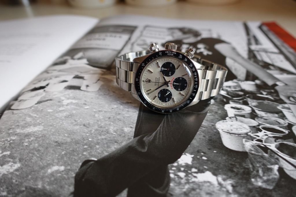
Plus this beauty ...
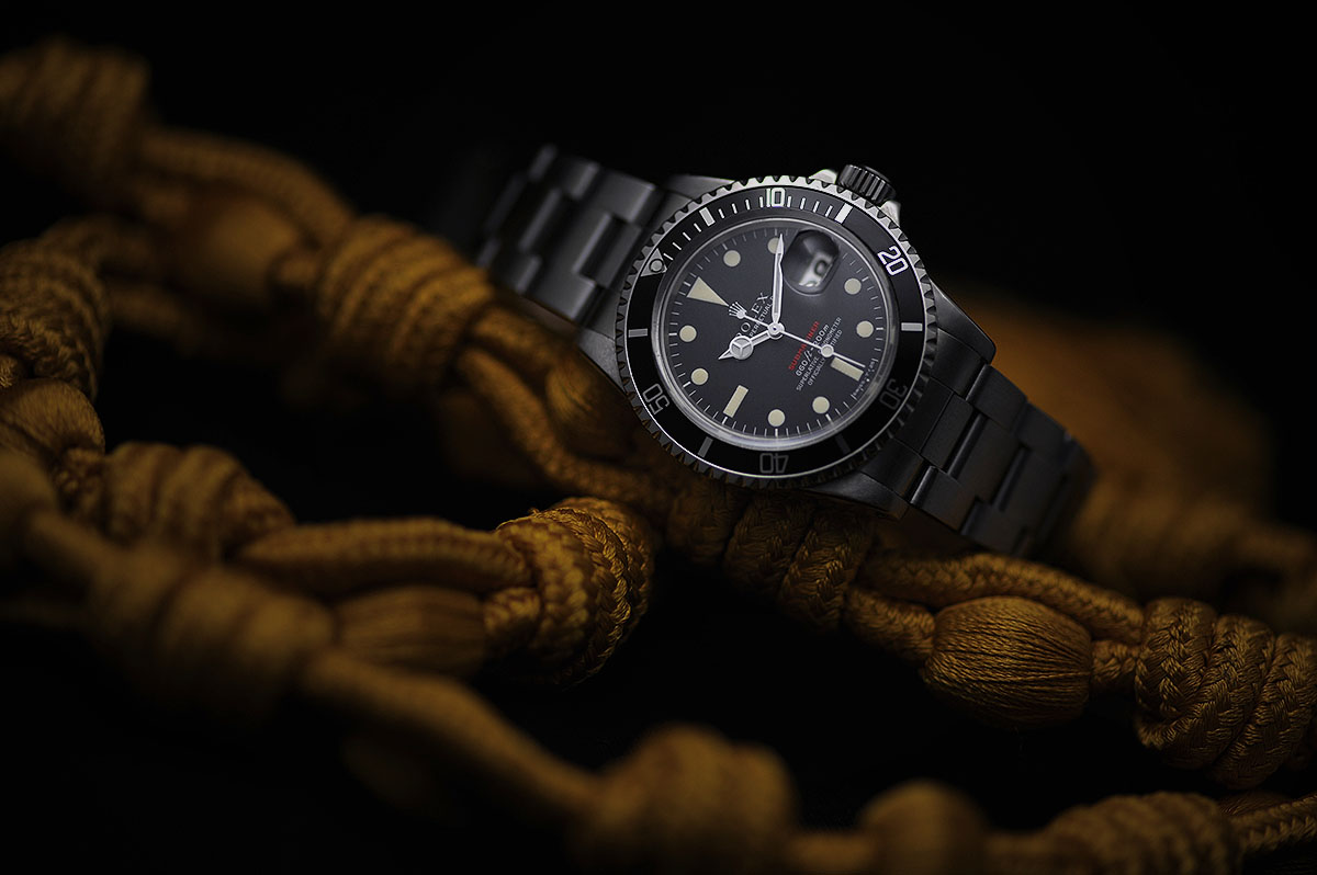
And this...
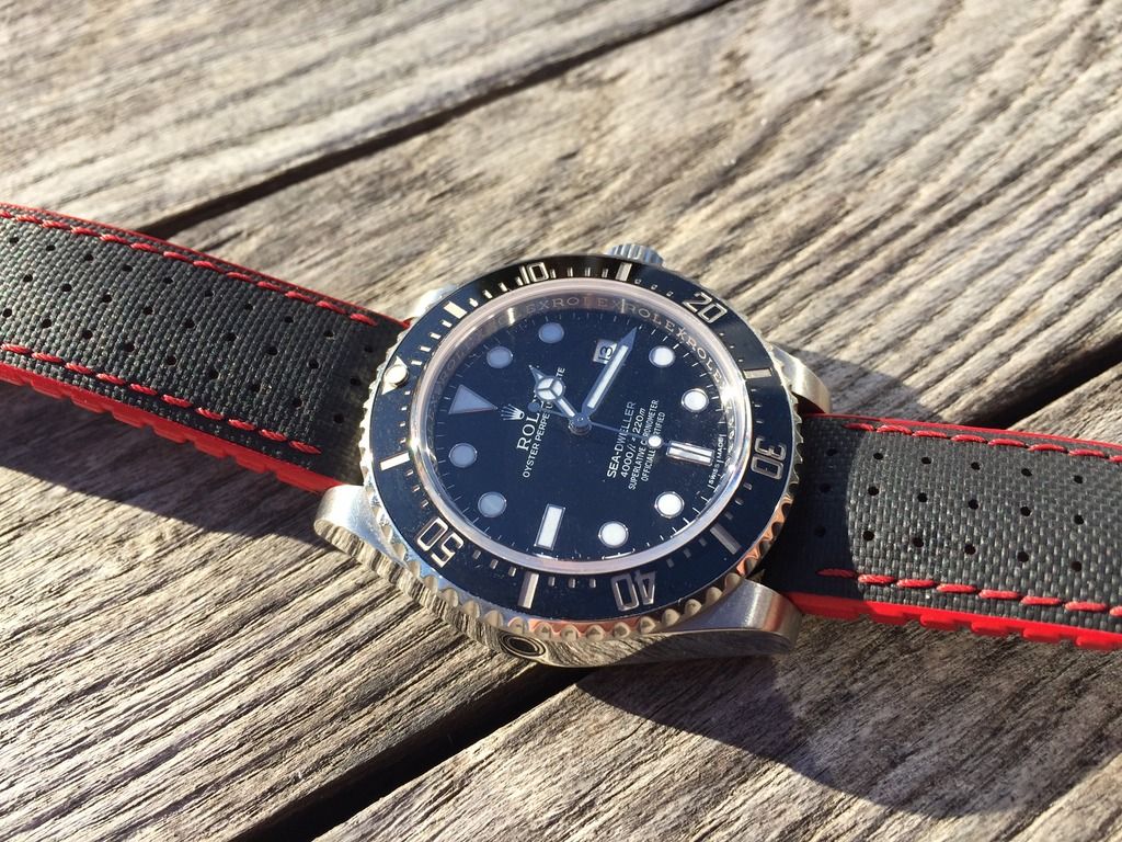
... & a more rugged model with a splash of red...
It would appear I am in agreement
z
Last edited by zelig; 10th November 2016 at 16:28. Reason: i realised I have a couple more with a bit of red
Agree.
Yes, couldn't agree more


What a beautiful watch!Originally Posted by MrSmith

Yes
And yes


perfect dash of color while keeping classy. not overdone.
some lovely pieces of horology.
Stunning photo! Watch is a beauty too.
Not quite in the same league (watch or photography) but here's mine
Sent from my iPhone using Tapatalk
hope that it is not too much

Agreed.
[IMG]free upload pictures
Agreed, just a touch of red is a very good thing!!!
(Sorry about the hasty iPhone pic)
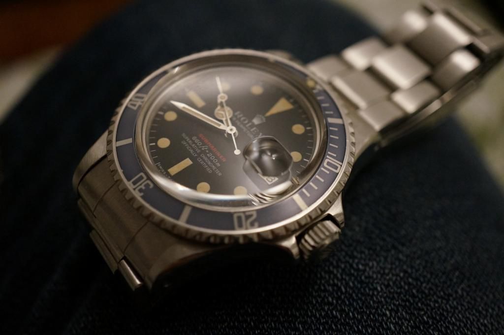
That top Rolex is stunning!
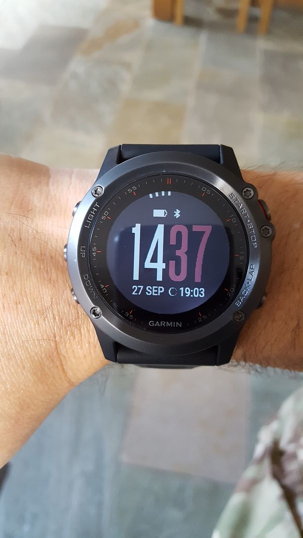
My Garmin Fenix 3, does that count
Excellent, I particulalry like the red date wheel you added to the YM, keep wondering whether to do it to mine....
Unfortunately it came with a security guard and had to be given back.

Just a touch
Sorry to be a nay sayer here, but to me, having just one little bit of red looks odd on some of these watches. Eg on Jocke's Sub, just having one red line of text looks out of place. Red accents / text / whatever are fine, but they should be carefully used to give an integrated consistent effect IMHO.
When I want a touch of red, this is my option:
But if more red is needed:


And here I thought this would be a pro-Trump thread!!!
Ok I admit the strap may be a bit much

A touch of vintage red...

Those 3 are crackers...
I nearly forgot about this one - only just a touch !
A touch of Precista Red

1958 Smiths

That's really thrown me, my Dad had one of these, he passed 40yrs ago when I was a kid but I remember that watch like it was yesterday.
Theyre getting hard to find in good condition at a reasonable price I think
This one is on its way to me at the moment - I'm keeping my fingers crossed that its a good one
Can you see the red...?

The Red makes all the differences
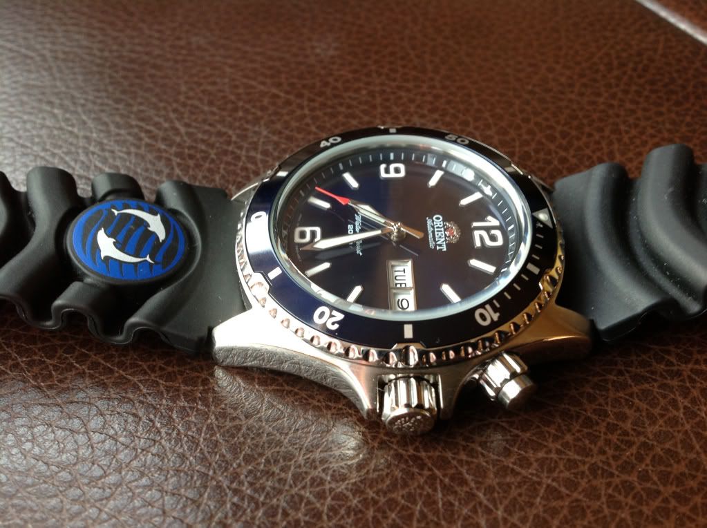
Heres my SD4000 on a Hirsch Robby
Bracelet is going off to the valet man.....
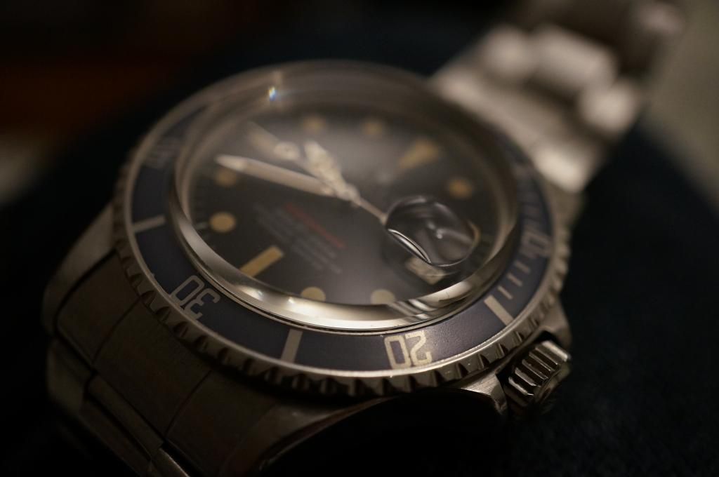
One of the nicest red Subs I have seen.
Would love to see more pics.
Roamer Searock
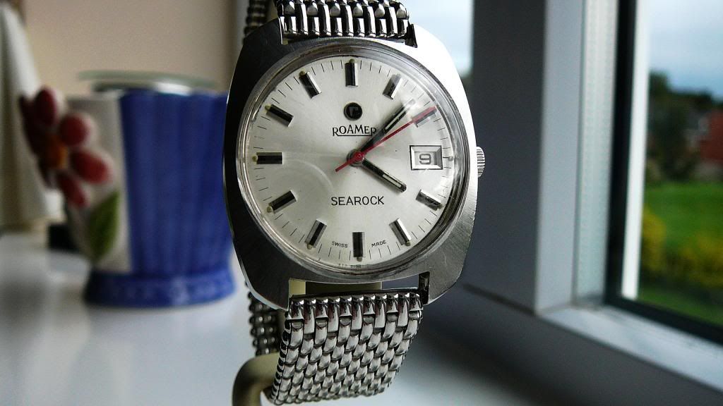
Here you go Sir
A bit more red.

Great watch collection, especially love the oris 😍
A lovely thread!
FMF
Like your forum name, or is it your real name..........
Here is my bit of red anyway
Great replys and some great pics.

Sent from my iPhone using Tapatalk
 Posting Permissions