

 Reply With Quote
How many people who buy it would actually use it for diving? Very very few I suspect.
Sent from my iPhone using Tapatalk


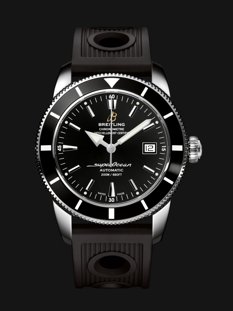
As you may know I am a great fan of Breitling having had a few and still own two. But I cannot understand them marketing an extreme diver chrono with NO BEZEL PIP. What are they thinking!


How many people who buy it would actually use it for diving? Very very few I suspect.
Sent from my iPhone using Tapatalk
Still it would be nice to pretend that this was a useful dive watch.
Good looking watch! You aren't seriously expecting people to actually wear a WR 2000m watch in water are you???
Despite no pip, I think it's still a good looking watch, but then I do have a soft spot for Breitlings.
Sent from my iPhone using Tapatalk
Expect you are correct but a pip or triangle makes a more obvious start reference than a 60. Might as well ditch the bezel altogether.Originally Posted by jaytip

Why do they shove so much garbage and crap on the dial ? I'ts full as a full thing that....uugh !

Surely it is better than the ashtray-on-a-motorbike bezel.

At first I thought that was an Invicta
Sent from my iPhone using Tapatalk
I thought you were writing about the boss eyed font on the bezel. That would be laughable on a cheap fake.
If a pro diver probably never,if a rec diver probably never too.
I like a huge % on here buy a watch cos I like the look of it,not for what it does.....I didn't say all.
Before scrolling down I presumed the question was 'why so thick hands obscuring the dials on a chrono FFS?
Followed by 'Chrono diver WTF?'...etc

I like it.. just my 10 cents
And most probably wouldn't wear it in the shower!
I like the M1 more.
Hmm now you mention it......
Not a fan... But for me it's because of the crisp clean chrono vs the clumsy, wonky bezel digits and bracelet.... It doesn't work
Because they can....
This is the one I like Ti bumblebee M1 - discontinued but still available second hand.
Image from www

other than the crap looking numbers on the bezel i quite like it
Breitling. Meh since I've passed the puberty.
Kinda know what you mean i used to adore all Breitling when i was in my late teens and early 20s . now days the only one id actually buy is the Navitimer
If this is the "daftest bezel" thread, may I add this confused contender:
Paul
The breitblings bezel numbers are terrible, but that CW above is just ..........shitty!!!!!
mike
Breitling are just combining what the customer wants to show off all in one watch.
Edgy/sporty font on the bezel (gives the ageing man a feeling of youth), 2000m WR (just huge number to bragg about in the office), lots of busy pilot gumpf on the dial and what looks like a 4th hand...
All in a very wrong combination for me but no doubt they'll sell lots to the high street shopper..
Not only are the numbers on the bezel wonky but the overall size of the bezel, including polished internal edge, make it look over sized and the cluttered dial look even smaller than it probably is.
Unfortunately or perhaps fortunately, there are very few Breitling watches that attract me. I find most of their designs garish. Quite a few of the photos posted above thread illustrate this aspect.
Having no pip on a diver is in my eyes the least of Breitlings design problems.
Yep. Another reason I pass on modern Breitlings - those from their "golden period" (mid 90s to mid noughties) just walk all over these modern things, even in their sleep.
...but what do I know; I don't even like watches!
They appear to have so many variants of basically the same thing which is a very water resistant hybrid chrono / dive watch.
It would be interesting to see them produce a classic fleiger style watch, rationalise some of the Chrono's and push a tough sports watch in the AquaTerra / Explorer type mode.
Perhaps the risk is they'd just be like everyone else but at the moment it seems model after model are doing the same thing.
I know we have a spate of "Well hard diver types" on here, but really? Does the missing bezel pip REALLY matter?
Anyone who goes diving in this is PROBABLY going to be in crystal clear water in 20M tops...
It's NOT a tool watch, it's not going welding oil pipes in the North Sea, it's probably not even doodling around on the James Eagan Lane!
It's a fashion watch, like most others, that will be worn, at most, for recreational diving (or PR purposes).
If you can't see the bezel in the circumstances this watch will be worn, I'd be very surprised...
I like the SOH and I liked the very short lived Transocean (Date only), but I don't like all of Breitling's current output, but I can say that of most watch makers.
To be honest, I wouldn't buy this one, but not because it lacks a bezel pip!
M
Last edited by snowman; 7th May 2016 at 12:22.
Never liked Breitling until this.
Really tempted

i cannot abide a so called diver with no bezel lume, and also the font on that is horrible!
ktmog6uk
marchingontogether!
As I said above, I do generally think it looks good, though as others have pointed out the italic font on the bezel was a mistake.
For me, it'd be even better with white subdials (I have a weakness for Panda dials) and maybe even a 'pepsi' bezel, though I'm aware for those who already think its way OTT, either of those would make it even worse! I'm not one for understated elegance.....
Was just thinking that the font is like something out of a Hanna-Barbera cartoon... Sheitling does it again.
i can't get past the diagonal joints on the bracelet links

 Posting Permissions


