Reply With Quote
what?


Knowing the forum is teeming with techno gurus, can anyone tell me what the font used in a lot of TV titles, where sides of certain letters are flattened is?
e.g. a capital O looks like a sports steering wheel with a flat bottom, but rotated through 45 degrees clockwise, so that the flat bit is between 7 and 8 on the clock face?
OAP is all ears.

what?
Good luck everybody. Have a good one.
WTF?..

Stay off the sherry.
"Bite my shiny metal ass."
- Bender Bending Rodríguez
Can you give an example of a programme that uses it?
"Babe station 4PM pick me up 2-4-1."Originally Posted by Mr Tetley

"Bite my shiny metal ass."
- Bender Bending Rodríguez
What fresh hell is this?

Then imagine that some twat in a design department thinks that this inadequacy equates to style and uses the compromised tech for titles etc.
It's like brown paper spray stencils where letters and numbers like O 0 and 9 need little bridges to make them usable, but dumbed down for 21st century yoof consumption.
Edit: can't find strike through, so please read '12 year old editor' for 'twat'.
grey
This thread needs a picture. There are plenty of ways to play titles with Catch Up or iPlayer. Pause and snipping tool should do the rest.
Oh...strikeout is [s]###[/s].
Last edited by PickleB; 22nd December 2015 at 23:39.
For God sake grey, forget about telling waterbuoy37 to stay in calm waters, just name a bloody TV program which uses these fonts youre so keen to know the name of.
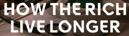
I think they were on a Ch4 prog called 'Why the rich live longer' tonight. Could of (sic) been on a commercial before though.
See, it all gets a little confusing when you are old like what I am, but thanks for your kindly worded offer.
So this:
...and I've no idea...but what the *&%$ were you doing watching that?
I'm a twat in a design department but I have no idea what that font is. However, I do have a super computer at work which can identify fonts so I will run the image through that tomorrow. Very kind of me (if I remember)
i recognise that font from my time at the font bureau. i think its called 'werthers original'
Good luck everybody. Have a good one.
Oddly enough I'm just watching C4 and notice it appears to be their current brand font as its just been on several "coming soon" adverts.
It's called Horseferry. It's the new c4 brand font created by Neville Brody.
http://www.dezeen.com/2015/09/30/nev...n-glazer-dblg/
Oh god. I'm a design geek.
I'm afraid that you may be. Then, working in a design department, is that a bad thing?
I am impressed that you have found its name so quickly.
Thank you mowflow, PickleB for your splendid efforts to help an old fart at Christmas; and I hope those moments of self-realisation won't spoil your Christmas.
And to Stoo for suggestions to search for. And to Seikopath for his intuitive suggestion (to quote John Lennon - 'you'll get yours yet, Dave').
And to all the other wellwishers on this thread.
'So it's called Horseferry, eh. Horseferry......... Horseferry?............. Horseferry Road............Horseferry Road Magistrates Court, May 1958................'and we're putting you away for the sake of all the sixth-form schoolgirls in the area, you dirty sod. Take him down'........Oh, Oh! Must have dozed off! Nearly choked on my Werthers. Close thing that. Oh bugger, what's that stain on my cardigan?'
'Nurse! Nurse!'
Only just spotted that. What's it to you if I like looking at gay doctors with their clothes off? Eh?
Another thread revival to mention a BBC Four Programme, Two Types: The Faces of Britain:
We are surrounded by types, the words on signs, buses, shops and documents which guide us through our lives. Two types in particular are regarded as the faces of Britain - Johnston and Gill Sans. Their story is told by typeface expert Mark Ovenden.
It's surprisingly watchable, IMO, with "28 days left to watch" at the time of posting. And it does end up with a new font for the BBC.
Helvetica and Courier tend to be the standards used for end credits and the like.
Unveiling BBC Reith:
Why commission a typeface?
To improve legibility. Helvetica, Arial and also Gill Sans (our previous corporate typeface) were designed last century for print. They dont perform well on todays digital screens, causing issues with legibility. So this was an opportunity to solve those issues by designing a digitally optimised typeface.
Most designers veer away from using Gill Sans due to the usual unspoken yet widely accepted rumours that he abused his own daughters.
Sent from my Swift 2 Plus using Tapatalk
I don't think that it's rumour...he wrote all about it in his diaries...nor 'unspoken'...it's mentioned in the documentary I linked to above (that gives examples of Gill Sans in common use) and I well remember another TV documentary about him around the time that the BBC was resisting calls to remove the statue from outside its HQ. I couldn't find the title online, but I did find Genius cannot excuse horror of artist’s abuse:
He is an artist of enormous repute.
He was also a paedophile who abused his daughters, their maid, had sex with his sisters and even his dog. His was a sexual deviancy on a monumental scale.
None of this is new. His biographer Fiona McCarthy revealed it in 1989 while the two daughters were still alive. She went on to opine that despite the controversy his artistic reputation had been “strengthened”. It is something of an understatement to call that a surprising view.
...and many other such articles that are online.
But, we digress from the topic of typefaces, their development etc.
Good god. That ghastly typeface channel 4 uses was deliberately designed to be that ugly? Wow.
I use Helvetica all the time for films and TV.
In fact Reith looks an awful like like Helvetica. Infail to see how this mysteriously reads better on digital displays. What mysterious property it possesses is certainly intriguing.
Last edited by Mr.D; 9th March 2018 at 02:41.
Just love this thread for the comedy... keep it up
But isn't that really what happens with font design these days - you choose the font that you like and then get somebody to create a "version" of it so that you don't have to pay the fees?
As a matter of interest could that super computer identify the font used by a certain vintage watch manufacturer on its dials?
In the Sotadic Zone, apparently.
 Posting Permissions