Reply With Quote
The new one looks like a Colt for some reason - top one by a country mile for me.
Although I went for the 44 which is just superb


What do you think?
I've wanted a blue dial watch to wear casual, rubber strap and had my eye on the ltd superocean 42 for awhile. Now ive the chance at one currently but in the last couple of weeks the superocean 42 2 had come out with guess what a blue dial (thanks for devaluing the ltd brietling 🙈)
So now with that an option although would cost a few hundred more than the older one I have a chance with but can't help thinking the new dial is a bit girly.
I know it's a love or hate watch for most.


The new one looks like a Colt for some reason - top one by a country mile for me.
Although I went for the 44 which is just superb
looks awful compared to the heritage
Top one for me too. Not as nice as the Heratige though.
The "old" one (top pic) looks classically "modern Breitling: The newer one looks... like something Steinhart would do.
No question the old one is the one to go for.
Having said all that, for me, the old old one is the better watch!

Top one would be my choice.
New one looks like a Glycine Combat Sub IMO .

The new dial is a bit busy in the traditional Breitling way but other than the numerals being rounded I don't see how it's "girly". Easier to read in the dark I suspect.
Breitling has always had a blue Superocean available so I don't know why they elected to bin it for the last iteration and reintroduce it as a specious "special edition". Blue rubber bezels and dials can hardly be harder to make!
The old version has the deeper 15mm case and 1500m WR. The new one is only 500m but is 13mm deep, and there's no He valve (if that's important).
...but what do I know; I don't even like watches!
I don't know if you can call it "classically modern" but Breitling did start doing slanted chunky numbers in the 90s with the Chronomat so there is a history. The very newest Breitling has numbers very much like the third pic in your post - the 1995-2009 version.Originally Posted by ach5

I agree the new one is quite Glycine-ish. Too many tick marks but otherwise, fairly no-nonsense. From the press blurb:

...but what do I know; I don't even like watches!
+1
My exact thoughts
The new one has a bezel pip and is therefore actually a useable diver's watch. Cannot believe they omitted the pip for that generation...
+2
Not a 'bad' thing perhaps?
That's the one bugbear I have with the 44 - havibg to line the middle of the 60 on the bezel up with the minute hand is a (slight) irritation when using it to time something. I'm otherwise very taken with it though
Contrary to most people here, the top one is IMO awful, worst Breitling in ages. Short hands, goofy large 6 and 9 markers, bezel with a 60 rather than a lume pip - seriously, why buy this rather than previous generations? Looks even worse in Berrys' shop window than that picture, which is saying something.
The "old old " one is much nicer, as already said.
Another vote for the heritage version over the 'modern' - both of the OP pictured I find awful (super cluttered)
The new version gets my vote.
New version gets my vote too. When this does become available its top of my wants list. My current daily wearer is an electric blue Omega Seamaster and i think that new model Breitling might well take its place. I have previously owned 2 different model Breitling Superocean A17360:of all the versions there have been the current model with its pointless non pip bezel is one i would never buy.Unlike the classic busy dials it has no 24hr divisions and why they put some of the numbers in bright silver i just dont get at all(they did the same to the steelfish)
As much as it hurts me to say this, I agree with the captin.
I way prefer the bezel on the new SO2, but the dial/hands combo in the older SO42 is just beautiful in the metal. The old old Steelfish is the the nicest by looks, but it feels horrible on my wrist. So SO42 gets my vote.
Heritage is nicer, for sure, but that's not what the OP asked about.
The new one looks a bit dull and bland compared to the previous one, in the same way as the Longines Hydroconquest's dial is less unique now (actually, this looks very like it now!).
Chances are the new one is better in other respects, but I can't comment directly.
Buy the one you like...
M.
I must say I'm in this camp. That iteration of the SO was not popular and I think the design direction they've taken - back to the future - is telling.

Hey guys I recently got the SOH42 black with green bezel. Must say the classic look for me is much better then the modern superocean and the mesh strap is an amazing piece of hardware.
Thinking I may come round the the SO however I wear for more day to day/office.
Absence of a lume spot on the bezel is puzzling on a number of recent Breitling models I must say!
Agree that the new models look goofy, not sure who the target consumer is for these. I much prefer the older style models as I think they are more toolish and don't shout 'fashion victim' quite as loudly.
I prefer the new bezel but imho the dial is too busy. Overall I think the old version would be my choice if I had to choose one. Although I would have to see the new one 'in the flesh' before making a final decision.
Well they haven't gone all that way back, but 1998 is a while ago :). Like the new one, this could have done without the 13-24 markings on the dial, there's enough there already!

...but what do I know; I don't even like watches!
Far too many numbers all over for me.
New one for me... And you won't hear me say that too often!
When I saw the Heritage version in the flesh it was love at first sight and I handed my wallet over as soon as the buckle was fastened on my wrist!
I showed your pic of the new one to the missus who just said "Meh!".
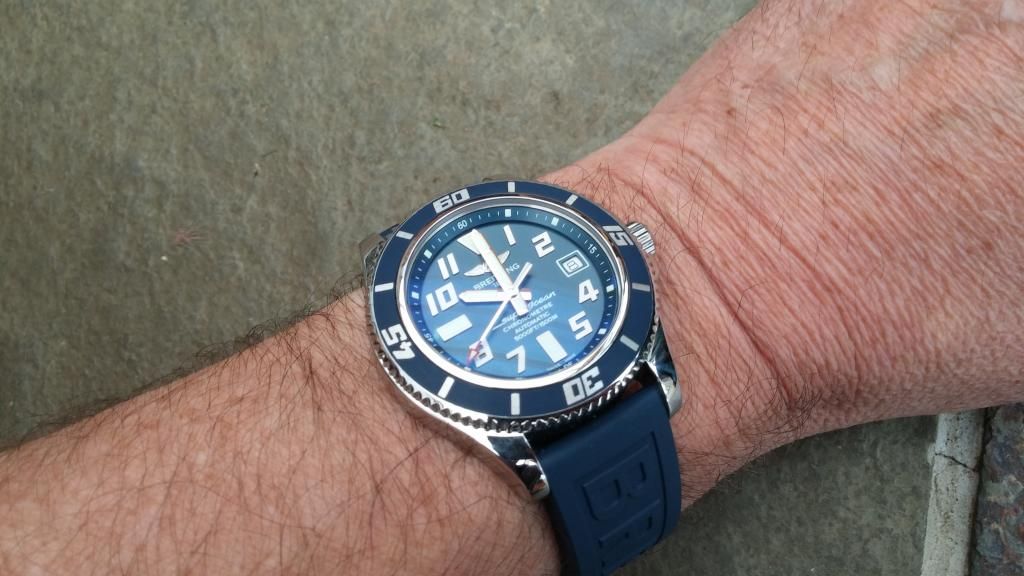
Here's mine...
Ltd edition one for me,the font of the numerals are so much nicer..
I am actually lookng for one as well,although I specifically want one like the bargain one I missed out on on sc recently... Bracelet with superocean in blue script and blue second hand. I can't find one like it anywhere!!
I'm obviously biased, but the 44 is definitely worth a look too IMO - would definitely be better with a lume pip though!

I have a blue SO A17360 with Pro II bracelet that I'm considering getting a Superocean classic mesh bracelet in 20mm for it... Not quite sure what it'll look like and Breitling do NOT recommend it being used "but" I like to be a little different.
On the watches, I like the numbers on the Avengers but the overall watch I prefer the 2003-2007 Superocean...
I like the ltd ed 1 bexause of the numerals and blue. Or go older something about the new bezel i dont like.
I cant tell on my phone but is the limited edition 1 a blue bezel and is it rubber. I like it of it is blue but the rubber 1s scare me abit.
Interesting, why's that? The standard Superocean (basically the 41.5mm case shape that's been in use since the early 90s) has quite short lugs, could it foul the case? I think it would look OK...
...but what do I know; I don't even like watches!

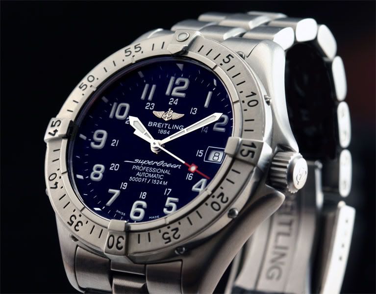
Didn't have the chance to see the 42 mm version, but here are some pictures of the new 44:
Overall, I think I would go with the new one (even if the dial is a lot busier) of the two watches in question, mostly because of the bezel.
thanks for nice photos. However, that breitling just looks cheap. No applied indexes, only logo and superluminova. Movement probably the same as in a Longines HC. Price around 2.5k so i would head somewhere else :)
I prefer the new one, but I do have an old Colt SuperOcean, so like that style of number, as well as having a bezel pip.
I prefer the old one, prefer 3 or 4 numbers on the dial, just looks cleaner, and yes I think the new one looks like a colt too
On the one hand, dive-watch dials don't need gold-plated lume plots, just lots of lume, and easy to read. But on the other hand, £2.5k is a ton of money for something so straightforward...
Also, the new 42mm version has a slimmer case but "only" 500m WR. The same-sized Colt Superocean had 1000m, then 1,500m. Fair enough, it's academic at this point, but they're asking lots of money. I think at least the design direction is the right one, even if it doesn't have a luxury dial, although I agree they really could bin the 13-24 markings, they're noticeable but add next to nothing:
Last edited by andrew; 25th April 2015 at 22:20.
...but what do I know; I don't even like watches!
I prefer the new model but in 44.
I like the "busy" arabic dial, bezel pip and bezel font. The bezel font on the previous model drove me mad as the 60 font always appeared to look misaligned, just like the one in the above photo. A bit of an optical illusion. Both benefited from a lack of rider tabs and I like that.
Last edited by j111dja; 25th April 2015 at 23:39.
 Posting Permissions