Reply With Quote
I too have looked for this and can find nothing. The very first 1954 watch had this dual colour Bakelite bezel. Maybe there is a clue in that? I believe the whole bezel was luminous. I bet Mike Wood might know.


Does anyone know why Rolex chose red and blue as the original GMT bezel colours?
I know the two colours represent night and day on the 24hr bezel, but why did they go for red for the day and blue for the night?
I too have looked for this and can find nothing. The very first 1954 watch had this dual colour Bakelite bezel. Maybe there is a clue in that? I believe the whole bezel was luminous. I bet Mike Wood might know.

This article suggests it was from their association with Pan-Am Airlines?
http://www.forbes.com/sites/arielada...t-for-a-price/
When you look long into an abyss, the abyss looks long into you.........
Yeah read that and a lot of other stuff but as the OP says why red and blue in particular. They were not Pan Am colours.Originally Posted by Chris_in_the_UK

I've always assumed the colours were chosen because they're functional and they look good, in addition to being commonly used by the company that commissioned the design.
http://www.everythingpanam.com/Posters.html

In an era when most large airlines were government sponsored, Pan Am was the unofficial flag carrier of the USA so perhaps the red white and blue of the flag came into play in color design of pilot's GMT.
Could I play the simplicity card and suggest warm and cool colours to signify day and night? Seems almost too obvious to be the case but it makes sense to me.
All good thoughts guys, but nothing concrete out there then? PanAm was blue and white, and light blue at that, so I doubt that had any influence into the bezel.
Maybe the designers just thought it would look good...
Makes sense to me as well.
That's my understanding developed for pilots to emphasise the night and day element on the watch.
Does anybody know how the bezel would have looked under night-time cockpit lighting in 1954?
Don't know about the cockpit of 1950's airliners but the bridge of my 1950's minesweeper had red tinted dimmer control spotlights. Under red lighting red would appear white, and blue would be black.
Very plausible explanation
Great info, never would have thought of that. Seems very plausible indeed.
Sorted. Next question. Why on earth do Rolex make watches with diamonds all over them?
'Awesome' post of the day there!
My guess on the red/blue would just have been high contrast between the colours but I like your explanation much more.
One of the best and most plausible explanations. And a very cool answer as well!
So football players can buy their wife's a present!!!!!
That's not what this suggests: http://www.d.umn.edu/~mharvey/handbook5607.html
Red under red lighting will be red, blue will be black. So why not just use red and black?
It's a trick of the brain perhaps.
Under red lighting white looks red and red also looks red. The brain knows full well that white is white but now it can't be sure if red is red or is in fact white.
It's why I asked the question about cockpit lighting in the fist place. Perhaps red- blue just gives the best contrast under red light? I knew about submarines and ships using red light at night to preserve night vision but was unsure about the practice used on airplanes?
Wouldn't that be the Coke bezel?
Exactly! But the Pepsi came first and was the only option initially, I'm curious as to why...
Blue looks red, red looks green, orange looks blue, fat slags look like beautiful nymphs, on Coke...
I'll get my coat...
Last edited by MerlinShepherd; 20th January 2015 at 21:53.
I blame Isaac Newton.
In his 1704 meisterwerk "Optiks", he maintained that there was the greatest contrast between red & blue.
It's all over Google, you know.
http://www.gutenberg.org/files/33504...-h/33504-h.htm
(This is the 1730 edition.)
One of the designer's sons supported Liverpool the other Chelsea.... must be.'
Another good theory.
When navigating said 1950's minesweeper, I used to conduct pilotage by standing at the compass repeater and taking bearings of shore marks and lights. The first time I did this at night, using my daytime notes, I was completely perplexed. The red clearing bearings (e.g. the light must bear not more than 257˚; not less than 221˚) i had marked on the white pages of my Navigator's Notebook (red for danger, of course) just became practically invisible. I switched to purple after that, because it still visible under red lighting.
I just tested this out using my business cards, which have black lettering and a blue and red design on a white background, in the dark, using a red LED torch. The red square on the design is virtually indistinguishable from the white background; the blue square is practically impossible to pick from the black lettering.
Notwithstanding the table printed above, it works for me, under red lighting.
Try it for yourself. If you don't have a red torch, wrap some red electrical insulating tape over the lens of a white torch. Try writing on white card in different colours.
So far for me at least the night vision theory has the most credibility.
Of course it could just be a happy design accident. It's iconic though and has been emulated by so many others over the years.
We still use red light on offshore helicopters.
Just to throw a spanner in here with the whole red light altering the perceived colour (my fave theory so far)- what if you are red colour blind?
I had a friend who couldn't be a Raf pilot due to colour blindness. Perhaps commercial carriers have similar rules?

Isn't the better question, why not? Seriously, if you want to separate day for night on the bezel, isn't red and blue just as good as any other combination (and better than most)? Does it have to be any more complicated than it looks cool?
Since, under red light, red and white become indistinguishable, I wonder how the silver numbers on the bezel which appear as almost white under normal lighting hold up. I'd imagine although you may have great contrast between the day/night sectors of the bezel, the actual numbers would be a bitch to read as noted above with the red pen on white paper under red light.
Anyone with a red torch, Pepsi GMT and a camera?
The numbers on the red half should be practically invisible whilst those on the blue will still be easily read.
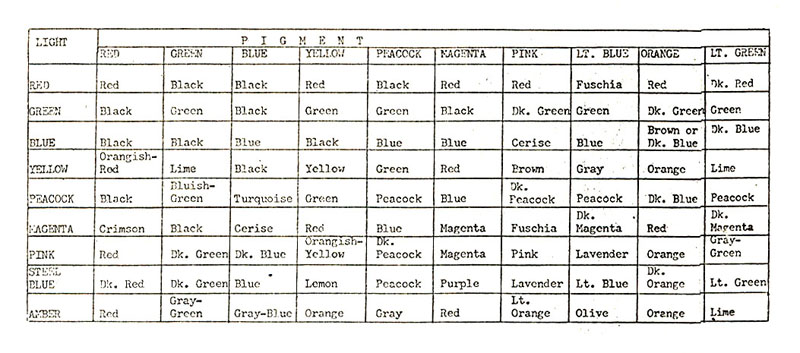
This thread has taken me back to my school days and A level Physics. If something looks black it's because it absorbs all the light waves whilst white reflects all the light waves (white light is made up of the whole spectrum- see the "Dark Side of the Moon" album cover for the proof). Any colour only reflects light of the colour you see and absorbs the rest. When only red light is shining the blue absorbs it so showing black whilst the White still reflects it making it look red.
Last edited by Dave+63; 22nd January 2015 at 08:53.
Maybe as simple as they looked at various colours and that combo looked and worked the best?
F.T.F.A.
Exactly. If you are red colourblind (or, virtually, any colourblind), you won't get an aviation medical so you won't be able to get a flying licence.
Might also have something to do with which pigments were most reliable back then, as in which ones would bond nicely and not scratch off easily when mixed/applied.
I suspect the colours/light theory may be correct
We still use blue and yellow to identify our control pods when our equipment is Subsea even though with modern camera's all colours can be seen. Its a throw back to the days of black and white when they were the 2 most easily distinguishable colours on a black and white camera where the light didn't glare and the black just deadened the picture.
Niall
Accepted! Was more a question of perception of the bezel colours under red light, rather than it being a red light in the cockpit of a Pan Am jet, as such :)
Liking the thread. The contrast under cockpit lighting conditions seems a good idea, but given it was designed in conjunction with pan am, perhaps there were prototypes with various high contrast combinations and they simply trialed them with pilots? Then got feedback?
I think you can discount the red light theory. This is a Coke, not Pepsi, but seeing as how you'd expect the blue to show as black I'd reckon they'd look about the same.
The pictures show a greater contrast than it looked in reality. From a lot of angles it looked like an entirely black bezel.


I guess that blows this theory out of the water then!
Shame.
 Posting Permissions