Reply With Quote
Is this model 30mm. If so too small for me.


Absolutely not in my case. Unless you have the funding stream of an Arab Prince it is always going to be a gross extravagance and it is only a watch.
Don't forget the quote about buying things we don't need, with money we don't have, to impress people we don't like! I can imagine there being feelings of great guilt if you bought it, and you will end up selling it at a loss. Is the possession worth 9k?
And it is a handsome watch!
Is this model 30mm. If so too small for me.
Tinker, you are correct in your observation about the IWC. So from that starting point no would be my immediate response.
However it is a beautiful watch that will wear it's coming years with grace and style.
The solid caseback is a plus for me.
If you can, why not? Resale should be possible at not too much financial pain should it not be for you in the long term.
Even if you are initially disappointed, you could leave it in secure store for a while and revisit, finances permitting of course. The classic good looks of the piece would grow on you I am sure.

I think there's a reason the Calatrava is so well received for decades. If I were you, I'd go for it.

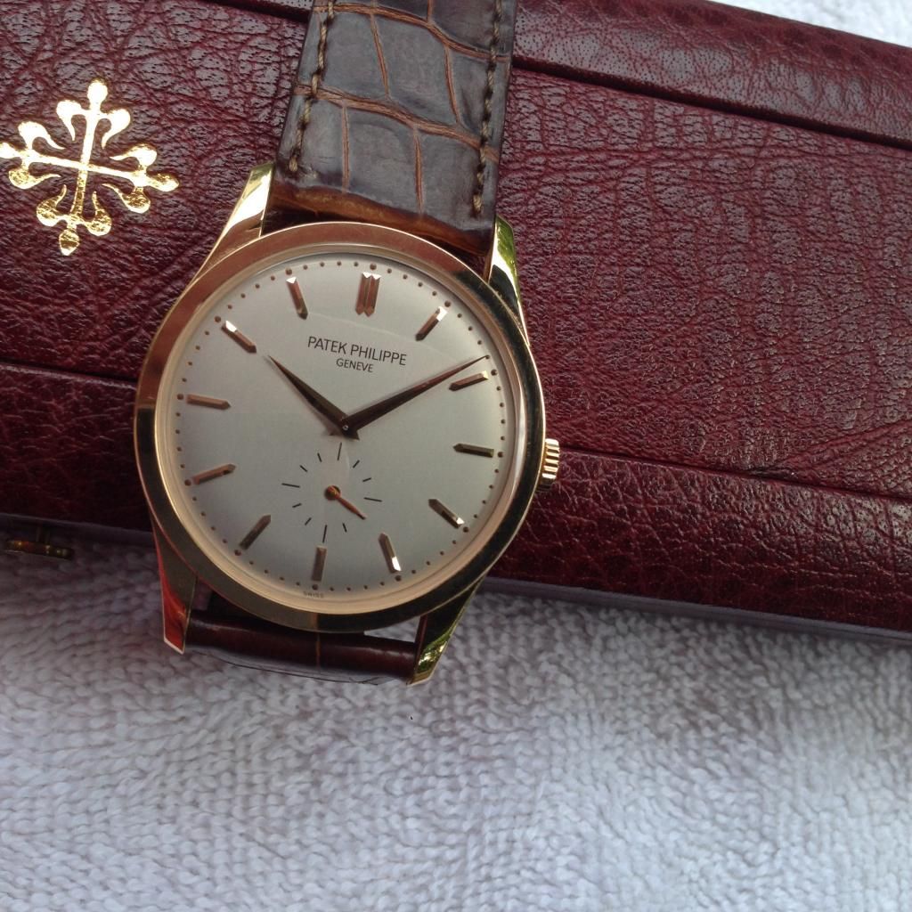
The simple elegance of this watch is compromised by the loss of part of the 6 baton to accommodate the seconds. Other Calatrava with roman numerals avoid this. For me this spoils an otherwise desirable piece. So in answer to your second question. No.
Tink, your pic of the movement just confirms my earlier vote to 'BUY IT'! That movement is gorgeous and most importantly, from what I can see, that watch has never seen the filthy hand or clumsy screwdriver of a bodger!
To those who say you are paying a bundle for the name, well indeed you are but with the name comes an example of exquisite horological engineering. In this case, you are actually GETTING what you are paying for, not some overpriced crap with a modified ETA movement that some blue sky thinking bean-counter thinks is worth a bundle of money because it looks trendy!
A Patek Philippe watch is pure class and quality, no getting away from that!
Last edited by KavKav; 30th July 2014 at 09:12.
I wouldn't spend nearly £9k on such a boring looking watch.
A lot of people don't seem to get the appeal of this one, and assume that an expensive watch should be louder, or bigger, or do more. I love it though, it's as near to perfect as you can find, and although you'd think you could find similar things for a fraction of the price, none of them turn out to look exactly right for one reason or another. I would however go for the white gold with the vertically brushed dial, which is by far the best version for me.
As to whether I'd actually drop the best part of £10k on such a watch, that depends if I was in a position where I had £10k lying around that I wouldn't miss! A PP isn't really about value for money, it's about having reached the point where you no longer need to care about that.
Too perfect is boring. I'm all for discernment in details, but I can see the truncated index as a conscious decision by a competent designer, rather than the fundamental design illiteracy that plagues so many newer watches.Originally Posted by lowndes

It's 37mm.

The whole thing is relative as to whether you have the £8.8k to spare. It's an elegant, sparce and beautiful watch - what sacrifice would be required to have it? Having said this I'd also concur with Itsguy that a slightly more textured dial would make it even more interesting. 37mm sounds just about perfect.
why not try something a bit left field http://www.ebay.co.uk/itm/Fortis-Men...p2056016.l4276
Good luck everybody. Have a good one.

No, I find that completely uninspiring, regardless of the name on the front.
Thats gorgeous! So much nicer than the plain dial, to my eyes.
Some watches just photograph well but this one is even better in the metal. I guess 'linen dial' were the words I was searching for, it does add that extra something - so subtly sophisticated. Sadly I'll be admiring it from a safe distance.

if they were bigger I would still be wearing one now, it never looked -or felt- big enough on my big fat, fuzzy wrist: But it's still my favourite (non-complicated) Patek and imho still sports the best balanced dial they produce.
Apart from that and the crackers prices PP's seem to go for now, what's not to love?
Go for it.
Joe
@ OP I think you can do better that, all depends on condition, (service) history, paperwork etc but still.. my issue with Calatrava is size, be it 39/40mm I'll be all over it like a maculopapular rush
Is that what you get when you have too much amoxicillin?
In principle that is a fair point, and apologies if my comments were read as suggesting design illiteracy. That was not the intention.
Rather it was an observation that dealing with small seconds on a simple elegant watch can present design challenges. Over the years Patek have addressed these in various ways. For example going back in time Ref1516 has no index marker at 6, nor does Ref 2449. On the other hand Ref 2501/1 from the year 1952 has a truncated baton at 6. The Ref 2540 has triple batons at 3, 9 and 12 and a little pyramid at 6.
And so it goes on to the present day. Much design thought expended but in the end it comes down to personal preferences.
No apology necessary; I highly value reasoned critique and it's a fair point you made about the 5196's lopped-off marker. I agree that it falls within the realm of personal preference, much like the mixed Arabic and Roman numerals on some of Lange's models. Though competently executed, it's completely reasonable to disagree with the style for aesthetic reasons. And yes, simple is often more difficult than complicated.
My reference to lack of subject literacy was to contrast this decision to designs that imply incompetence, including some of Patek's more recent efforts. The 5140 perpetual calendar's dial, for example, is clearly the work of someone whose skills are deficient. There are others that are problematic not only because I don't like the look, but also because they have signs that the MS Paint dilettante designer fundamentally didn't know what he or she was doing.
Thanks for the comment; I find that there's too little discussion of this nature. Of course, that's just my opinion — I could be wrong. ;)
Not a good look I agree. In my view it's predecessor 3940 was better resolved, though a PC with moonphase will always present a challenge for the designer.
It's a poor effort, to be sure.
The 3940 and 5136 were much better-done compared to the 5140. Here are all three in sequence:

Last edited by Belligero; 31st July 2014 at 10:36.
How to make a clean and readable PC with moonphase;
That watch would send a glass eye to sleep. Just think how many tranquillisers you could buy for the same amount and same effect.
That's a spot on statement.
Most people go through lots of other, bigger louder more recognised watches over the years before they get to the stage where an understated PP is what they want.
My problem with this, and the others too, is how the designer thought putting January (the 1st month of the year) at the 12 o'clock position made perfect sense!
Just out of genuine interest. Where would you put it and why?
Well, since December's the 12th month on the calendar, it would be logical to put it at 12 o'clock, and then the rest of the abbreviated remaining months become Feb, Apr, Jun, Aug, Oct.
So simplistic it's unfathomable as to why they went with what they have.
If the months displayed are somehow more significant or easier to communicate the function of that sub-dial and associated hand, then simply putting Jan at the 1 o'clock position would've achieved the same thing.
It's not a difficult pattern to decipher, by any means.
The whole reason to put 12 at the top is because of Midnight and Midday. This doesn't happen with the months so it looks neater to my OCD mind to put Jan at the top. If it wasn't it would feel like not having the bezel straight on a Sub, which I could never accept.
Ergo, you start with December at 12, and change to Feb, Apr, etc…
This just smacks of poor thinking or electing to be different for no other reason than because they can.
Last edited by PJ S; 31st July 2014 at 16:34.
Or to view it another way perhaps........
Whereas days can be indicated with adequate precision by a single spot or mark, months are not so easy. If for example you put Dec at 12 it is actually spanning roughly 11.30 to 12.30. By the same token Jan would, if there were room to write it, be centred at 1 and span from 12.30 to 1.30. Then just after midnight on the 31st December as the last refrains of Auld Lang Syne fade away the indicator hand on your PC would spring forward and in visual term 30 days would have gone in the tick of an escapement.
If on the other hand you represent Dec as a dot at 11 and have Jan at 12 the indicator hand spends the whole of December logically on the left side of the vertical line which looks right ( if you see what I mean!) and lo at the start of the New Year it points in exactly the right direction, (and you can show your friends how wonderful your PC is), albeit by 31st Jan it’s looking a little out of sync.
We're getting further away from the OP's topic of conversation, but without knowing exactly how the PP PC is designed, I'd see no reason for the month indicator to move fractionally each day, but instead jump between each of the 12 month indicators.
The point is that to be confused over which month the hand is pointing to would require the wearer to be a special class of idiot, especially as the date indicator on the bottom sub-dial would clarify the matter.
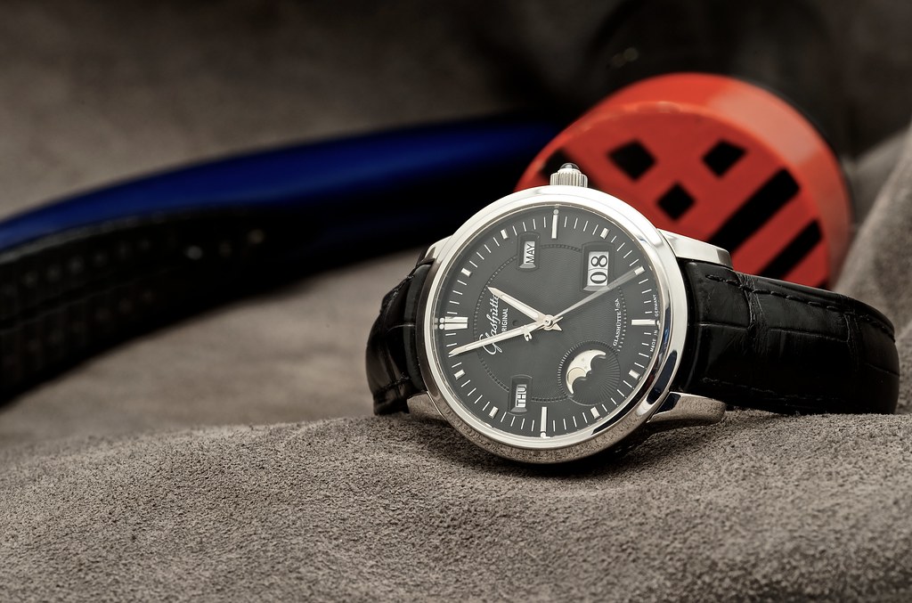
As Tim showed above, if you want a mechanical PC done right, just buy the Glashutte Original it's the best implementation by a country mile.
Moser?
Left to its own devices the PP PC month indicator moves 12 times each year, no fractional movement involved during the month. So on Jan 1 it looks spot on and on Jan 31 less so, albeit it is spot on again the next day.
Yes that is also a perfectly clear and readable PC
One of the better ones done with hands, but it doesn't top the GO's dials, since it has no ambiguity about what's pointing where.
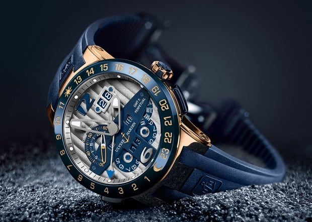
Although I do have a soft spot for the Ulysse Nardin El Toro…..but then it makes the GO look like a veritable bargain in comparison.
Last edited by PJ S; 31st July 2014 at 20:44.
Huh? That's Irish!
If it doesn't move and only has 12 detents, then on the 31st of January, it'd still be pointing straight up at the 'a' in 'Jan'. As the date changes to the 1st Feb, it'd then jump to the dot at the 1 o'clock position, or is it one of those ones which takes 3-4 hours to complete the date change?
The UN is stunning and a very clever Oeschlin machine , all wheel driven and reversible. Probably among the best.
Regarding the digital displays of day and month provided on the GO. This does make for a clean and readable dial. It must be said though that a dial display provides a lot more information and perspective than the digital display. Some may prefer to accept the downside of poorer readability in favour of greater time span perspective.
Moser by an absolute mile - whoever suggested GO (and respectfully I have owned and flipped (sadly) pretty much every watch ever (I exaggerate of course but not by much) it's not even close you shouldn't put Moser and GO in the same category Moser is far superior and that's not IMHO that is cold hard fact. I compare Moser with the Pateks I have owned and wonder how on earth Patek are seen as superior and that's the truth
Go for the simple clean looking dial on that PP !
Last edited by UKWatchGuy; 31st July 2014 at 23:05.
To the OP: I have the 5146J so personally will not be getting another Calatrava.
But the one pictured is classic in design truelly timeless. Go for it
Martyn
Ford... you're turning into a penguin. Stop it. HHGTTG
The GO was there as an example of clear readable PC dial . Which it is, clearly. The thread had drifted OT at that point.
I certainly agree with regarding Moser Quality. My Moser Monard is probably what has prevented me from buying a Patek.
Understood, thanks for clarifying.
This one, indeed ...
Not wishing to take this any further OT but simply to clarify the point. On the PP PC Ref 3940 the abbreviation JAN is centred with the A at 12. The month indicator hand jumps to that point within a few minutes either side of midnight on 31st December. The indicator then remains stationary at that position until around midnight on 31 January when it jumps to the dot which represents FEB where it remains until.......
The day and the date also jump to their next resting position within a few minutes of midnight more of less simultaneously but slightly after the month indicator has moved. All changes complete within a total of half an hour either side of midnight.
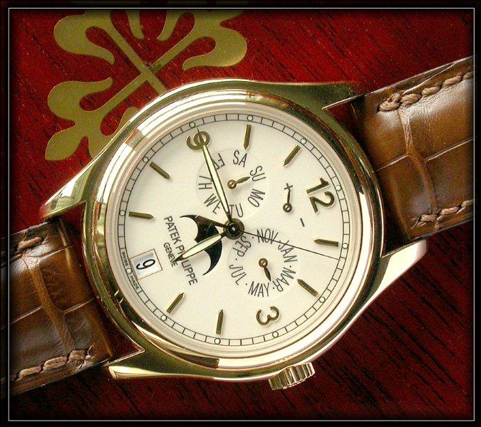
Back to the OPs question. I think it might have been more helpful if rather than just saying No, I had explained I have a 3940R which from a distance can appear to be a simple elegant dress watch and to that extent like MartynJC (UK) I have no plans for a Calatrava.
I would also point out in passing that the 3940 sports four different baton sizes to indicate the hours ( single, double, shortened and pyramid!) and according to my earlier post should disqualify itself from consideration by anyone with a modicum of aesthetic appreciation.
its nice but not for me... especially at £9k.
What a weird post. Can I ask why you have joined tz-uk?
That is the exact watch I'd upgrade from my Calatrava to at some point, in yellow gold. I saw one in Luxembourg, stunner of a piece. I thought I didn't like yellow gold too.
 Posting Permissions