
 Reply With Quote
Hmmm, maybe... but I still wouldn't kick her out of bed for farting...


Hmmm, maybe... but I still wouldn't kick her out of bed for farting...
Hmm... the subdial does look a bit out of place on the main dial imo. But, that aside, the Nautilus is a design that has grown on me since I first saw it.

Fugliness lies in the eye of the beholder.
Speaking for
Myself,I love it!

To be honest It looks perfect for me
That is an outstanding watch and in the flesh utterly brilliant
RIAC

Photo is crappy, watch is great
seen a hell of a lot worse and if Mrs West surprised me with one in about a month or so I wouldn't be disappointed (fat chance)
Love it.
Me too. Would be stunning in the flesh.
I agree with Op. The dial looks unbalanced.
I tried the 5980 on for the first time the other night; I knew I wanted one but didn't realise how much.
For me, it's the perfect steel sports watch and the ultimate expression of Genta's design philosophy. One will be mine, just need to make 'sad face' at Mrs Yeti and she'll let me buy one hopefully.
The 5980 is a personal favorite of mine and only Nautilus that looks great on my wrist for "modern" standards. It is big and stands tall, which I am used to when wearing sports watches. "If one day" this would be the watch to buy for me, absolutely gorgeous example

Yep, horrible looking in my eyes as well. Amazing how subjective it is, isn't it? The 5712 on the other hand...
hmmm...
I have to disagree
or the steel and gold ... In general not a fan of that combo but not an ugly watch if you see it irl

I like it a lot. A small nitpick is the color of the date window which I prefer to have the same color as the dial.
But I'm not sure how much of that is down to the branding. Would I still like it if it said something else on the dial?
I actually rather like it, but only in the same price range as, say, a Seamaster Pro or possibly even as much as a Rolex Sub. I've not seen another Patrick I like and I can't help think the majority of people like the idea of owning a Patrick rather than the watches themselves which are all rather plain and ugly.
Originally Posted by Swissz

"A man of little significance"
Dare to be slightly different, I like it.
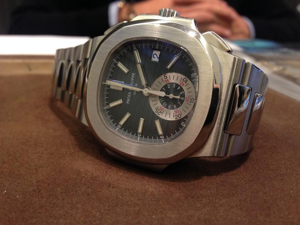
Must say it does look better on the wrist.
Aarrgghh!! My eyes! My eyes!
I have to disagree, I tried it on in London at the boutique whilst collecting another watch. I found it to be stunning in the white dial, very subtle and comfortable.
In all honesty, I'd rather have a Sub or a Seamaster, I'm not a fan of these at all.
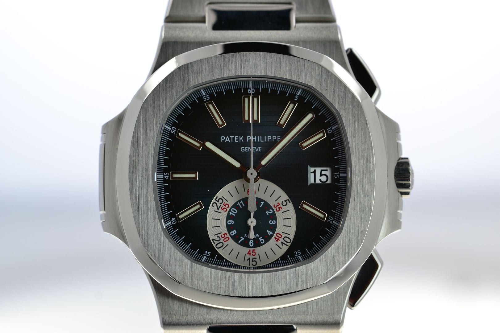
Another case of the sub-dial being partially obscured by the tail of the large chrono second hand in it's default position. The missing 5, 6 and 6 indices caused by the size of the subdial reduce the utility of the watch at the bottom of the hour. Chronograph designs always seem to me to be a compromise between the aesthetics of analogue display and the amount of information required to be placed on the dial to support its intended function. In this case I fear that the aesthetic has outweighed the functional so that although the case is nice, the poor functionality and usability of the dial design would make me inclined not to choose this watch. Luckily as I don't move in these exalted economic circles, being forced to live with this sort of design deficiency will never be a problem for me.
Last edited by Harry Tuttle; 23rd November 2013 at 11:24.
I love it especially with the blue dial, still can't understand why PP have discontinued it.
As PP's go, it isn't exactly elegant. I've also read on another forum from a respected member that shirt cuffs can mark the bezel on a Nautilus.
not normally a fan but thats much less bad than i thought it would be, wouldn't mind seeing that in the metal ...
Last edited by bigbaddes; 23rd November 2013 at 13:04. Reason: speelin
Attachment 5110
Just seen this in WOS Manchester for £34,460 if anyone's feeling tempted.
Have they got a 5396 in the window? 32k for the diamond lady's Aquanaut, haha.
Look fantastic. Too tall to wear though in my view.
Actually quite like it, the colours don't clash and the sub dial sets it off nicely.
I thought it was very slim indeed. I wear a ROO and a Planet Ocen chrono though so am used to taller watches.
This one was almost a dress piece by comparison...
Would not buy one at Sekonda prices. The bezel always reminds me of a toilet seat.
Not a fan of that particular model. I think the sub dial is far to overbearing and the date wheel should be white on black.
This model, however, is stunning, and top of my grail list.

Nope, its awesome
Having handled a fair number of Pateks i came to my own conclusion, for me the brand is about 80/20. Thats 80% about the name and 20% about the watch. But then all tastes differ, which is a good thing.
I did find the reference to the toilet seat/bezel reference amusing
I'll never own one admittedly, I'd scratch all the heavy flat and lumpy metal on the bezel and sides, so no ta.
These are lovely in the flesh, prefer the straps than bracelets as not overly keen on the polished center link.
Had dinner with some friends last night who had them. I prefer the white gold to rose. Lovely kit. Scrathmagnetz though.

I have to admit to really liking it! I have no objection to the date wheel being black on white and I would happily wear one, but maybe not pay for one so happily.
Aren't they all?
PP or not, don't like it.
Unbalanced dial IMHO.
But with Patek it's just like with AP for me, the original models should have been left alone, don't like the RO pimped up big chrono's as well.
Daddel.
Got a new watch, divers watch it is, had to drown the bastard to get it!
I don't mind it at all, with the title expected it to look at lot worse.
Would you still love it with another brand name, like seiko or others, on the dial ?
I guess not
Might come as a surprise to you but there is more to a watch then name on the dial like movement, quality, feel etc.
And, in many cases, how it looks on the emperor...
One of my favourite watches ever. I love the dial layout, the pattern and, well just about everything it has to offer really. The only watch that would seriously give my AP RO a run for its money in my grail list.
Bloody Hideous
Dont like the shape,the dial and it has the appearance of looking like the left side of the watch is a hinge.
Sorry.
It is a hinge on the left side
Just what I want on my wristwatch,a hinge,ala longcase clock style.Is it a 8 day movement?
Still looks like a Diesel fashion watch to me with a massive price tag.
Again sorry.
There are not many PP's I like, which is just as well..... But this is one that could tempt me.
I love it!
 Posting Permissions


