Reply With Quote
Which leads us to mý one.
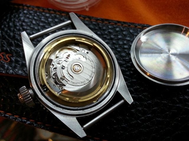
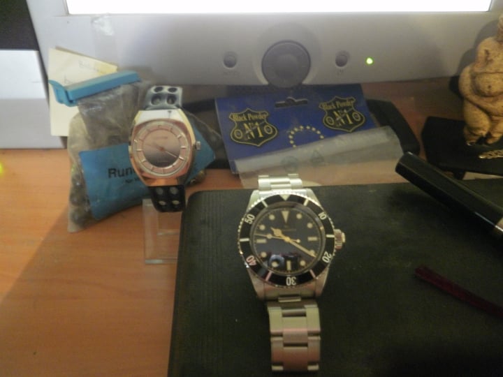
I wanted the ETA option, for no other reason than ´ETA inside´ silly bugger perception. Yes, I know; infused by marketing.
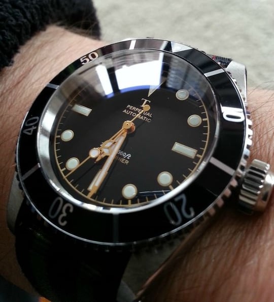
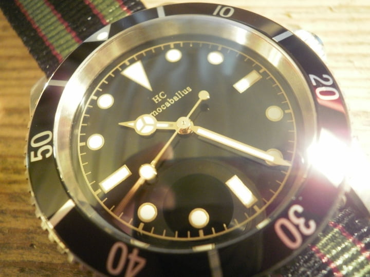
Deciding on the dial print was a bit of a bigger challenge. I wanted a s less as possible but print as 6 looks sóó nicely balanced:
HR (for ease sake) could not have been more helpfull and patient. He made several mock ups to help me make up my mind and each time responded promptly.
It took me some time to get round to realising just being accustomed to it, that the blurp would be superlatively superfluous, so I finally I decided on logo at 12 only.
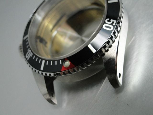
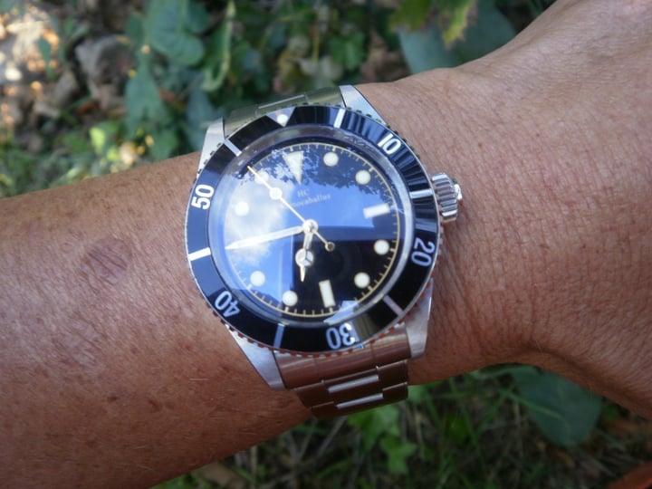
Thén I suddenly got a bee in my bonnet about the bezel
For some (vaguely historic/heritage) reason I got the idea that the red triangle/minute hashes was the more authentic...
Go figure. On a 21st C. homage of a Hollywood thing meant to be a fún thing between a gf and me; for a bloke who doesn´t dive deeper than his knees!!
How silly can you get???
I got the swatter out and dispatched the bee.
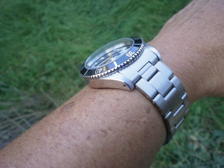
HR dutyfully kept me updated of the status. Last week he assembled it and posted in on the 18th, last thursday.
Fingers crossed.
I cannot write ´meanwhile´as I had more immediate things to keep the fun part of my brain occupied, but after lunch today I got curious....