Reply With Quote
Is that image from watchuseek? I actually prefer the sub second one in that thread. That being said the Grand Seiko hand wind watch is probably the nicest I have seen from the Seiko range.


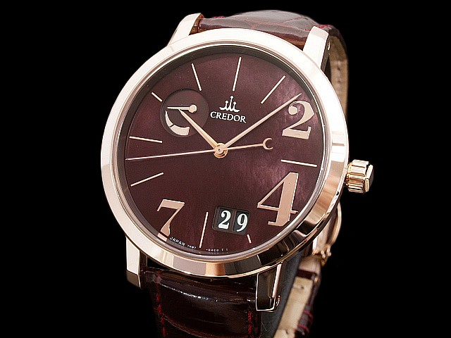
Limited to 25 pieces - was $70,000 new.
Noritake porcelain dial - 44 jewel movement.
Possibly the nicest dress watch I personally have ever seen.
When you look long into an abyss, the abyss looks long into you.........

Is that image from watchuseek? I actually prefer the sub second one in that thread. That being said the Grand Seiko hand wind watch is probably the nicest I have seen from the Seiko range.
Stunning.
Is the case White Gold or Platinum?
Best Regards - Peter
I'd hate to be with you when you're on your own.
It is platinum Peter.Originally Posted by Griswold

When you look long into an abyss, the abyss looks long into you.........
Not sure personally Chris, but we all have different tastes.
I for one would prefer the model/movement numbers on the rear, or anywhere other than six o clock on the dial.
As you say mate - different stuff for different folks.
When you look long into an abyss, the abyss looks long into you.........
Thanks Chris. It certainly is a stunner.
Best Regards - Peter
I'd hate to be with you when you're on your own.
That's a lovely dress watch with a stunning dial.
Can't wear one of those, but that's because of the lifestyle and work.
Any movement pics?
Daddel.
Got a new watch, divers watch it is, had to drown the bastard to get it!
Agree almost 100%
Maybe not the nicest but surely among a few nicest for my taste.
When you look long into an abyss, the abyss looks long into you.........
Thanks!
Great stuff, from the back as well.
Daddel.
Got a new watch, divers watch it is, had to drown the bastard to get it!
It's a beauty alright... but on looks alone, the enamel dialled Breguets are stunning.
Love the idea of the porcelain dial though.

Love the dial, but isn't the power reserve indicator misplaced and too big? I think this watch would be better without it.
I have to admit to being a great Grand Seiko fan. I don't own a Credor yet, but I think I need one.
There's a really nice 6S78-0A10 chrono on the bay at the moment......
Love that dial and power indicator. Porcelain you say?.. Well me like!
Think I'd wear it back-to-front. ;-)
R
Ignorance breeds Fear. Fear breeds Hatred. Hatred breeds Ignorance. Break the chain.
A most wonderful watch. But as you imply, to really appreciate it, I'm sure you need to see it the flesh. Pictures hardly ever do such high-end watches full justice.
I think this is going to be a new favourite for the "I will never be able to afford this" section. Stunning!
The mainspring is not sitting well in its barrel, the plate in focus is not particularly well finished, nor is the screw head by the logo and why on Earth does the movement need 44 jewels? As for the beautiful and attractive porcelain dial, it is, unless the Japanese have found a way of strengthening it, almost unwearable.
Nice watch but somehow not for me.
Stunning, isn't it. I particularly like the power reserve indicator on a watch like this.
I saw a video of the craftsman making the dial by hand. Meticulous.
Tinker: I suspect the plate you indicate is simply reflecting something that suggests it's not rounded evenly. It will be beautifully made.
Last edited by Glamdring; 13th October 2013 at 00:01.
Hmm. Different strokes for different folks. Not keen at all personally - I think the dial looks unfinished and washed out. To each their own!
Not bad. But at this price point it would be Lange all the way for me

Not sure about the dial or the RRP but each to their own I guess.
The Noritake dial has always reminded me of the bottom of a teacupand of course like the majority of porcelain dials it will probably end up cracking over the years.
Seiko can make some beautiful dials but not this one.
Cheers,
Neil.
Not a fan of the dial either I'm afraid.
Andy
Wanted - Damasko DC57
Can you post that video?
Agreed.
I love porcelain dials, but compare this dial with the finish on a Jaquet Droz and it comes up lacking. Even more when you consider the price.
However, the backside of the watch shows it's class. Stunning.
Not with that dial, sorry not a fan of porcelain either.
glad im not the only one not a fan of this! of course i can appreciate its attractive to some, and of course the movement! but sadly that dial looks (dare i say it) cheap to me!
Like you do with your underwear?
Daddel.
Got a new watch, divers watch it is, had to drown the bastard to get it!
I'm sure you're right, Glamdring. It's just that recently I've seen some new high-end wristwatches, i.e. £50k+, and the quality of every surface is beyond reproach. So, for example, screw heads & slots are all identical in finish and plates, bridges & cocks are immaculate in surface texture.
In contrast, I was looking at the dial of a £9k Bl...p.in and within seconds could see two flaws on the dial. (Ironically, however, sub-£2 or 1k dials are often close to perfect - perhaps because they're less ambitious.)
Whatever, £70k should buy more than this Credor seems to offer in these photographs.
That said, impractical as it is, I like the dial very much.
Utterly stunning. Crazy price though
Do you have that link to WUS?
+1
The PR is too dominate for my liking.

I'm sure mechanically it's amazing, but aesthetically (to my taste anyway), it doesn't look up to par.
Maybe the porcelain is more endearing in person rather than a photo.
Presumably this one – http://forums.watchuseek.com/f21/mos...em-621490.html – or possibly this one – http://forums.watchuseek.com/f2/can-...ch-717306.html
Same watch, only the first link's may be on the bracelet.
Agreed - one of the very few Credors that just fails to absolutely grab me, although the hands and batons are lovely.
Last edited by PJ S; 14th October 2013 at 00:09.
Might be worth looking at the other photos of the rear here http://www.watchesbysjx.com/2011/12/...-in-world.html not seeing the same barrel issue.
I wonder if some of those are shot after a servicing has been done?
As for the jewel count my Spring Drive has thirty (30), so I can only presume they've added more to reduce friction for extended power reserve.
It does look a wee bit Armatage Shanks.
http://www.watchesbysjx.com/2011/12/...-in-world.html
"One of the finest watches in the world"?
Yes it's that link. I much prefer the second one sub second. This one just doesn't do anything for me and the price is frankly eye watering.
You don't agree?
Kenji Shiohara from the Micro Artist Studio sought out Philippe Dufour for advice on watch finishing when the Spring Drive Sonnerie was in development. And in typical Japanese fashion they took the advice and went even further. In a conversation with Mr Dufour a year ago, he expressed respect for Seiko’s fanatical dedication to quality.
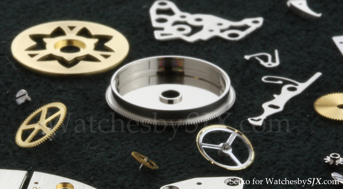
Everything in the movement is finished to a near obsessive level. Even the interior of the barrel is polished to a mirror finish to minimise friction and wear, something I have never come across, even in other ultra-high end watches.
A photo from Seiko showing the mirror finished barrel interior
The dedication to finishing is illustrated by the fact that when the watchmakers from the Micro Artist Studio returned from visiting Mr Dufour, they brought back branches of the gentian tree, a plant found in Alpine regions around the world, which grows near Le Sentier. They did that so that they could replicate the wonderful polished finish on the bevels of the untreated German silver bridges. As can be seen from the photos there is already some patina on the bridges.
Hence for several years, the final polish of the anglage of watches made at the Micro Artist Studio was done with the exact same wood Mr Dufour uses for his Simplicity. But after searching all over Japan a similar gentian plant was found in Hokkaido, not too long ago. So the watchmakers are proud to say their timepieces are now entirely Japanese.
The finishing of the Eichi is technically comparable to Philippe Dufour in my humble opinion. It might even be more perfect technically (look at the mirror finished barrel interior). But it lacks some of the warmth and charm of Dufour, the Eichi movement seems a bit colder. My opinion, however, is subjective. Objectively speaking the movement finishing is impeccable.
For me, this is the one I would happily sell my soul for.
And twice over if this one was also included.....
Sadly, no. Not least because the 3-plate architecture is inelegant. Plainly, the Japanese maker hasn't seen Philippe Dufour's work, which is not only better, but also considerably less expensive.
Elegance is a subjective term, and if I look at PD's Simplicity or photo of a 40 jewel movement, with similar rear bridge architecture as the 21 jewel Simplicity, it doesn't scream "I'm better looking."
Depending on which photos you look at, his chosen machining technique is rough as hell, for the Côtes de Genève striping.
I was going to say maybe the reason Credor's design is necessitated due to the layout of the parts, and their choice to utilise as many jewels as they did, for the friction performance they sought.
I don't think you could surmise they've never seen PD's work, since the very text I quoted above, from the linked review, states the Japanese engineers travelled back to the Studio, from meeting with him. Being drafted in as a consultant, do you honestly think they'd not have scoped his work before deciding they'd like to consult with him?
That it'd be unlikely they didn't see his work on their visit?
As said, maybe there's a jewel-based reason, or it was an aesthetic one, or even there was an increase in rigidity which bolstered the porcelain dial.
I don't know which, but from my POV, it looks perfectly fine and acceptable.
If there's a technical reason behind your comment, then please enlighten me I've never been one to shy away from learning something new.
Agree. I much prefer the back of the watch.
Dont look back, youre not heading that way.
Does nothing for me but am sure it looks a thousand times better in the flesh. The Brand name leaves a lot to be desired especially given the history and competition in that price bracket,and i would imagine the resale values are astonishingly low compared to others.
Taste is funny isn't it? To me that is an absolute wreck, aesthetically. The numerals are a random selection, different sizes and bisected by the bezel; the crown looks ungainly and out of place; there are 5 different lengths of stick baton; the large date is coloured inconsistently and in an obscure place; the power reserve is in an awkward place; the tail on the second hand appears too long and the modern script at the bottom of the dial unnecessary and out of place.
The movement looks lovely though :)
 Posting Permissions