Reply With Quote
Starts to look a bit Mickey Mouse with two colours on the second hand, for me.Originally Posted by snowman


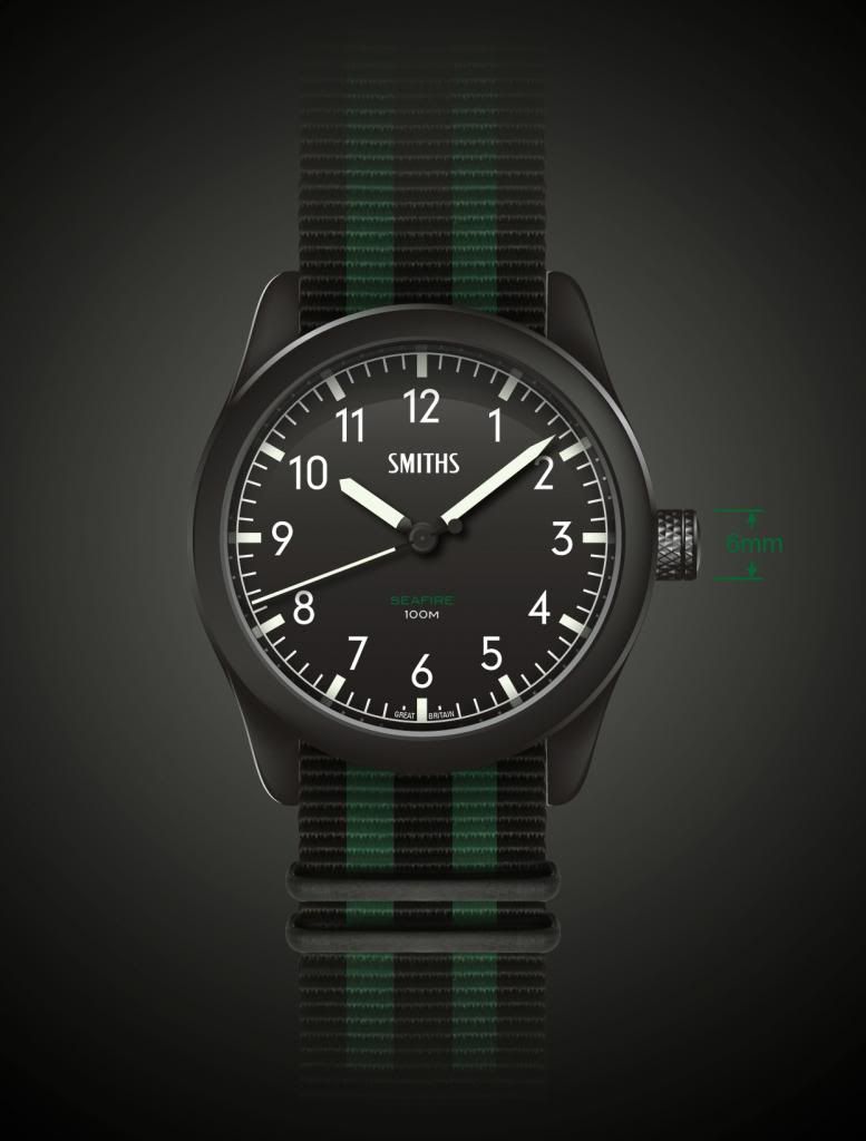
That would be a must-have for me in the 'revision 1' form whether quartz or auto, although my own preference would be to lose the tail of the second hand. I'd hope it's a screw-down crown.
Starts to look a bit Mickey Mouse with two colours on the second hand, for me.
The refinements will be down to Eddie's better judgement, however if it's a manual wind it won't be a screw-down, it's not necessary for a watch rated at 100m.
I'm wondering if this Seafire version could be at the higher end of the market as a PVD all singing all dancing Automatic.
With the case design also used for a stainless G10 quartz, PRS-10 replacement, for the punters who want lower pricing.
An Army G10 styled quartz, and the excellent Airforce Seafire.
It would take the strain off Eddies 300 minimum order for cases if the design was shared by both models.
Different dials, maybe with rad tubes on the G10, different hands, different look, different movement and a different price.
I'm a little confused - Airforce Seafire? Either this is a Seafire - and therefore has *some* link to the Sea Spitfire - or it's just *another* name that's plucked out of the annals to be used, willy-nilly. If it's the latter, it really doesn't matter *what* the watch looks like, as it's not meant to reflect the 'plane, its history or legacy. If it's the former, then surely it's preferable to tie it back to the 'plane in some way? The same with the Smiths links: either link it to Smiths Instruments, or even to Smith & Sons cockpit clocks if you like (although these were Jaegers IIRC), but don't just throw faux heritage at the design...
Better still as its a PVD crown, like I said previously, I can see the PVD coating on the crown getting some serious wear if its a manual wind.
To ease your confusion - here is the Army / Airforce Timefactor watches made under the Sewills name.
I wasn't trying to suggest anything new or offensive.
Airforce / Army variants would be a continuation of the theme (and help to move the PRS-10 replacement along).
I'm sure Eddie will do the right thing when he makes his final decision.
Many thanks; I'm well aware of of those Sewills watches.
The "Airforce" (RAF) Seafire was the Spitfire. The Royal Navy (or Fleet Air Arm) Spitfire was the Seafire.
Thanks
Maybe I should have said "aircraft styled" Seafire model in black.
With a cheaper "G10 styled" quartz version in stainless.

You have to get design approval and pay a licence fee to use the RAF or Army logos in commerce.
Eddie
Whole chunks of my life come under the heading "it seemed like a good idea at the time".

If you google images for 'spitfire altimeter' you'll probably find images of a gauge that shares some similar design cues to this. I wouldn't advocate the alternate green and white numbering of the altimeter, but, the inclusion of green, I think, is subtle, but worthwhile reference and makes the name relevant to the piece, notwithstanding other similarities... I think the watch is worthy of the name.
Disclaimer- I have no practical knowledge of ww2 planes, or planes at all, but I read your post and googled spitfire cockpit, and found images which I think justify my statement, but am ready to be shot down (pun intended) by those who actually have knowledge of the subject...
Last edited by holio cornolio; 14th August 2013 at 14:33.
You're missing my point. When we were discussing something similar a few years ago, Smiths Instruments were a major influence - not the watches, but the instruments. Smiths as a watchmaker had very few utilitarian / military designs, and none that were truly "aeronautical" in nature. In fact, I'd go so far as to say that they were limited to a handful: the (true) Everest watch; the Commando; the two divers; and the W10. The former was not even released as a production model (although there were a few similar watches under a different name). The latter was recently spruced up as the PRS-29. I'm not sure what happened to the divers (perhaps they got swallowed by the '68). But what is almost certain is that the black dial, lumed hands and sweep seconds found on a non-W10 vintage Smiths would have looked *nothing* like those in the picture. Adding a red dot, arrow or diamond may be a nod to the 19J manual wind Everest, 15J DeLuxe, or even to a lesser watch, but it has no place on the dial that's rendered in this thread. You may as well give it horned lugs. The closest *actual* Smiths watch to that design is probably the Commando, but more likely to be the black-cased rally timer, or even the dash-mounted clock; neither of which has anything to do with 'planes. They've already had to plump for a second choice name - Seafire (or Sea Spitfire) - why not build on the Smiths Instruments heritage and at least tie it to the aircraft? Or, choose another clock / aircraft combo - perhaps the Vampire had a S Smith & Sons 6A/3157**? My one suggestion would be don't just produce something for the sake of it (as so many purchasers of old names appear so wont to do). Make the links; make them real; honour the name. If you don't, are you really that much better than the other brands that this Forum seems so happy to mock?
**Yes, I know these were JlC.
Last edited by Broussard; 14th August 2013 at 17:23.
I beg your pardon, I did miss your point. I thought that you were referring to the Seafire tie in. As far as Smiths as a watch name goes I can only speak for myself, but I have no emotional connection with the brand outside of it's use by 'Timefactors'. I simply see this design as one that speaks to me aesthetically, and the SMITHS name, just looks REALLY good on the dial. So referring back to your earlier post, I guess I fall into the 'plucking a name out of the annals willy nilly' camp.
Excellent.
(1) Successful communication requires two parties. I'm not blaming you for missing my point; I probably didn't explain myself clearly, or perhaps you missed a post.
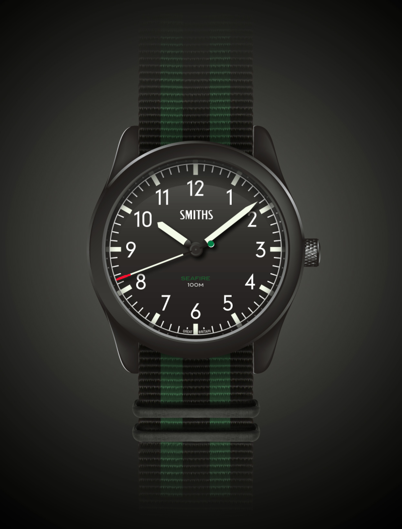
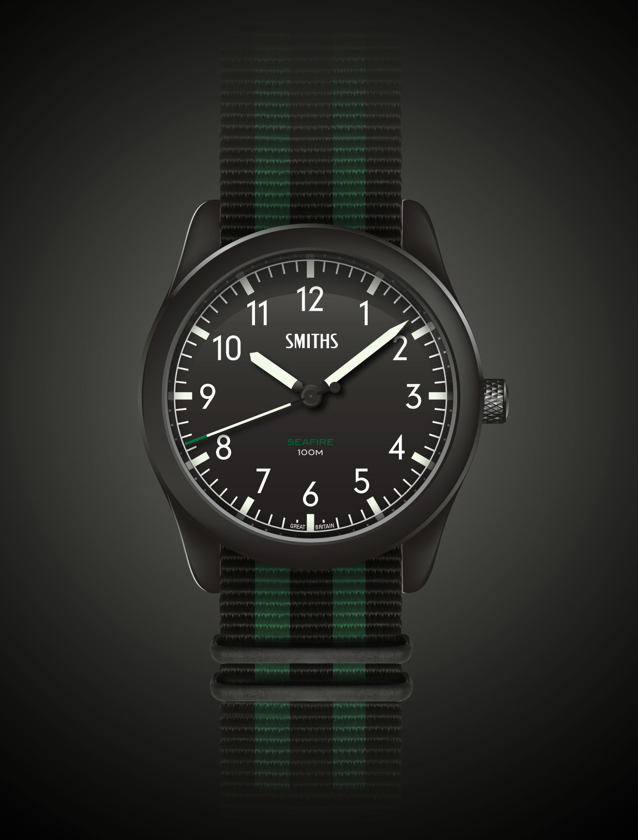
Which brings me on to (2) The OP: "I've always liked the simplicity of cockpit instrument panels, and the watches inspired by them. As Smiths instruments were actually used in some of our most iconic aircraft, I thought that there should be a Smiths watch to suit and fortunately Eddie agrees. So I present the Smiths Seafire, inspired by Smiths Dials used in the famous Spitfire* and Seafire planes."
Which dovetails into (3) My advice - which the design-by-committee is free to ignore - remains stay true to the "inspiration." Keep it clean. There's plenty of Smiths' instrument inspiration there without resorting to plundering additional Smiths watches.
I like the OP's design...no tip or counterweight colouring for me, thanks. I did think that a red (or yellow) tip would aid its functionality, but on reflection it really doesn't. Your own choice of strap or band can add extra colour(s) as required.
From my point of view the design in it's first or second iteration is still a draft. As you rightly point out it's not a remake of a Smiths model, and doesn't intent to be. It's a new Smiths watch. Design-by-committee is not usually the best way to design a watch, but I don't think that what this is. It's more real customer feedback, which is an integral part of any design process.
My view is that second hand doesn't need the green tip, but the Nato will be coloured.
Ultimately it's up to Eddie on how the finished thing will turn out, but much like the PRS-30 I hope it'll be pretty close to my visuals.
This forum way of developing a watch design is quite unique and it gives everyone the opportunity to have their say, and be involved whether it's taken on-board or not. I'd rather people voice their comments good or bad, I certainly don't intent to create hundreds of visuals, but it's fine for others to photoshop, amend (as someone has) and post it for comment.
I think it's great that we get to see potential watches at the design stage and even have some say in the look.
I'm only a recent member here but I love the idea that I might have some input in something that I eventually put on my wrist.
Personally I think this is a great looking watch and like the green accents - it's nice to have something different and red is used a lot.
I would buy the second design (green tipped seconds) on the green stitched leather in a 38mm ish size right now if I could.
I think you've done a nice job (and the designs on your Tumblr are impressive too). As I said, we've been talking about something very similar for years - and I hope to see the fruits soon. Smiths' instruments / dials are a fantastic source of inspiration - some dials were quite wacky too...
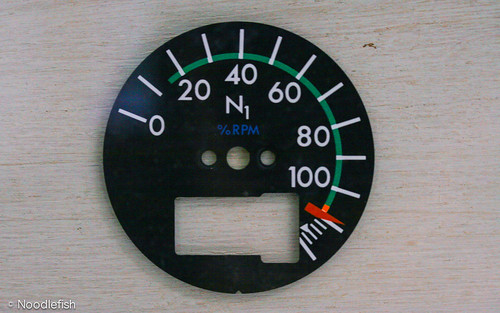
Dial by Noodlefish, on Flickr
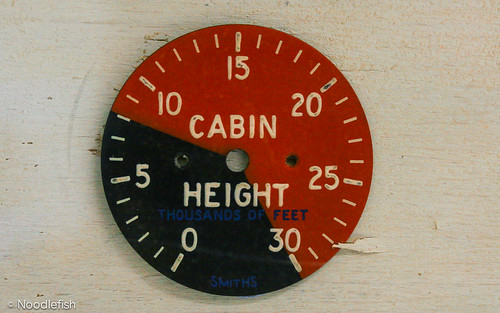
Cabin Height by Noodlefish, on Flickr

I'm liking it a lot, though definitely in the clean second hand camp, I don't think the green is needed at all. Personally think it would look better without the outer white track.

I'd tried it with both, but feel the outer track gives it a more vintage feel, without it looks a little more modern and even a bit motorsport.
Chris.
Think you've done a great job Chris . Credit where credit is due .
Good luck everybody. Have a good one.
Agreed. I'll have one as it is, but heretically would prefer quartz.
If I could get hold of the quartz sweep second movement (actually 57600 BPH) used in the Bulova Precisionist, I'd use it in a heartbeat. I know it's Japanese and I know it's not a Bulova in-house movement but I don't know who makes it.
Eddie
Whole chunks of my life come under the heading "it seemed like a good idea at the time".
Sounds like a challenge for those possessing google-fu.
Almost certainly not news to you...
"... Precicionist's second hand runs at 16 beats per second (57,600 bph). Precisionist was developed by Bulova in cooperation with its parent company, the Citizen Watch Company, ..."
And I'm guessing they would either have exclusive rights or punitive controls over distribution.
Last edited by stooo; 14th August 2013 at 18:24.
"Bite my shiny metal ass."
- Bender Bending Rodríguez
That would be perfect in this watch!
Would it be feasible for (interested) people to buy a donor watch and hand it over?
I see some are kind of affordable.
"Bite my shiny metal ass."
- Bender Bending Rodríguez
It's odd how little the internet knows about the movement....
I don't recall seeing any manufacturer or place of origin marks when I put mine under the loupe.
What this obviously very intelligent man said!!!
And the boss has agreed to buy me one for our 15th anniversary next September if its ready....so crack on Eddie.......and make it as high spec as you like!
This watch looks fantastic! Well done Chris. Can't wait until its available to order!
Looks stunning. I haven't been this excited about a watch since the patient wait for the first issue of the SB3.
38mm, 20mm lugs, plain simple design as above, hand cranker movement, big crown to wind on the wrist, bingo bango boingo home run.
I'll add my name to the list of folks excitedly looking forward to this one
Last edited by nickyboyo; 15th August 2013 at 04:00.
I've found a piece online that states that the P102 is made by Citizen. There is no additional confirmation, but maybe that's a starting point?
BTW, re-considering my initial thought about a coloured tip to the seconds hand and thinking that the initial rendering is the one.
I believe that Citizen now own Bulova so this may approximate to being in-house. Worth a punt, though.
In the Sotadic Zone, apparently.
Looks like a great design!
Reasonably sized (38 mm case) and quartz movement (keeping the cost down) would be my preference.
This might be the first black watch I'd consider.
I reckon it has the potential to be TimeFactor's biggest seller long term.
That last rendering (above) looks excellent... love the way it reflects the Smiths instrumentation. Personally I'd hope for quartz too. I'd buy that for certain!
Rod
Tim from Alsal watches in The Strand is on the forum but can't recall his username. He sells Bulova & Citizen and does a lot of repairs & servicing so he might have a contact who can supply the movements?
Steve
I dont see any reason to change anything about dial or hands. But I agree it needs a bigger crown:
I think I'd prefer this as an auto...it would really take on something like the MB2. The only quartz that's worth buying is a SQ.
This is the one I want. I'd pay right now if I could!
I dont know if i'd prefer quartz, manual wind or auto... I think quartz with a sweep hand would put this at a decent price point where i would buy it and use it as a utility watch.
I say go!!
Change nothing (except adding a date at 4½) and it should be a winner.
Agreed, a discrete date would be useful, and if done right, wouldn't detract from the overall appearance.
I second a date window. I'm really liking this watch. I hope it gets made.
A date window would spoil it IMO. I don't think I'd want one with a date.
There won't be a date. Not even maybe a date; just no date, ever.
Eddie
Whole chunks of my life come under the heading "it seemed like a good idea at the time".
I like a date window on a watch as I am a bit thick and need reminding every little while (ask my wife!) but looking at these renderings a feel that a date would spoil the design
Good stuff.
 Posting Permissions